ember-cli-toggle
Checkbox based Toggle Switch component for Ember.
Based on this codepen.
Here's the official demo using this component.


See the 0.x branch for 0.x code and fixes.
Usage
First install with npm install --save-dev ember-cli-toggle, and add one of the following
in your template:
{{x-toggle toggle='startCar'}}{{x-toggle theme='light' toggle='enableLayer'}}{{x-toggle theme='ios' size='small' toggle='muteVolume'}}{{x-toggle theme='flat' toggle='disableTest'}}{{x-toggle theme='flip' offLabel='Nope' onLabel='Yep' toggle='haveFun'}}{{x-toggle theme='skewed' size='large' toggle='enablePartyMode'}}Labels
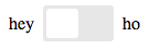
You can also show text labels on either side of toggle switch with:
{{x-toggle showLabels=true offLabel='Hey' onLabel='Ho' toggle='letsGo'}}Which would look like (using "default" theme):
This option is available on all themes but is a less sensible choice for those themes which actually
include the label within the control (e.g., skew and flip).
Binding
It's perfectly normal to not need bindings for a toggle switch as the "toggle" property allows the container to catch thrown actions
which happen at each state transition. Sometimes, however, it's easier to just bind your toggle switch to a property on the container. This is possible with use of the value binding:
{{x-toggle value=controller.heyOrHo showLabels=true offLabel='Hey' onLabel='Ho'}}This will ensure that the bound property is always set to the true or false value and as it's a two way binding this will allow the toggle control to automatically update its UI when the value is changed external to the component as well.
Finally, it is sometimes the case that rather than a true or false value the toggle is meant to move between two discrete, but non-boolean states.
In order to support this functionality there is an overloaded form of setting the onLabel and offLabel properties which not only sets a "label"
for the state but also a "value". In our "hey" versus "ho" example you might do the following:
{{x-toggle value=controller.heyOrHo showLabels=true offLabel='Hey:hey' onLabel='Ho:ho'}}With this configuration the "value" for the on state will be hey and in the off state it will be ho. If the bound property
is set to anything other than the two accepted value states it will reset to its "off state".
Available Options
theme- One of 'light', 'ios', 'flat', 'flip', 'skewed', 'default'. Defaults to 'default' if not specified.size- One of 'small', 'medium', 'large'. Defaults to 'medium' if not specified.onLabel- The label for the on state. Defaults to 'On'.offLabel- The label for the off state. Defaults to 'Off'.showLabels- Defaults to 'false', if 'true' will display labels on left and ride side of toggle switchtoggled- Defaults tofalse, meaning not enabled by default. Whentrue, an.x-toggle-container-checkedclass is set on the component.disabled- Defaults tofalse, which means you can click the toggle. Whentrue, an.x-toggle-disabledclass is set on the toggle and an.x-toggle-container-disabledclass is set on the component.name- A name to differentiate multiple toggles, gets passed to thetoggleaction. Defaults to 'default'.
Actions
toggle- The toggle action, which has two arguments i.e.isToggledandtoggleName. ThetoggleNameis set by thenameattribute on the toggle, e.g.{{x-toggle toggle='switchToggled' name='typeA'}}.
actions: { }Configuring
Add a configuration for ember-cli-toggle to include only the themes that
you will use.
ENV'ember-cli-toggle' = includedThemes: 'light' 'default' 'flip' excludedThemes: 'flip' defaultShowLabels: true // defaults to false defaultTheme: 'light' // defaults to 'default' defaultSize: 'small' // defaults to 'medium' defaultOffLabel: 'False' // defaults to 'Off' defaultOnLabel: 'True' // defaults to 'On';note: the IOS theme is referred to as just
iosnotios7as was indicated in the originating CSS source
To exclude or not include a theme, means that it's css styles will not be bundled with your application, thus not polluting your app.
Note: Including a blank array e.g. includeThemes: [] will not include any themes, leaving
you to define your own theme styles. See the vendor/ember-cli-toggle/themes directory
for reference.
Contributing
See CONTRIBUTING.md for details.