Easy Modal for React
An simple, clean, and easy to use modal that supports any screen size and uses (mostly) modern CSS.
Installation
npm install easy-modal-react
Usage
Simple
import EasyModal from 'easy-modal-react';

<EasyModal
    open={this.state.modalOpen}
    onClose={this.closeModal}
>
    content here!
</EasyModal>
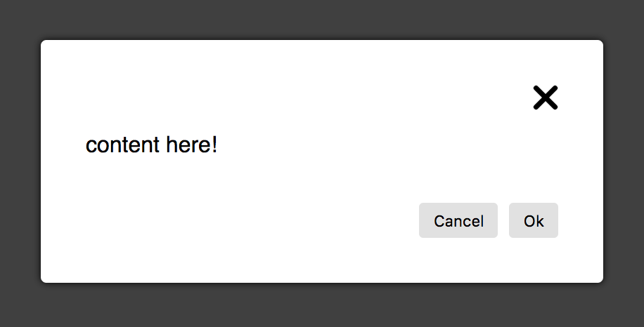
Advanced
import EasyModal, { EasyModalHeader, EasyModalFooter } from 'easy-modal-react';

<EasyModal
    open={this.state.modalOpen}
    onClose={this.closeModal}
    header={<EasyModalHeader onClose={this.onClose} />}
    footer={<EasyModalFooter onCancel={this.onClose} onApprove={this.onApprove} />}
>
    content here!
</EasyModal>
<EasyModal /> Props
| Prop | PropType | Description |
|---|---|---|
open (required) |
PropTypes.bool |
Tells EasyModal weather it is open or closed Options: true | false |
onClose (required) |
PropTypes.func |
Called by EasyModal when the user clicks outside the modal or hits the ESC key. Should update state for open |
children (required) |
PropTypes.node |
The content of the modal |
className |
PropTypes.string |
Adds a CSS class of your choice to the .modal-message element. |
header |
|
A React node or a string to display at the top of the modal. Use EasyModalHeader for a default header with a close button. |
footer |
|
A React node or a string to display at the bottom of the modal. Use EasyModalFooter for a default footer with "Cancel" and "Ok" buttons. |
<EasyModalHeader /> Props
| Prop | PropType | Description |
|---|---|---|
onClose (required) |
PropTypes.func |
Called by EasyModal when the user clicks the close button. Should update state for open |
<EasyModalFooter /> Props
| Prop | PropType | Description |
|---|---|---|
onCancel (required) |
PropTypes.func |
Called by EasyModal when the user clicks the "Cancel" button. Should update state for open |
onApprove (required) |
PropTypes.func |
Called by EasyModal when the user clicks the "Ok" button. Should update state for open |
Browser Support
Tested in all modern browsers as well as IE11.