dp-data-table
dp Data Table is a simple ready to integrate component made in React using bootstrap styling.
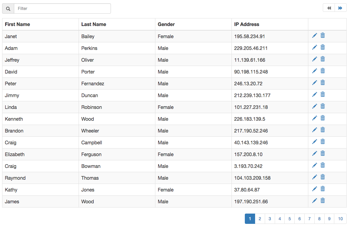
Screenshot
Integration
Here is a sample integration:
<script src="https://cdnjs.cloudflare.com/ajax/libs/react/15.0.0/react.js"></script>
<script src="https://cdnjs.cloudflare.com/ajax/libs/react/15.0.0/react-dom.js"></script>
<script src="dist/dpDataTable.js"></script>
<script>
  window.RenderDpDataTable({
    selector: '#data-table-1',
    items: [.......]
  });
</script>
React Integration:
import React from 'react';
import DpDataTable from 'dp-data-table';

......

<DataTable items={[.......]} />
To have proper styling, include bootstrap.
Options
The options are passed in as props when used as a React component.
| Option | Type | Description |
|---|---|---|
| items | array | Collection of items to bind to the grid |
| headers | array | array of keys and their matching Header names.[{'first_name' : 'First Name'}]
|
| hidePagination | boolean | Boolean to hide the pagination values. Setting this to true will show all items in same page. |
| itemsPerPage | number | No of items per page. Default is 15. |
| isLoading | boolean | Boolean to show the loading icon over the grid. |
| iconClasses | object | An object with all the class names for the font icons used in the project. {LOADING: 'glyphicon glyphicon-refresh'}. Available options to override: LOADING, EDIT, DELETE, PAGE_PREV, PAGE_NEXT, FILTER, SORT_NONE, SORT_ASC, SORT_DESC |
| showFilter | boolean | Boolean to show the filter input |
| filterableFields | array | Array of item property keys that can be made filterable. If not provided, all columns are filterable. |
| onFiltering | function | Override function for filter. onFiltering({items, filterString})
|
| showSort | boolean | Boolean to show column sort |
| sortableFields | array | Array of column keys which can be sorted. |
| showContextColor | boolean | Boolean to add context css to table row. Setting this to true will apply the __dp__contextCss property of item, to the row. |
| onSorting | function | Override function to sortonDeleting({items, sortKey, sortOrder})
|
| onEditing | function | Event handler for editing a row. The edit icon is enabled only when a function is supplied to this option.onEditing({item, index})
|
| onDeleting | function | Event handler for deleting a row. The delete icon is enabled only when a function is supplied to this option.onDeleting({item, index})
|
| onView | function | Event handler for viewing details of a row. The view icon is enabled only when a function is supplied to this option.onView({item, index})
|
| onItemsChange | function | Event handler to get all changes that happen within the component. onItemChange(e)
|
Development
- Development server
npm start. - Continuously run tests on file changes
npm run watch-test; - Run tests:
npm test; - Build
npm run build;