DMP图表组件开发指南
组件开发工具
window 系统建议使用 CMD/Powershell 命令行工具,Git Bash 不支持 init 命令
安装
npm install dmp-cli -gwindows下若出现 fsevents 安装失败,尝试在命令后面添加--no-optional参数
安装完成后运行dmp,输出以下画面,说明安装成功。

初始化组件
dmp init1. 组件基本信息
添加组件的基本信息。

- 组件英文名:组件标识 code,需要全局唯一,支持英文数字及下划线
- 组件中文名:显示的组件名称
- 组件描述:显示的组件描述
2. 组件终端类型
选择组件的终端类型,不同类型的组件只会在指定的报告类型中使用,支持多选。

- large_screen:大屏报告,对应的创建类型为报告
- pc_screen:PC仪表板,对应的创建类型为仪表板
- mobile_screen:移动报告,对应的创建类型为移动报告
目前暂未区分 large_screen/pc_screen,仅区分 mobile_screen,即 large_screen 和 pc_screen 类型通用,都支持在大屏报告和 PC 仪表板中使用。
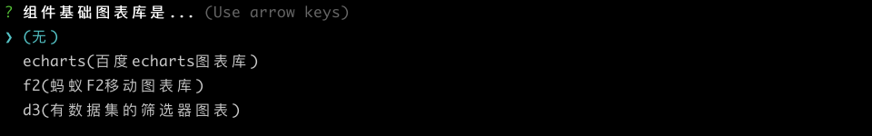
3. 组件基础图表库
选择组件的基础图表库,平台提供 3 中内置的基础图表库:echarts,f2,d3,使用基础图表库无需安装相关依赖,DMP 会在运行时检查并动态加载组件库。
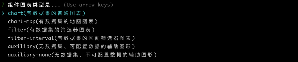
4. 组件图表类型
-
chart(有数据集的普通图表):数据源通过配置数据集的图表,如表格、饼图等大部分图表
-
chart-map(有数据集的地图图表):与 chart 类型一致,另外会加载高德地图 sdk
-
filter(有数据集的筛选器图表):数据源通过配置数据集的筛选器,如下拉筛选等
-
filter-interval(有数据集的区间筛选器图表): 与 filter 类型一致,返回的数据是区间类型,如数值区间筛选器
-
auxiliary(无数据集、可配置数据的辅助图形):数据源通过手动输入配置的简单图表,如文本、图片等
-
auxiliary-none(无数据集、不可配置数据的辅助图形):无数据源的简单图表,如时间器,简单Tab选项卡组件
5. 开发框架

6. 初始化完成
当初始化完成后会在当前目录下生成一个以组件英文名为名的组件包(文件夹),开发者在此基础上进行开发。

组件开发
进入组件包文件夹,启动设计器
cd example_chart
dmp run // 连接到 dmp 正式环境的开发者租户
dmp run --test // 连接到 dmp 测试环境的开发者租户
需要使用 fs.linkSync 链接文件夹,在 window 下需要以管理员身份运行
执行运行命令后,会打开报告设计器本地开发调试界面,同DMP平台报告设计器功能一致。
1. 注册成为开发者
输入账号/邮箱/密码,注册成为开发者。

2. 组件开发调试
开发组件,调试界面。
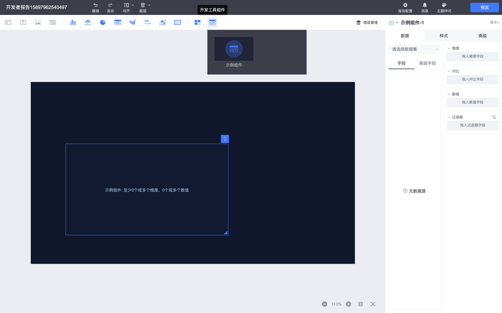
组件导航栏包括所有的内置组件以及开发者组件,开发者组件在组件导航栏最右侧的开发工具组件类别中。
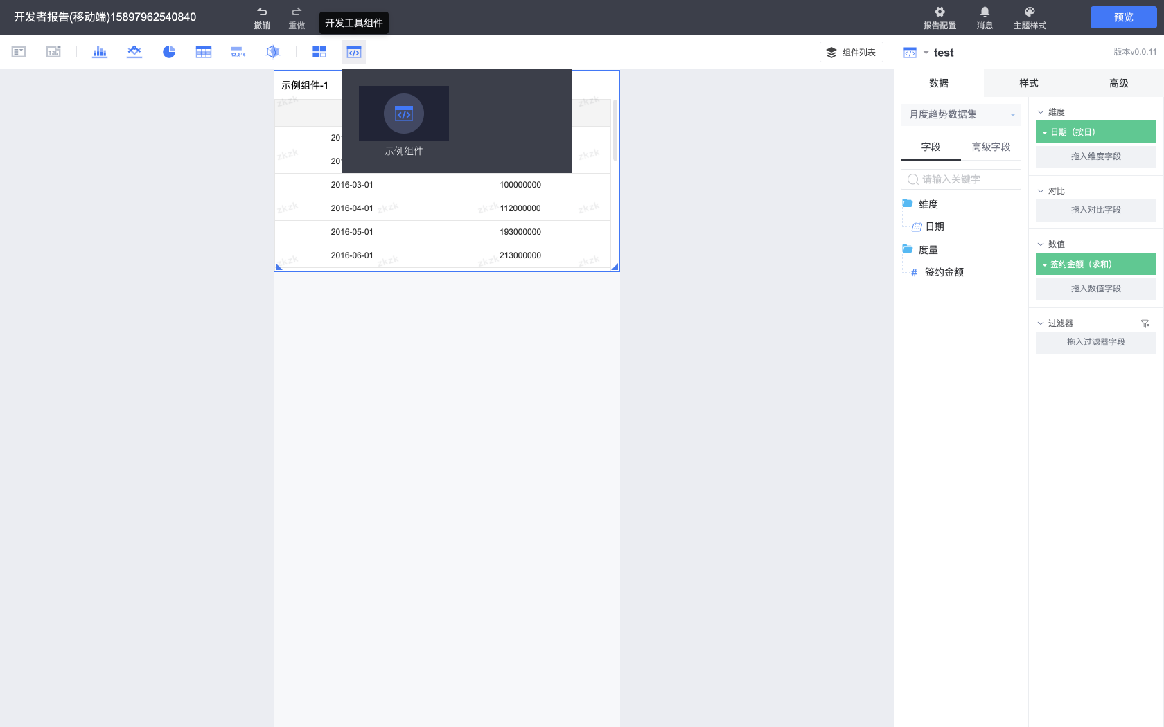
3. 设计器切换
开发者工具内置两种设计器:大屏报告以及移动报告设计器,通过组件终端的类型来区分启动哪种类型的设计器,当组件终端包含移动报告(mobile_screen)时,开发工具默认启动移动报告设计器,否则启动大屏报告设计器。
也可以通过手动设置 package.json 中的 platform.runTerminal 字段切换不同的设计器。
从不同设计器中可以预览不同类型的报告。
打包组件
进入组件包文件夹,启动打包命令
dmp package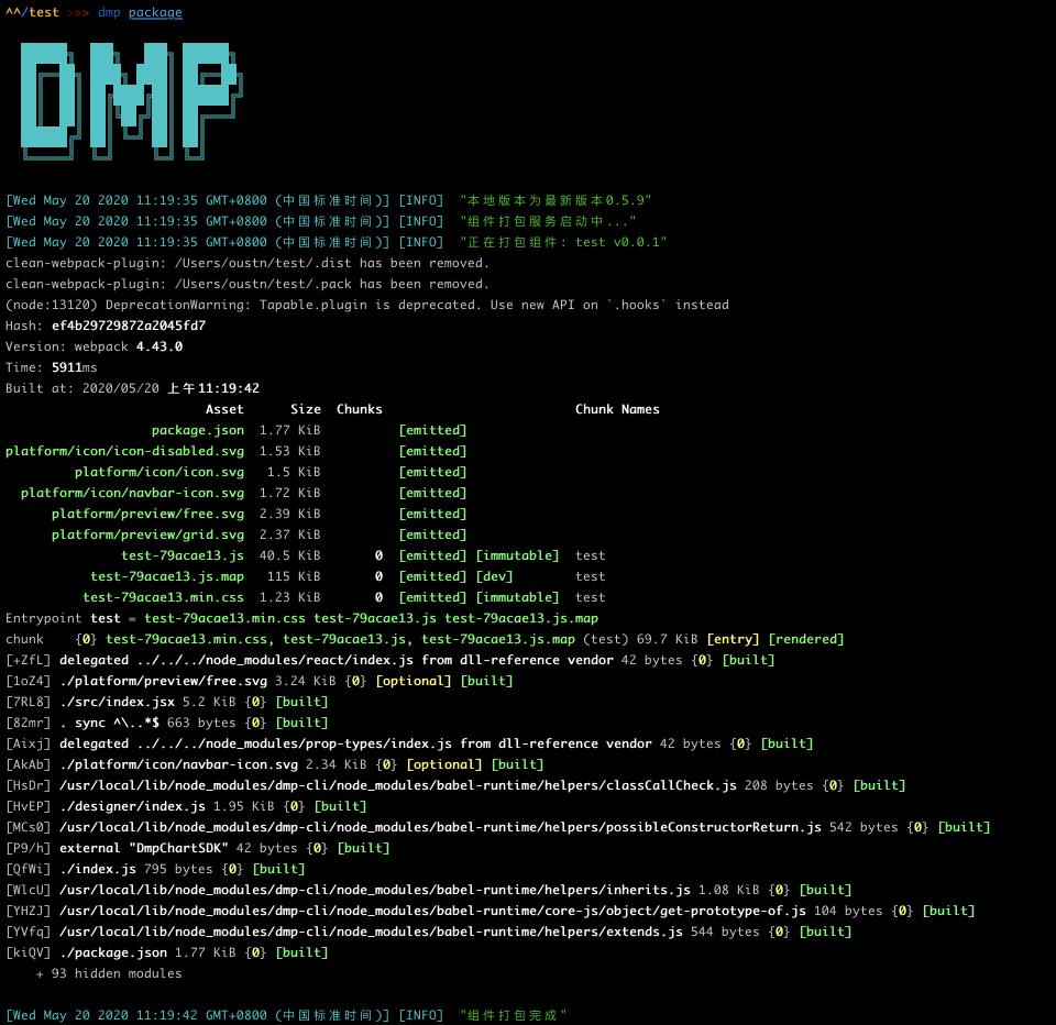
打包完成后,生成的 zip 文件在组件包文件夹中的 .pack 文件夹内。
暂时没用提供开发者自动上传分发组件功能,请联系 DMP 团队分发组件
组件包规范
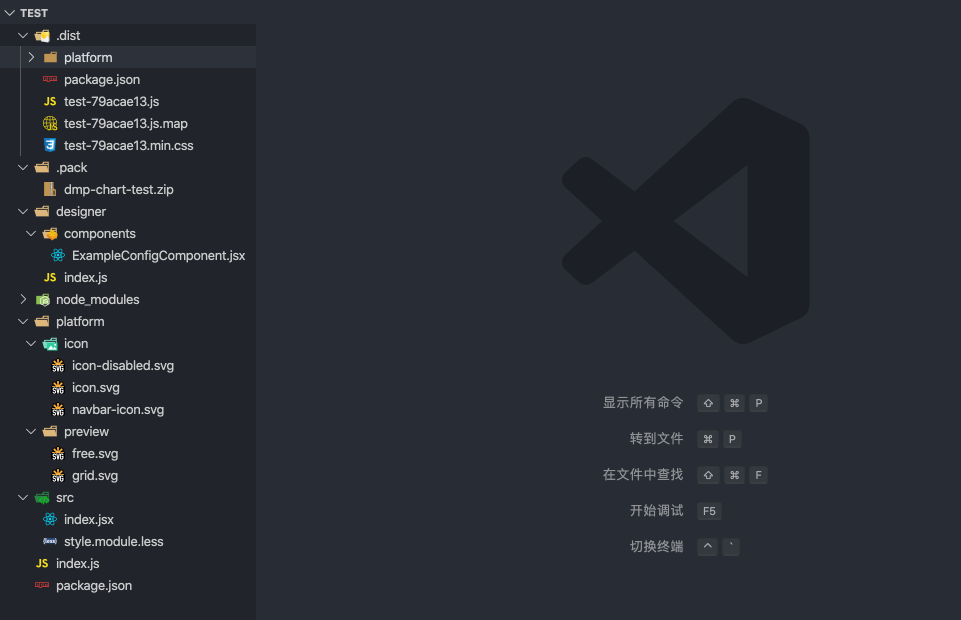
目录结构
component                           //组件包
   |
   |-- .dist/                       //包含组件打包文件
   |-- .pack/                       //包含组件打包文件的zip压缩包
   |
   |-- designer/                    //包含组件的设计器代码
   |   |--components/               //包含开发者自行开发的样式属性组件
   |      |--ExampleConfigComponent.js
   |   |--index.js                  //组件的功能配置
   |
   |-- platform/
   |   |--icon/
   |      |--icon.svg          	 //组件icon图标(32*32)
   |      |--icon-disable.svg  	 //组件禁用状态的icon图标
   |      |--navbar-icon.svg        //设计器中选中单图时展示在组件类别顶部的icon,第三方组件可不提供
   |   |--preview/
   |      |--free.svg               //组件显示的示例图片(335*238)
   |      |--grid.svg			   // 仪表板&移动报告展示的示例图片
   |-- src/
   |   |--index.jsx                 //包含组件的运行时源码
   |   |--style.module.less         //包含组件的运行时源码
   |
   |-- index.js                     //组件包主入口文件
   |-- package.json                 //组件包配置
/package.json
{
  "name": "test",
  "version": "0.0.1",
  "description": "用于 dmp-cli doc 的示例组件",
  "platform": {
    "name": "示例组件",
    "icon": "/platform/icon/icon.svg",
    "icon_disable": "/platform/icon/icon-disabled.svg",
    "navbar_icon": "/platform/icon/navbar-icon.svg",
    "previewImg": "/platform/preview/free.svg",
    "chartType": "chart",
    "dataLogicType": "column",
    "layout": {
      "grid": {
        "previewImg": "/platform/preview/grid.svg",
        "size": {
          "width": 12,
          "height": 6
        }
      },
      "free": {
        "previewImg": "/platform/preview/free.svg",
        "size": {
          "height": 270,
          "width": 480
        }
      }
    },
    "containMapGallery": false,
    "baseChartLib": [],
    "runTerminal": [
      "mobile_screen"
    ]
  },
  "config": {
    "dataSourceOrigin": "dataSet",
    "indicatorRules": [
      {
        "dim": {
          "min": 0,
          "max": 0
        },
        "value": {
          "min": 1
        },
        "comparison": {
          "min": 0,
          "max": 0
        }
      },
      {
        "value": {
          "min": 0
        },
        "dim": {
          "min": 1
        },
        "comparison": {
          "min": 1
        }
      },
      {
        "value": {
          "min": 0
        },
        "dim": {
          "min": 1
        },
        "comparison": {
          "min": 0
        }
      }
    ],
    "indicatorDescription": "0个或多个维度,0个或多个数值",
    "sortable": true,
    "penetrable": false,
    "linkage": false,
    "canLinked": false,
    "hasZaxis": false,
    "hasNotice": true,
    "hasDesiredvalue": false,
    "hasComparison": true,
    "hasChartParams": false,
    "dimsReportRedirect": false,
    "numsReportRedirect": false
  }
}
组件初始化默认生成的部分,开发者不需要修改
- name
- version
- description
- platform.name
- platform.chartType
- platform.dataLogicType
- config.dataSourceOrigin
chartType、dataLogicType和dataSourceOrigin的对应关系:
| chartType(组件类型) | dataLogicType(组件数据类型) | dataSourceOrigin(组件数据源) |
|---|---|---|
| chart | column | dataSet |
| chart-map | column | dataSet |
| filter | assist | dataSet |
| filter-interval | interval | dataSet |
| auxiliary | nondataset | manual |
| auxiliary-none | nondataset | none |
开发者需要自定义部分
-
platform.icon 以组件包路径为根目录,指向对应的图标文件
-
platform.icon_disable 以组件包路径为根目录,指向对应的图标文件
-
platform.navbar_icon 第三方组件可不需要,可移除该字段,或指向对应的图标文件
-
platform.previewImg 以组件包路径为根目录,指向对应的预览文件
-
platform.layout 根据不同的报告类型设置对应的预览图和初始化大小,如果不使用某种类型,可以忽略该类型的配置。
- grid:仪表板/移动报告
- free:大屏报告
"layout": {
  "grid": {
    "previewImg": "/platform/preview/grid.svg", // 预览图
    "size": {
      "width": 12, // 初始化宽度,按照报告宽度平分为 12 份,数值代表 x/12 * 报告宽度
      "height": 6,// 初始化高度,按照 40px 一个单位计算
    }
  },
  "free": {
    "previewImg": "/platform/preview/free.svg", // 预览图
    "size": {
      "width": 270, // 初始化宽度,像素
      "height": 480 // 初始化高度,像素
    }
  }
}
移动报告的宽度始终为 12(即屏幕宽度),自定义宽度不生效 不提供自定义尺寸时使用默认的尺寸
- config
| 功能配置项 | 值说明 |
|---|---|
| indicatorRules | array,配置维度字段dim、对比维度comparison、数值字段value的数量。如[{"dim": {"min": 1,"max":1},"value": {"min": 1,"max":1}}] |
| indicatorDescription | string,指标(维度或数值字段)配置说明,如1个维度、1个数值 |
| sortable | boolean,是否支持字段排序 |
| penetrable | boolean,是否支持穿透 |
| linkage | boolean,是否支持触发联动 |
| canLinked | boolean,是否支持被其他单图联动 |
| hasZaxis | boolean,是否支持添加次轴 |
| hasNotice | boolean,无数据时是否自定义样式 |
| hasDesiredvalue | boolean,是否支持设置目标值 |
| hasComparison | boolean,是否含有对比维度 |
| hasChartParams | boolean,是否含有参数 |
| dimsReportRedirect | boolean,是否支持设置维度字段进行报告跳转 |
| numsReportRedirect | boolean,是否支持设置数值字段进行报告跳转 |
/index.js
import component from './src/index'
import designer from './designer'

const packageJson = require('./package.json')

const { name, platform } = packageJson

export default {
  info: {
    name: platform.name,                           // 图表名称
    code: name,                                    // 图表唯一标识符
    type: platform.chartType,                      // 图表类型: filter(过滤器), chart(图表), auxiliary(辅助图形)
    data_logic_type_code: platform.dataLogicType   // 图表数据类型: default(通用单图),geo(地图类单图), nondataset(无数据集的简单单图), assist(筛选器类单图)
  },
  icons: {
    normal: require(`.${platform.icon}`),
    disabled: require(`.${platform.icon_disable}`)
  },
  preview: require(`.${platform.previewImg}`),
  component,
  designer
}
index.js 是组件包的入口文件,通常来说不需要修改其中的内容。导出对象的 component 属性在 React 和 Vue 框架下会有不同:
- React 文件直接在导出时通过 Connect 导出高阶组件,component 直接使用该导出即可
// ...

export default Connect()(Example)- Vue 文件导出后需要通过 sdk 的 getVueComponent 方法接入Vue组件,然后使用 Connect 创建高阶组件
import { Connect, getVueComponent } from 'dmp-chart-sdk'
import component from './src/index'

// ...

export default {
  // ..
  component: Connect()(getVueComponent(component)),
  // ..
}
/src/index.jsx(index.vue)
运行时源码。
组件开发需要引入 DMP 平台提供的组件开发SDK: dmp-chart-sdk, 组件通过 Connect 方法连接平台,接收 config(样式配置)、data(通过数据集获取的数据)和 events(平台功能API)等 Props 属性。
import React from 'react'
import PropTypes from 'prop-types'
import isEqual from 'lodash/isEqual'

import { Connect, Utils } from 'dmp-chart-sdk'
import style from './style.module.less'

// ...

class Example extends React.Component {
  static propTypes = {
    designTime: PropTypes.bool, // 设计时(编辑区)
    data: PropTypes.object, // 数据集返回的数据
    config: PropTypes.object, // 样式配置数据
    events: PropTypes.object, // 可触发的事件
    layer: PropTypes.object, // 组件在编辑区的图层信息
    scale: PropTypes.number, // 组件在编辑区的缩放比例
  };

  // ...

  render() {
    const lightTheme = ['colorful_white', 'gradual_blue'].includes(getCurrentDashboardTheme())

    const { data, config } = this.props
    const { data: chartData } = data || {}

    // ...

    return (
      <div className={`${style['example-chart']} ${lightTheme ? style['light-theme'] : ''}`}>
        <div className={style['table-view-wrap']}>
          // ...
        </div>
      </div>
    )
  }
  // ...
}

export default Connect()(Example)
组件内部接收到的props属性列表:
| Props | 属性说明 |
|---|---|
| chartData | 组件的元数据 |
| chartId | 组件在当前报告的图表id |
| config | 组件的自定义样式配置,所有配置field对应的值 |
| configInList | 组件的自定义样式配置原始值,数组 |
| data | 组件接收到的数据(通过配置数据集) |
| designTime | 当前组件是否运行在设计时,在报告设计器中为 true |
| detailMode | 移动报告中是否访问的是组件详细页 |
| events | 组件可调用的平台功能API |
| getReportMetadata | 获取报告元数据 |
| isNotice | 是否返回数据为空(需要配置 hasNotice 为 true) |
| layer | 组件在报告中的图层信息 |
| layoutMode | 区分固定布局或自由布局,取值为grid或free |
| scale | 组件在报告中的缩放比例 |
| platform | 组件运行的客户端: mobile或pc |
| events Props | API说明 |
|---|---|
| onFilterChange | 调用平台筛选功能,详情见平台功能调用-筛选 |
| onRedirect | 调用平台跳转功能,详情见平台功能调用-跳转 |
| onRelateChart | 调用平台联动功能,详情见平台功能调用-联动 |
| onPenetrateQuery | 调用平台穿透功能,详情见平台功能调用-穿透 |
| updateConfig | 通过代码更新组件样式配置,events.updateConfig(config,chartId) |
| onDispatchAction | 调用平台筛选/跳转功能,详情见平台功能调用-筛选 |
| onTransferEvent(移动报告) | 调用平台跳转功能 |
/designer/index.js
import { PropComponents, Utils } from 'dmp-chart-sdk'
import ExampleConfigComponent from './components/ExampleConfigComponent'

const { getCurrentDashboardTheme } = Utils.Theme

const lightTheme = () => ['colorful_white', 'gradual_blue'].includes(getCurrentDashboardTheme())

export default {
  ...require('../package.json').config,

  // 隐藏数据显示条目数
  hiddenDisplayItem: false,

  // 设计时数据请求条目数
  defaultDataSize: 100,

  // 默认数据
  previewData: {},

  // 图表配置
  chartConfig: [{
    title: '表头',
    field: 'tableHeader',
    show: true,
    spread: false,
    items: [
      {
        field: 'fontSize',
        label: '字号',
        component: {
          component: PropComponents.Spinner,
          props: {
            min: 12
          }
        },
        data: 14
      },
      // ...
      {
        field: 'customItem',
        label: '自定义配置项',
        component: ExampleConfigComponent,
        data: 'test'
      }
    ]
  }]
}
设计时代码。
通过该文件对组件进行配置,包括功能配置(package.json/config)、样式配置(chartConfig)、previewData(没有配置数据集时的默认数据)、defaultDataSize(报告设计时获取数据的最大条目数)等。
-
样式配置格式详情见《样式配置chartConfig》。
-
每个样式配置项对应一个样式配置组件PropComponent
-
开发者可以从dmp-chart-sdk的PropComponents获取,详情见《内置样式配置组件PropComponents》
-
开发者也可以扩展开发样式配置组件,详情见《样式配置组件扩展开发》
-
开发者引入使用Vue框架开发的样式配置组件时,需要调用dmp-chart-sdk的 getVueComponent 方法,如下图:
{
  field: 'customItem',
  label: '自定义配置项',
  component: getVueComponent(ExampleConfigComponent),
data: 'test'
}
组件开发 SDK
平台提供了图表组件开发SDK: dmp-chart-sdk
import {
  Connect,
  PropComponents,
  Utils,

  getVueComponent,
  convertToVueComponent,
  MobileSDK, // 移动端,其他类型为 undefined
} from 'dmp-chart-sdk'
Connect
连接器,为图表组件与DMP大数据可视化平台提供了连接,通过此连接可为组件提供开发相关的props属性。
React和Vue组件使用略有差别。
- React: src/index.jsx
class MyChart extends React.Component {
 ...
}

export default Connect()(MyChart)- Vue: index.js
import component from './src/index'
import designer from './designer'

export default {
  ...,
  component: Connect()(getVueComponent(component))
}
PropComponents
平台内置样式属性基础组件,详情见《内置样式配置组件PropComponents》
Utils
实用方法
| 方法 | 调用说明 | 备注 |
|---|---|---|
| Utils.DataUtils.pluckDimsData | 从data获取维度字段数据 | const dimsData = DataUtils.pluckDimsData(data, indicators) |
| Utils.DataUtils.pluckNumsData | 从data获取数值字段数据 | const numsData = DataUtils.pluckNumsData(data, indicators) |
| Utils.formatDisplay | 格式化维度或数值字段的数据 | Utils.formatDisplay(fieldValue, fieldDisplayFormat) |
getVueComponent
getVueComponent('path/to.vue')
引入vue文件,使vue组件能够在dmp平台运行
convertToVueComponent
使dmp组件sdk提供的基础属性组件PropComponents,能够在vue文件内使用
vue文件示例:
<template>
  <color-picker :data="color" :onChange="onChangeColor"/>
</template>

<script>
import { PropComponents, convertToVueComponent } from "dmp-chart-sdk"

export default {
  components: {
    ColorPicker: convertToVueComponent(PropComponents.ColorPicker)
  }
};
</script>
MobileSDK
移动报告中包含单独的 MobileSDK,主要是一些 F2 图表的封装
{
  F2Utils:  {
    components: {
      Chart,
      Coord,
      Axis,
      Guide,
      Geom,
      Tooltip,
      Legend,
      PieLabel,
    },

    plugins: {
      valueLabelPlugin,
      elasticPainterPlugin,
    },
  }
}
样式配置 chartConfig
chartConfig配置用以说明组件有哪些配置,既用于传给组件,也用于说明编辑器的选项.
四种概念:
- 配置模块
- 配置组
- 配置项
- 配置组件
###示例:
//使用组件SDK的基础配置组件PropComponents
import { PropComponents } from 'dmp-chart-sdk'

export default {
  chartConfig:[
    //这是一个配置模块
    {
      field: 'module1',        // 模块字段,必填
      title: '模块1',           // 模块名称
      show: true,              // 设置模块开关按钮的状态(开启或关闭),不设置该属性则不显示开关按钮
      spread: true,            // 设置模块的展开状态(下拉展开或收缩隐藏)
      items: [                 // 配置模块包含配置组或配置项

        //这是一个配置组
        {
          field: 'group1',     // 配置组字段,必填
          label: '配置组1',     // 配置组名称
          show: {              // 配置组开关按钮,不设置则不显示
            field: 'checked',  // 开关字段名,必填
            data: true         // 开关按钮状态(开启或关闭)
          },
          items:[              // 配置组包含配置项,不支持嵌套配置组

            //这是一个配置项
            {
              field: 'item1',      // 配置项字段,必填
              label: '配置项1',     // 配置项名称,不设置该属性则不显示label

              //这是一个内置配置组件
              component: PropComponents.ColorPicker,
              data: ''             // 配置项默认值,传入配置组件
            }
          ]
        },

        //这是一个配置项
        {
          field: 'item2',      // 配置项字段,必填
          label: '配置项2',     // 配置项名称,不设置该属性则不显示label

          //这是一个内置配置组件,可传递prop属性
          component: {
           component: PropComponents.Spinner,
           props: {
             min: 12
           }
          },
          data: 14          // 配置项默认值,传入配置组件
        }
      ]
    }
  ]
}
传递给组件的配置数据
//react
const { config } = this.props

//vue
const config = this.config

//配置JSON数据如下
config={
  module1:{
    show: true,
    spread: true
    group1:{
      checked: true,
      item1: ''
    }
    item2: 14
  }
}
效果

平台内置通用配置(标题),可选择禁用。
chartConfig=[

  //禁用标题模块
  {
    field: 'containerTitle',
    disabled: true
  }
]
内置样式配置组件PropComponents
PropComponents.Border

####示例
{
  component: {
    component:PropComponents.Border,
    props:{
      hideColor: false,   //是否隐藏颜色配置项
      colorLabel: '颜色',  //颜色配置项标题
      styleLabel: '粗细'   //线条配置项标题
    }
  },
  data: {
     borderColor: 'transparent',
     borderStyle: 'solid',       //solid(实线), dashed(虚线), dotted(点线)
     borderWidth: 0
  }
}
PropComponents.Checkbox

####示例
{
  label: 'Checkbox',
  component: PropComponents.Checkbox,
  data: true
}
PropComponents.ColorPicker

####示例
{
  label: 'ColorPicker',
  component: PropComponents.ColorPicker,
  data: '#24BCFA'
}
PropComponents.DatePicker

| 配置属性(prop) | 含义 | 默认值 |
|---|---|---|
| single | 日期格式为单日期,还是区间 | true |
| parentEl | 日期控件挂载父节点 | body |
####示例
{
  component: {
    component: PropComponents.DatePicker,
    props:{
      single: false,
      parentEl: 'body'
    }
  },
  data: ['2017-08-16', '2017-10-25'] // single:true时,data:'2017-08-16'
}
PropComponents.FontStyle

####示例
{
  label: 'FontStyle',
  component: PropComponents.FontStyle,
  data: {
     fontWeight: 'normal',   //bold, normal
     fontStyle: 'normal',    //italic, normal
     textDecoration: 'none'  //underline, none
  }
}
PropComponents.GridSpinner

| 配置属性(prop) | 含义 | 默认值 | 备注 |
|---|---|---|---|
| options | 配置选项 | [] | [{name:'width', label:'宽', max: +Infinity, min: 10, step: 1},{...},{...},{...}] |
####示例
{
  component: {
    component: PropComponents.GridSpinner,
    props: {
      indent: false,
      options: [
        {
          name: 'width',
          label: '宽',
          max: +Infinity,
          min: 10,
          step: 1
        },
        {
          name: 'height',
          label: '高',
          max: +Infinity,
          min: 10,
          step: 1
        },
        {
          name: 'x',
          label: 'X',
          max: +Infinity,
          min: -Infinity,
          step: 1
        },
        {
          name: 'y',
          label: 'Y',
          max: +Infinity,
          min: -Infinity,
          step: 1
        }
      ]
    }
  },
  data: {
    width: 478,
    height: 360,
    x: 86,
    y: 44
  }
}
PropComponents.ImageUploader
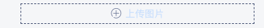
####示例
{
   component: PropComponents.ImageUploader,
   data: ''
}
PropComponents.Input
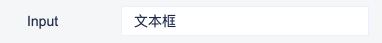
####示例
{
  label: 'Input',
  component: {
    component:PropComponents.Input,
    props:{
      type:'input', //input或textarea
      placeholder:''
    }
  },
  data: '文本框'
}
PropComponents.Select

| 配置属性(prop) | 含义 | 默认值 | 备注 |
|---|---|---|---|
| style | 样式 | - | |
| options | 选项 | [] | [{ value: '值', text: '文本' }] |
####示例
{
  label: 'Select',
  component: {
    component: PropComponents.Select,
    props:{
      options:[
        { value: '文字', text: '文字' },
        { value: '图片', text: '图片' }
      ]
    }
  },
  data: "文字"
}
PropComponents.Slider

| 配置属性(prop) | 含义 | 默认值 |
|---|---|---|
| max | 最大值 | 1 |
| min | 最小值 | 0 |
| step | 数字间隔 | 0.01 |
####示例
{
  label: 'Slide',
  component: {
    component: PropComponents.Slider,
    props: {
      min: 0,
      max: 100,
      step: 1
    }
  },
  data: 50
}
PropComponents.Spinner

| 配置属性(prop) | 含义 | 默认值 |
|---|---|---|
| max | 最大值 | 无穷大 |
| min | 最小值 | 0 |
| step | 数字间隔 | 1 |
| unit | 单位 | px |
####示例
{
  label: 'Spinner',
  component: {
    component: PropComponents.Spinner,
    props:{
      max: 60,
      min: 12,
      step: 1,
      unit: 'px'
    }
  },
  data: 12
}
PropComponents.TimeSpinner

####示例
{
  label: 'TimeSpinner',
  component: PropComponents.TimeSpinner,
  data: {
    time: 0,
    unit: 'hour'  //hour, minute, second
  }
}
PropComponents.TextAlign

####示例
{
  label: 'TextAlign',
  component: PropComponents.TextAlign,
  data: 'left'  //left, center, right
}
样式配置组件扩展开发
开发者可扩展开发样式配置组件,以满足图表的个性配置
基础Prop属性:
| 属性(prop) | 含义 |
|---|---|
| chart | 当前图表的相关配置(数据集、维度等) |
| chartData | 当前图表请求返回的数据 |
| data | 当前配置项的值 |
| onChange | 配置项值修改后需触发的事件 |
- react示例
import { PropComponents } from 'dmp-chart-sdk'
import MyComponent from './components/mycomponent'

export default {
  chartConfig:[
    {
      field: 'module1',
      title: '模块1',
      show: true,
      spread: true,
      items: [
        {
          field: 'customItem',
          label: '自定义配置项',
          component: MyComponent,  //使用自己开发的配置组件
          data: 'test'
        }
      ]
    }
  }
}
mycomponent.jsx
import React from 'react'
import PropTypes from 'prop-types'
import _ from 'lodash'

class MyComponent extends React.Component {
  static propTypes = {
    chart: PropTypes.object,     //当前图表的相关配置(数据集、维度等)
    chartData: PropTypes.object, //当前图表请求返回的数据
    data: PropTypes.object,      //当前配置项的值
    onChange: PropTypes.func     //配置项值修改后需触发的事件
  }

  constructor(props) {
    super(props)
    this.state = {
      data: props.data
    }
  }

  componentWillReceiveProps(nextProps) {
    if (!_.isEqual(nextProps.chart, this.props.chart)) {
      this.setState({
        data: nextProps.data
      })
    }
  }

  render() {
    const { data } = this.state
    return (
      <div className="diagram-design-config-content">
        <div className="form">
          <input
            type="text"
            className="form-control"
            value={data}
            onChange={this.handleChange}
          />
        </div>
      </div>
    )
  }

  handleChange = (e) => {
    const data = e.target.value
    this.setState({
      data
    }, () => {
      this.props.onChange(data)
    })
  }
}

export default MyComponent- vue示例
import { PropComponents, getVueComponent } from 'dmp-chart-sdk'
import MyComponent from './components/mycomponent.vue'

export default {
  chartConfig:[
    {
      field: 'module1',
      title: '模块1',
      show: true,
      spread: true,
      items: [
        {
          field: 'customItem',
          label: '自定义配置项',
          component: getVueComponent(MyComponent),  //引入自己开发的vue配置组件
          data: 'test'
        }
      ]
    }
  }
}
mycomponent.vue
<template>
  <div className="diagram-design-config-content">
    <div className="form">
      <color-picker :data="color" :onChange="onChangeColor"/>
    </div>
  </div>
</template>

<script>
import { PropComponents, convertToVueComponent } from "dmp-chart-sdk";

export default {
  props: {
    chart: Object,
    chartData: Object,
    data: String,
    onChange: Function
  },
  data() {
    return {
      color: this.data
    };
  },
  components: {
    ColorPicker: convertToVueComponent(PropComponents.ColorPicker)
  },
  methods: {
    onChangeColor(color) {
      this.$set({ color });
      this.onChange(color);
    }
  }
};
</script>
效果

平台功能调用
筛选
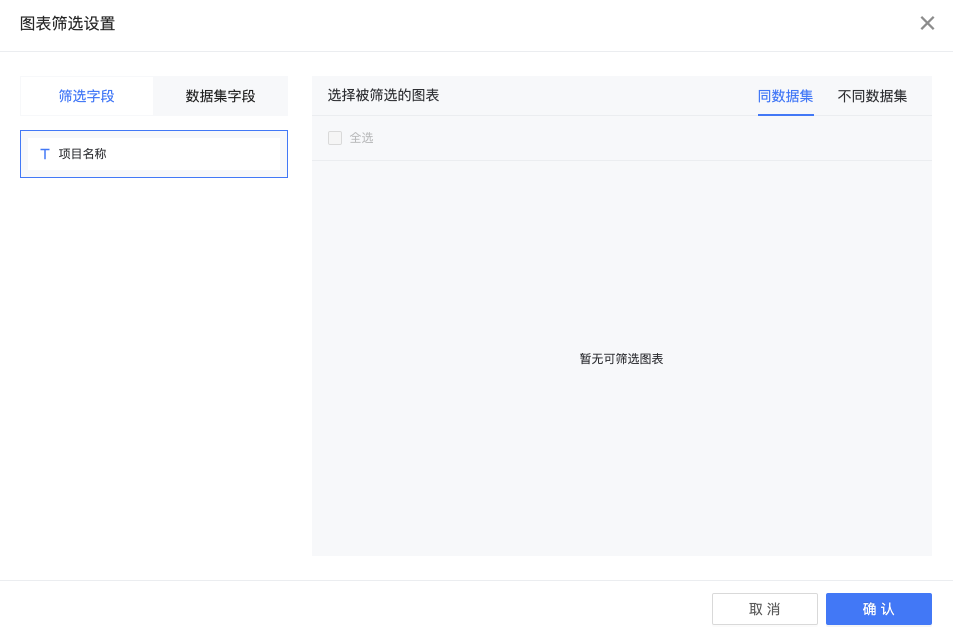
开发者在开发筛选器(chart_type === 'filter')时可扩展组件筛选功能,以满足筛选器图表对于其他图表组件进行筛选
平台筛选设置

基础Prop属性:
| 属性(prop) | 含义 |
|---|---|
| designTime | 设计时编辑区 |
| chartId | 当前图表的id |
| data | 当前图表平台属性对象 |
| data.data | 当前图表数据集数据 |
| data.indicators | 包含当前图表维度、数值、次轴、目标值等数组 |
| data.conditions | 当前筛选器图表已触发的筛选条件 |
| data.defaultValue | 当前筛选器图表默认值(在设计时筛选器可以添加默认值,预览时会直接选中默认值) |
| event | events.onChangeDatasetDefaultValue(改变筛选器默认值),events.onFilterChange(触发平台筛选) |
- react示例
  handleDateChange(value) {
    const { designTime, data, events, chartId } = this.props
    const { dims } = data.indicators || {}
    const dim = dims && dims[0]
    const newDate = _date2Range(value, this.state.type)
    const conditions = []
    newDate.forEach((item, i) => {
      if (i === 0 && !!item) {
        conditions.push({
          field_name: dim.col_name,
          field_id: dim.dim || dim.id,
          col_value: item,
          operator: '>=',
          formula_mode: dim.formula_mode,
          dim
        })
      } else if (item) {
        conditions.push({
          field_name: dim.col_name,
          field_id: dim.dim || dim.id,
          col_value: item,
          operator: '<=',
          formula_mode: dim.formula_mode,
          dim
        })
      }
    })
    this.setState({
      date: newDate
    }, () => {
      if (designTime) {
        events && events.onChangeDatasetDefaultValue && events.onChangeDatasetDefaultValue(this.state.date.join(','))
      } else {
        events && events.onFilterChange && events.onFilterChange(conditions, chartId)
      }
    })
  }
联动
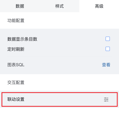
开发者在开发图表组件(chart_type === 'chart')时可扩展组件联动功能,以满足图表对于其他图表组件进行联动
平台联动设置

基础Prop属性:
| 属性(prop) | 含义 |
|---|---|
| designTime | 设计时编辑区 |
| chartId | 当前图表的id |
| data | 当前图表平台属性对象 |
| data.data | 当前图表数据集数据 |
| data.indicators | 包含当前图表维度、数值、次轴、目标值等数组 |
| event | events.onRelateChart(触发平台联动) |
| linkStatus | 当前图表联动选中条件 |
| linkList | 当前单图联动列表, 用于标识是否联动了其他单图 |
组件联动相关属性:
| 属性(this) | 含义 |
|---|---|
| validConnect | 是否触发联动事件 |
| hasBindClickEvent | 是否绑定联动事件(避免重复触发联动事件) |
组件联动注意项: 1.优先级低于穿透(点击事件优先绑定穿透事件) 2.组件本身需要样式区分选中状态与非选中状态 3.组件如果要设置联动,必须存在维度字段
- react示例
    //维度存在且被联动单图list大于0
    if (dims && dims.length > 0 && linkList && linkList.length > 0) {
      this.hasBindClickEvent = true;
      this.validConnect = false;
      //2018-04-26 处理'{空}'的情况以区别currentName为''的无联动状态
      if (chartRelated && (params.name === currentName || currentName === '{空}')) {
        this.setState({
          currentName: '',
          chartRelated: false
        }, () => {
          if (events.onRelateChart) {
            events.onRelateChart(conditions, chartId, '', () => {
              this.hasBindClickEvent = false
              this.validConnect = true
              this.bindEvents()
            })
          }
        })
      } else {
        //拆分name 获得condition_value
        const valueArr = params.name.split('&')
        valueArr.forEach((item, index) => {
          let condition = { chart_id: chartId }
          // 拼接conditions
          item = item === '-' ? '' : item
          if (dims[index]) {
            condition = { ...condition, col_value: item, col_name: dims[index].col_name, dim: dims[index], operator: '=' }
            conditions.push(condition)
          }
        })
        //将params.name为''的情况处理为'空'
        this.setState({
          currentName: params.name || '{空}',
          chartRelated: true
        }, () => {
          if (events.onRelateChart) {
            events.onRelateChart(conditions, chartId, params.name || '{空}', () => {
              this.hasBindClickEvent = false
              this.validConnect = true
              this.bindEvents()
            })
          }
        })
      }
    }
跳转
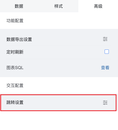
开发者在开发有数据集的单图组件(chart_type === 'chart')时,以满足单图组件发起报告切换、路由切换、新开标签页功能
设计器中暂时无法使用该功能
平台跳转设置

基础Prop属性:
| 属性(prop) | 含义 |
|---|---|
| designTime | 设计时编辑区 |
| chartId | 当前图表的id |
| data | 当前图表平台属性对象 |
| dashboardName | 当前起跳报告报告名称(用于显示在跳转时面包屑上) |
| userToken | 当前用户登录态token,用于跳转时第三方验证 |
| platform | 当前报告类型(pc端、mobile端) |
| data.paramsConditions | 后台返回的当前图表参数跳转条件 |
| events.onRedirect | 平台跳转新API |
| redirectRelation | 平台跳转设置 |
平台跳转新API参数:
| 参数(params) | 含义 |
|---|---|
| params.type | 跳转类型(table_like、chart_like、pie_like)后续组件内的逻辑处理可能会移到sdk |
| params.col | 设置跳转的字段key(别名alias) |
| params.dashboardName | 当前跳转报告名 |
| params.dataset_field_id | 设置跳转的字段id(dim or num) |
| params.platform | 当前报告类型(pc端、mobile端) |
| params.events | 当前图表的事件props |
| params.router | 当前图表路由对象 |
| params.conditions | 后台返回的当前图表参数跳转条件 |
| params.data | 当前点击项的数据(维度值、数值)集合({ key(别名alias): value }) |
| params.token | 当前用户登录态token |
- 组件方法handlePlanformRedirect
  //只需要输出
  handlePlanformRedirect(rowObj, id, col) {
    const { events, data, dashboardName, userToken, platform } = this.props
    const type = 'table_like'
    const paramObj = {
      type,
      col,
      platform,
      events,
      router: this.context.router,
      dataset_field_id: id,
      dashboardName,
      token: userToken,
      data: rowObj,
      conditions: data.paramsConditions || []
    }
    events.onRedirect && events.onRedirect(paramObj)
}-
组件内处理数据
-
所有else if为新增逻辑判断,即先兼容平台旧跳转设置、如果旧跳转设置不存在的情况调用新API: handlePlanformRedirect
-
示例代码为柱状类跳转、是一种较为完整跳转设置(数值跳转、维度跳转、参数跳转、多数值维度同时设置跳转)
-
未来组件内处理数据会抽象到平台,所有组件只需要调用组件方法并输出参数即可
    //情况一存在维度
    if (dims && dims.length > 0) {
      dims.forEach((dim, index) => {
        const key = dim.alias || dim.alias_name || dim.col_name
        const reportObj = dimsReportRedirect[key]
        dimKeys.push(key)
        if (reportObj && !hasReportRedirect && reportObj.isOpen) {
          this.handleReportRedirect(reportObj, keys[index])
          hasReportRedirect = true
        } else if (redirectRelation && !hasReportRedirect) {
          const id = dim.dim || dim.dataset_field_id
          const redirect = _.find(redirectRelation.chart_redirect, item => item.dataset_field_id === id)
          //跳转设置存在并且是维度跳转
          if (redirect && redirect.type === 0) {
            this.handlePlanformRedirect({ [key]: keys[index] }, id, key)
            hasReportRedirect = true
          }
        }
      })
      nums.forEach((num, index) => {
        const key = num.alias || num.alias_name || num.col_name
        const reportObj = numsReportRedirect[key]
        //把params的值跟维度别名关联起来
        const keysArr = {}
        keys.forEach((k, i) => {
          keysArr[dimKeys[i]] = k
        })
        //2018-07-18加入新判断,目前会根据点击的柱子决定跳转顺序
        if (reportObj && !hasReportRedirect && reportObj.isOpen && index === params.seriesIndex) {
          this.handleReportRedirect(reportObj, keysArr, keysArr)
          hasReportRedirect = true
        } else if (redirectRelation && !hasReportRedirect && index === params.seriesIndex) {
          //如果存在维度,则默认
          const id = num.num || num.dataset_field_id
          const redirect = _.find(redirectRelation.chart_redirect, item => item.dataset_field_id === id)
          //跳转设置存在并且是数值跳转
          if (redirect && redirect.type === 1) {
            this.handlePlanformRedirect(keysArr, id, key)
            hasReportRedirect = true
          }
        }
      })
    } else {
      //情况二 无维度
      const key = params.seriesName
      const reportObj = numsReportRedirect[key]
      if (reportObj && !hasReportRedirect && reportObj.isOpen) {
        this.handleReportRedirect(reportObj, key)
        hasReportRedirect = true
      } else if (redirectRelation && !hasReportRedirect) {
        const id = this._getIdByAlias(key)
        this.handlePlanformRedirect({}, id)
        hasReportRedirect = true
      }
    }
    if (hasReportRedirect) return
报告主题开发
报告主题的加入提升了DMP的多样性,能够满足更多的报告风格的需求。为了使开发者可以快速的上手,开发一套独一无二的报告主题,接下来将介绍报告主题的具体开发步骤。
首先,我们得对单图中的配置文件(designer/index.js)进行升级,这里提供了两个函数,分别是getChartConfigColorByKey和generateDefaultColorTheme,其中第一个方法为单图中的样式动态的提供颜色(渐变色),第二个方法则是动态的改变配色方案。通过这两个方法可以读取echart.js文件中设置的主题样式和应用于单图,接下来我们就来看下如何应用这两个方法。
- 单图示例
  // 获取配色方案
  {
    title: '配色方案',
    spread: true,
    field: 'theme',
    items: [{
      label: '',
      field: 'colorTheme',
      theme_controled: true,
      component: {
        component: PropComponents.ColorThemeConfig,
        props: {
          gradient: true,
          dimensionSwitch: false,
          legends: 'line_like'
        }
      },
      data: generateDefaultColorTheme,
    }],
  }
  // 获取颜色
  {
    field: 'color',
    label: '颜色',
    theme_controled: true,
    component: PropComponents.ColorPicker,
    data: getChartConfigColorByKey.bind(null, 'text')
  }
注:每个需要使用到这两个函数的配置项都需要添加theme_controled字段,因为在编辑时切换主题需要通过这个字段来判断哪个配置项应用了动态获取颜色和配色方案
接下来,我们来看一下echart.js中的配置,首先需要一种配色方案,一般是由多个颜色组合而成的数组。如下所示:
- 配色方案示例
  gradual_blue: {
    name: '渐变蓝',
    colors: ['#297CBA', '#1f3a90', '#131568', '#0d1544', '#297cba', '#54c0d5', '#b3e2cf', '#dcedc8'],
    type: 0
  },
除了新增配色方案之外,还需要为几个单图中特别的字段进行配色,这里要注意,如果为一个主题新增了配色属性,那么其余所有的主题都需要新增这个配色。
- 单图配色示例
  // 渐变蓝
  gradual_blue: {
    rank: 4,
    name: '渐变蓝',
    dashboard_background: 'RGBA(255,255,255,1)',
    tooltip_background: '#FFFFFF',
    tooltip_extra_css: 'box-shadow: 1px 1px 4px 2px rgba(0,0,0,0.10);max-height: 450px;overflow-y:auto; transform: translateZ(1px);',
    tooltip_title_color: '#555555',
    default_color_theme: {
      v: '1',
      themeKey: 'gradual_blue',
      customColors: [],
      affect: 0
    },
    grad_color_theme: {
      v: '1',
      themeKey: 'gradual_blue',
      customColors: [
        {
          value: ['#54C0D5', '#1F3A90']
        }
      ],
      affect: 0
    },
    chart_colors: {
      text: 'RGBA(46,46,46,1)',
      content: 'RGBA(41,124,186,1)',
    }
  }
单图配色相关属性:
| 属性 | 含义 |
|---|---|
| dashboard_background | 主题的背景色 |
| tooltip_* | tooltip工具栏相关的配色 |
| default_color_theme | 默认配色方案 |
| grad_color_theme | 默认渐变配色方案 |
| chart_colors | 单图中属性项的颜色 |
通过以上的步骤,一个全新的主题就算是成功创建了,接来下只需要在新增报告中加入一个新主题的选项,就可以尽情的欣赏自己的制作的主题了。
开发建议
平台内置,组件开发不再需要安装的Node包列表:
react react-dom react-bootstrap-myui dmp-chart-sdk prop-types echarts lodash moment jquery isomorphic-fetch
另外平台已引入高德地图开发API,通过设置 package 中的 platform.containMapGallery 为 true 引入。 <script src="https://webapi.amap.com/maps?v=1.4.4&key="></script>
自定义数据为空时组件的样式
组件为空时 DMP 提供一个默认的数据为空样式,开发者也可以自定义数据返回为空时的样式。
- 设置 package.json 中的 config.hasNotice 为 true
- 当数据返回为空时,组件的 prop 中 isNotice 值为 true
- 在 render 函数中添加自定义组件样式