
react-native-dropdownalert


| info | warn | error | success |
|---|---|---|---|
 |
 |
 |
 |
digicard addons:
In addition to source, payload now also supports overriding the following props:
payload: {
  styles: {
    containerStyle: {             // whole style
      backgroundColor: <color>    // background only
    },

    imageStyle: {},

    titleStyle: {},
    titleTextProps: <int>,
    titleNumOfLines: <int>,

    messageStyle: {},
    messageTextProps: {},
    messageNumOfLines: <int>
  }
Table of contents
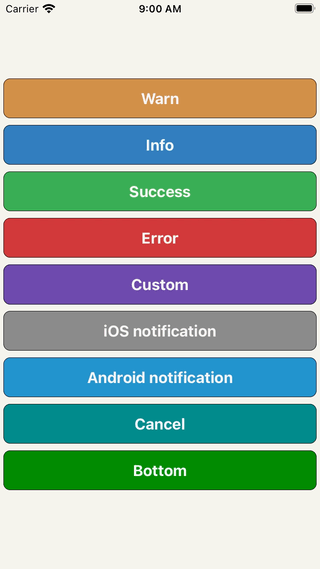
An alert to notify users about new chat messages, something went wrong or everything is okay. It can be closed by tap, cancel button, automatically with closeInterval, pan responder up gesture or programmatically (this.dropDownAlertRef.closeAction()).
Support
| react-native version | package version | reason |
|---|---|---|
| 0.50.0 | >=3.2.0 | Included SafeAreaView (iPhone X) |
| 0.44.0 | >=2.12.0 | Adopted ViewPropTypes |
Installation
npm i react-native-dropdownalert --saveyarn add react-native-dropdownalert
Demo
Usage
import DropdownAlert from 'react-native-dropdownalert';
export default class App extends Component {
  componentDidMount() {
    this._fetchData();
  }
  _fetchData = async () => {
    try {
      // alertWithType parameters: type, title, message, payload, interval.
      // payload object that includes a source property overrides the image source prop. (optional: object)
      // interval takes precedence over the closeInterval prop. (optional: number)
      this.dropDownAlertRef.alertWithType('info', 'Info', 'Start fetch data.');
      await fetch('https://httpbin.org/get');
      this.dropDownAlertRef.alertWithType('success', 'Success', 'Finish fetch data');
    } catch (error) {
      this.dropDownAlertRef.alertWithType('error', 'Error', error);
    }
  };
  render() {
    // DropdownAlert must be last component in the document tree.
    // This ensures that it overlaps other UI components.
    return (
      <View>
        <DropdownAlert ref={ref => this.dropDownAlertRef = ref} />
      </View>
    );
  }
}
Caveats
- Modals can overlap DropdownAlert if it is not inside the modal's document tree.
- It is important you place the
DropdownAlertABOVE theStackNavigator.- DropdownHolder example #1
- DropdownHolder example #2
- Redux + router flux example
- Repo: react-native-dropdownalert-router-sample Thanks @mitsuruog and @articolo
Inspired by: RKDropdownAlert