date-ranges
A calendar selectoin view for your react project
Installation
- Install using npm or yarn (
npm i date-ranges) - Import using
import Calendar from 'date-ranges'
Visuals
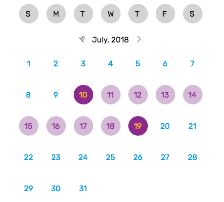
Using this package provides a calendar view which allows date ranges to be selected, with a start and end date. The start and end dates are marked with a specific color scheme, with all dates inbetween using a highlighted color scheme. The image below provides an example of possible color schemes with this datepicker.

Usage
The given code snippet demonstrates how to utilize the Calendar module in another component.
import React Component from 'react';import logo from './logo.svg';import './App.css';import Calendar from 'date-ranges' { return <div ="App"> <header ="App-header"> <img = ="App-logo" ="logo" /> <h1 ="App-title">Welcome to React</h1> </header> <p ="App-intro"> To get started edit <code>src/Appjs</code> and save to reload </p> <Calendar ='#000' ='#F5BA26' ='#8C298C' ='#D4BAD7' /> </div> ; } ;API
props
fontColor: string
The default font color the numbers on the calendar will have when highlighted or not selected
selectedFontColor: string
The font color the numbers on the calendar will have when selected
selectedColor: string
The background color of date selection when selected
highlightedColor: string
The background color of date when between start and end selection