
☢ dangerous


A utility function to create a dangerous/unsafe React component using tagged literal templates.
The syntax is borrowed from Styled Components.
dangerous returns a component, which uses
dangerouslySetInnerHTML
internally to convert your dangerous input to set literal to DOM's innerHTML
value.
⚠️ Requirement
Minimum required version of React is v16.3.0 because dangerous uses React.forwardRef, which was introduced in v16.3.0.
Installation
$ npm i dangerous# or $ yarn add dangerous✍ Usage
👶 Basic Usage
You can pass raw HTML to dangerous using tagged template literal.
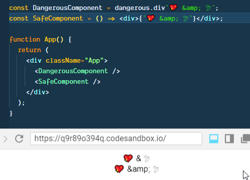
const DangerousComponent = dangerousdiv`💖 & 🕊`;// orconst DangerousComponent = `💖 & 🕊`You can Subtitute div with any valid DOM elements or a custom React component.
const DangerousComponent = dangerousspan`💖 & 🕊`const DangerousComponent = dangerousp`💖 & 🕊`const DangerousComponent = dangeroussection`💖 & 🕊`// andconst DangerousComponent = `💖 & 🕊`Render Result
Dangerous component will set &emp; directly so the rendered result will show
💖 & 🕊while React will render it as
💖 & 🕊as shown below.
🐱👤 Advanced Usage
dangerous returns a React component, to which you can pass props, which you can access within tagged template literal.
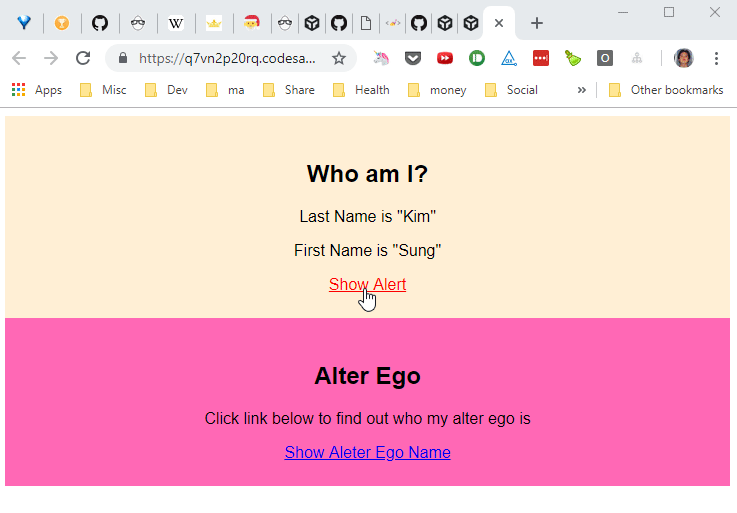
const DangerousComponent = dangerousdiv` <h1>Who am I?</h1> <p>Last Name is ""</p> <p>First Name is ""</p> <a href="javascript:alert('');">Show Alert</a>`; { return <DangerousComponent firstName="Sung" lastName="Kim" />;}In the code above, <DangerousComponent /> is passed following props in App.
firstName="Sung"lastName="Kim"
You can access the props in the tagged literal using ${props => props.properyName}.
This was taken directly from Styled Component syntax.
And you can destructure props and combine it to compose any string you want.
const DangerousComponent = dangerousdiv` //... omitted for brevity <a href="javascript:alert('');">Show Alert</a>`;⤵ Return object
dangerous returns a React component and behaves like a HoC (High-order Component).
If a custom component is passed to dangerous, then all static properties will be hoisted down to the wrapped component.
👨💻 Example
The example below shows how to use dangerous with a custom Block components with static properties and Styled Components, StyledDangerous & StyledBlock.
It also demo's wrapping StyledBlock (a Styled Component component 😅) with dangerous as DangerousStyled.

import React from "react";import ReactDOM from "react-dom"; import styled from "styled-components";import dangerous from "dangerous"; import "./styles.css"; Component // To check if static fields are hoised correctly static count = 10; static console; static console; { return <div />; } const Dangerous = dangerousdiv` <h1>Who am I?</h1> <p>Last Name is ""</p> <p>First Name is ""</p> <a href="javascript:alert('');">Show Alert</a>`; const StyledDangerous = ` background-color: papayawhip; padding: 1.5em 0;`; const StyledBlock = ` background-color: hotpink; padding: 1.5em 0;`; const DangerousStyled = ` <h1>Alter Ego</h1> <p>Click link below to find out who my alter ego is</p> <a href="javascript:alert('');">Show Aleter Ego Name</a>`; { return <div ="App"> <section> <StyledDangerous ="Sung" ="Kim" /> <DangerousStyled ="dance2die" /> </section> </div> ;} const rootElement = document;ReactDOM;🥊 Demo in action
💪 To Dos
- Create a GitHub project for version 1.
- Add TypeScript types
- Add TypeScript definition files to distribution
- Add tests
- Update Logo to look as stylish as that of Styled Components's. 😄