custom-checkbox-radio-scss

1.9.0 • Public • Published

Custom Checkbox Radio SCSS

SCSS based custom checkboxes and radios; a CSS-only solution.

View the Demo

Swanky

Install

npm i --save custom-checkbox-radio-scss

Include

Depending on your current directory and frontend stack, you'll want something along the lines of one of:

@import "../node_modules/custom-checkbox-radio-scss/custom-checkbox-radio";
@import "~custom-checkbox-radio-scss/custom-checkbox-radio"; // (webpack 3+) 

Add

Note, your labels must proceed the inputs and all have suitable name/id/for attributes.
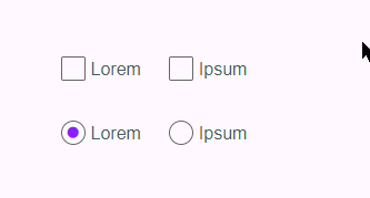
<fieldset>
    <legend>Checkboxes</legend>
    <p class="checkbox">
        <input type="checkbox" name="lorem-1" id="lorem-1" />
        <label for="lorem-1">Lorem</label>
    </p>
    <p class="checkbox">
        <input type="checkbox" name="lorem-2" id="lorem-2" />
        <label for="lorem-2">Ipsum</label>
    </p>
</fieldset>
 
<fieldset>
    <legend>Radios</legend>
    <p class="radio">
        <input type="radio" name="ipsum" id="ipsum-1" checked />
        <label for="ipsum-1">Lorem</label>
    </p>
    <p class="radio">
        <input type="radio" name="ipsum" id="ipsum-2" />
        <label for="ipsum-2">Ipsum</label>
    </p>
</fieldset>

Customise

Written in a non-invasive kinda way, so you can add your own styles to, say, input[type="radio"] + label::after, or simply override the various variables set in the SCSS file.

Browser Support

IE9 +

Package Sidebar

Install

npm i custom-checkbox-radio-scss

Weekly Downloads

17

Version

1.9.0

License

ISC

Unpacked Size

25.9 kB

Total Files

11

Last publish

Collaborators

  • entozoon