The input denote component
The input denote component module simply adds a visual box treatment before or after an input.
This extends current GOV.UK styles.
HTML Example
<h1 id="legend-heading" class="heading-large">Descriptive Heading</h1>

<div id="example-question" class="form-group inline">
    <span class="c-form-input-denote">£</span>
    <input class="form-control c-form-input-denote__input form-control-1-4" aria-labelledby="legend-heading" type="text" name="example">
</div>
Visual Example
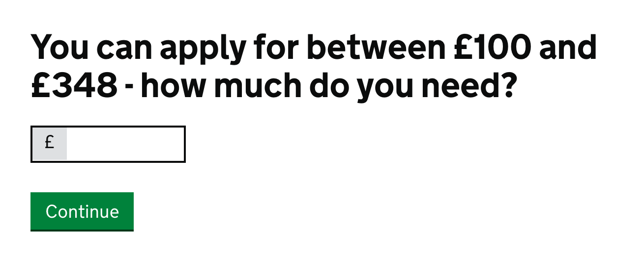
This is an example taken from Apply for a Budgeting Loan.
Usage
Once this has been installed you will need to include it in your Sass files.
links