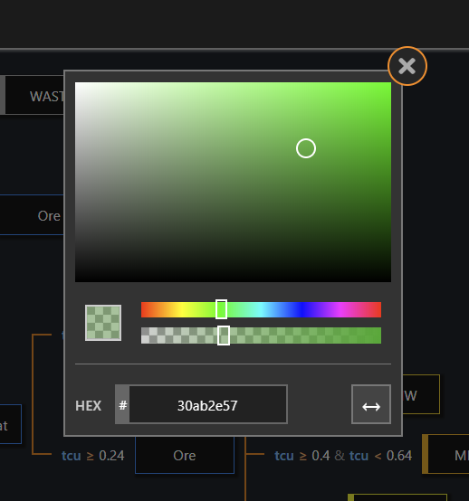
Color Chooser
A React component for choosing colors.
Provides a widget for choosing a color, allows for editing and viewing of:
- HEX
- RGB
- HSV
- HSL
- Alpha (pass property alpha to enable alpha channel)
Does not include funtionality to open or close the widget, this integration must be done manually.
All styling in CSS, override with your own style to customize.
Only depends on React.
Screenshots
Usage
<ColorChooser
    alpha                  // show the alpha layer
	color={'#00FF00'}      // css hex color
	onChange={callbackFn}  // pass a function to handle when the color changes
/>
Props
| Name | Required | Description |
|---|---|---|
color |
Yes | A hex value for the color to show. #00FF00 or #00FF00FF (alpha) |
onChange |
No | Callback for when the color is changed. Hex value of color. |
alpha |
No | Show the alpha layer. |
Example
import React from 'react';
import ColorChooser from 'color-chooser';

import 'color-chooser/lib/color-chooser.css';
import './my-color-chooser-style-override.css';

class App extends React.Component {

    constructor(props) {
        super(props);

        this.state = {
            color: '#00FF00'
        };
    }

    handleColorChange = (color) => {
        this.setState({
            ...this.state,
            color: color
        });
    };

    render() {

        let overlay = this.state.isOpen && (
            <div>
                <ColorChooser color={this.state.color} onChange={this.handleColorChange} />
            </div>
        );

        return (
            <div>
                <div>
                     { overlay }
                </div>
            </div>
        );
    }
}
Contributing
Feel free to make changes and submit pull requests whenever.
License
ColorChooser uses the MIT license.
