Responsive Max Width built with Bootstrap 5. Learn how to make a container or an element max width within its parent.
Check out Bootstrap Max Width Documentation for detailed instructions & even more examples.
Examples
Width utilities are generated from the utility API in _utilities.scss. Predefined classes support 25%, 50%, 75%, 100%, and auto by default. In order to make an element take the entire width of its parent add a .w-100 class to it.
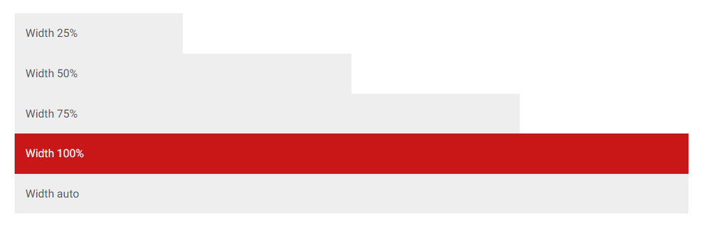
<div class="w-25 p-3" style="background-color: #eee">Width 25%</div>
<div class="w-50 p-3" style="background-color: #eee">Width 50%</div>
<div class="w-75 p-3" style="background-color: #eee">Width 75%</div>
<div class="w-100 p-3" style="background-color: rgb(201, 23, 23)">Width 100%</div>
<div class="w-auto p-3" style="background-color: #eee">Width auto</div>
You can also use max-width: 100%; utilities as needed.
<img src="https://mdbcdn.b-cdn.net/img/new/slides/041.webp" class="mw-100" alt="wild landscape" />Max width relative to viewport
You can also use utilities to set the width and height relative to the viewport with the vw (viewport width) values.
<div class="min-vw-100">Min-width 100vw</div>
<div class="vw-100">Width 100vw</div>
How to use?
-
Download MDB 5 - free UI KIT
-
Choose your favourite customized component and click on the image
-
Copy & paste the code into your MDB project
More extended Bootstrap documentation
- Bootstrap Address Form
- Bootstrap Avatar
- Bootstrap Back To Top Button
- Bootstrap Carousel Slider with Thumbnails
- Bootstrap Chat
- Bootstrap Code Blocks
- Bootstrap Comments
- Bootstrap Comparison Table
- Bootstrap Credit Card Form
- Bootstrap Drawer
- Bootstrap Nested Dropdown
- Bootstrap FAQ component / section
- Bootstrap Gallery
- Bootstrap Hamburger Menu
- Bootstrap Invoice
- Bootstrap Jumbotron
- Bootstrap Login Form
- Bootstrap Maps
- Bootstrap Media Object
- Bootstrap Mega Menu
- Bootstrap Multiselect
- Bootstrap News Feed
- Bootstrap Offcanvas
- Bootstrap Order Details
- Bootstrap Page Transitions
- Bootstrap Payment Forms
- Bootstrap Product Cards
- Bootstrap Profiles
- Bootstrap Quotes
- Bootstrap Registration Form
- Bootstrap Expanding Search Bar
- Bootstrap Shopping Carts
- Bootstrap Side Navbar
- Bootstrap Sidebar
- Bootstrap Social Media Icons & Buttons
- Bootstrap Square Buttons
- Bootstrap Survey Form
- Bootstrap Testimonial Slider
- Bootstrap Testimonials
- Bootstrap Textarea
- Bootstrap Timeline
- Bootstrap To Do List
- Bootstrap Video Carousel / Gallery
- Bootstrap Weather
- Bootstrap Dark Mode
- Bootstrap Padding
- Bootstrap Modal Methods
- Bootstrap Modal Size
- Bootstrap Modal Backdrop
- Bootstrap Table Filter
- Bootstrap Card Deck
- Bootstrap Logo
- Bootstrap Popup
- Bootstrap Hero
- Bootstrap Select Dropdown
- Bootstrap Labels
- Bootstrap Dialog
- Bootstrap Screen Sizes
- Bootstrap Dropdown Button
- Bootstrap Widgets