Responsive Border Radius built with Bootstrap 5. Use border radius to define the radius of the element's corners. This component gives you an ability to add rounded corners to elements.
Check out Bootstrap Border Radius Documentation for detailed instructions & even more examples.
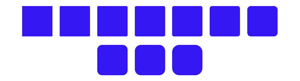
Basic example

<span class="square bg-primary rounded"></span>
<span class="square bg-primary rounded-top"></span>
<span class="square bg-primary rounded-end"></span>
<span class="square bg-primary rounded-bottom"></span>
<span class="square bg-primary rounded-start"></span>
<span class="square bg-primary rounded-pill" style="width: 150px"></span>
<span class="square bg-primary rounded-0"></span>
How to use?
-
Download MDB 5 - free UI KIT
-
Choose your favourite customized component and click on the image
-
Copy & paste the code into your MDB project
More examples
Bootstrap Border Radius Sizes:
Bootstrap Border Radius Circle:


Bootstrap Border Radius Rounded:


Bootstrap Border Radius Bottom:

Bootstrap Border Radius Sizes Image: