- I don't hate css files, but you won't need them anymore.


Initial release. Woohooo!
What is this?
BlockReady is a JavaScript UI library to quick setup styling for elements. It comes with a default theme enabled. But guess what?
YOU CAN ADD ANY THEME YOU WANT!
It has callbacks for basic interactions, font-loading from JS, loading a different theme on the go! AND OF COURSE, the easiest way to setup styling, just with ONE line of code!
GOTO:
- #### Quick Setup
- #### Make your own Themes or Custom Elements!
- #### Select from a list of themes!
- #### Docs
- #### Future Plans
Example
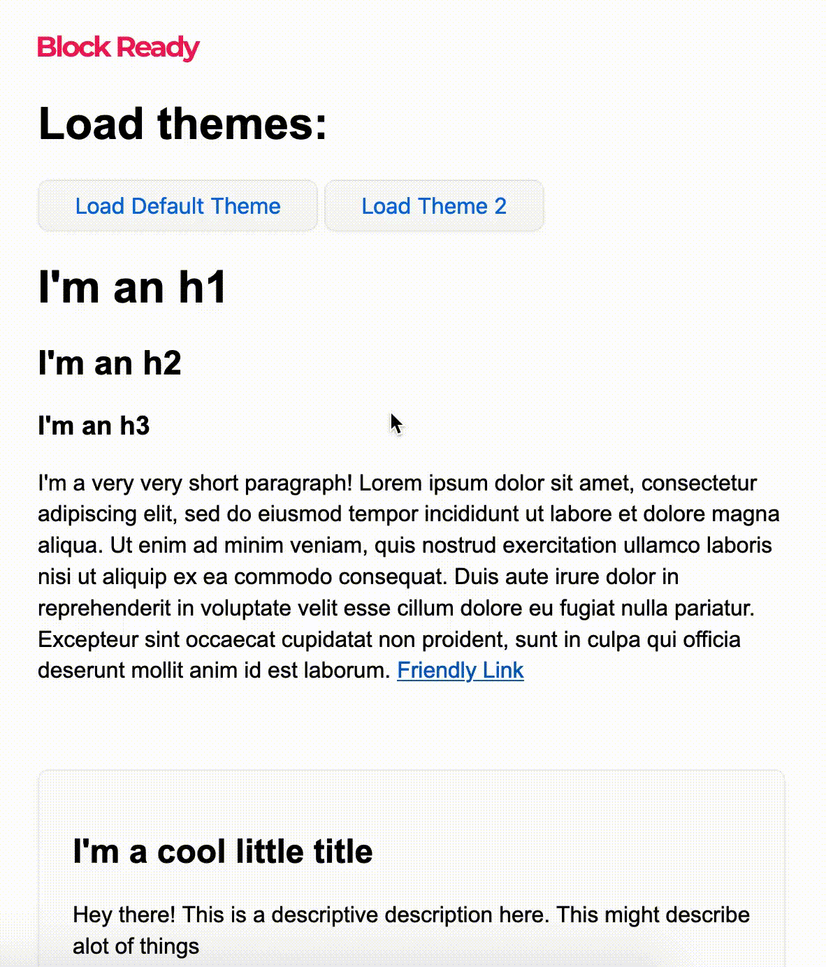
Click here to download the 'Theme 2'
Simply include the theme.js file using script tags or import it, then pass it in .loadTheme(). Like this
CDN
<script src="https://unpkg.com/blockready@1.0.3/src/blockready.js">
NPM Installation
npm i blockready
Usages
.initAll()
Put the default theme on every element that BlockReady styles:
// Using the CDN
io().initAll();
// Using npm or other Frameworks
import io from 'blockready';

io().initAll();
.theme()
Put the default theme styling on only specific elements:
io("button").theme();
Override some styles from the default theme:
io("input").theme({
  marginTop: "1em",
});
.style()
You can also simple just style any element without the theme being allied using the .style({}) method. BlockReady extends the JStyling library. See JStyling.
No theme styling will be put on an elements if you use:
// JStyling method! Only styles you define will appear. No theme will be applied.
io("button").style({
  color: "magenta",
  fontFamily: "Roboto"
});
.loadTheme()
Load in a new theme simply by first getting the THEME_OBJECT and passing it into the .loadTheme(THEME_OBJECT) method like this:
// THEME objects look something like this:
const DARK_THEME = {
  BUTTON: {
    NORMAL: {
      fontFamily: "Roboto",
      // ...
    }
  }
  // ...
}
Download the theme.js file and load it inside of either your <body> tag or import it:
<body>
  <script defer src="dark-theme.js"> // The defer parameter make the script load asynchronously
</body>
Then pass it into the .loadTheme(THEME_OBJECT) method:
io().loadTheme(DARK_THEME);
You can even load as MANY themes as you want, without even having to reload the page!
io().initAll() // Loads the default theme
io().loadTheme(DARK_THEME); // Loads the DARK_THEME
io().loadTheme(ANOTHER_THEME); // Then loads the ANOTHER_THEME

io("button").theme(); // Now it will use ANOTHER_THEME!
You can revert back to the original theme by doing:
// If you are using npm or other Frameworks import the BlockReady object
import { io, BlockReady } from "blockready";

// Simply do
io().loadTheme(BlockReady.THEME);
.make()
This method allows you to do what .theme() does and also setup some useful callbacks for any element!
io("#button1").make({
  style: {
    fontFamily: "Arial",
    color: "red",
  }
  onPressed: (e, element) => {
    console.log("I clicked: " + element.tagName);
  },
});

io("#button2").make({
  style: {
    color: "blue",
  }
  onHover: (e, element, hovering) => {
    if(hovering){
      console.log("Starting to hover: " + element.tagName);
    }else{
      console.log("Leaving: " + element.tagName);
    }
  },
});
Here the .make() method takes in an object containing an optional style object and 2 optional callbacks: onPressed and onHover.
They are all optional and will work without having to define all of them. Both the callbacks return the eventObject and the HTMLElement. onHover returns an additional hovering boolean to indicate if the element is being hovered. These are triggered when the state changes
.loadFont()
BlockReady can asynchronously load a font in as well:
BlockReady.loadFont({
  type: 'google', // Required
  // Required
  linkCode: '<link href="https://fonts.googleapis.com/css2?family=Poppins:wght@200;400;600;800&display=swap" rel="stylesheet">', // Required
})
// OR
BlockReady.loadFont({
  type: 'raw', // Required
  // Required
  url: "https://fonts.gstatic.com/s/poppins/v12/pxiByp8kv8JHgFVrLFj_Z1xlFd2JQEk.woff2",
  fontFamily: "Poppins", // Required
  fontWeight: "200", // Optional
})
Make your own Themes, Elements!
Name of the elements should be in ALL CAPS (eg: BUTTON, UL, P, H1). The styling that is given to an element after it loads is inside the NORMAL object.
// Here the element <button> is given a theme styling:
const NAME_OF_THE_THEME = {
  BUTTON: {
    NORMAL: {
      fontFamily: "Roboto",
      color: "red",
    },
    PRESSING:{
      color: "orange"
    }
    HOVERING:{
      color: "blue"
    }
  },
}
Notice how there are 3 objects within each BUTTON object:
NORMALPRESSINGHOVERING
Each of them represent the 3 different event styles an element can have. If PRESSING or HOVERING is not defined, the element won't change the element upon those events.
But, the NORMAL object is required for every element that you need to set you theme on.
You can also make your own Elements! The elements that you name in the THEME object will all be given the styling you define:
const THEME = {
  CARD: {
    NORMAL: {
      opacity: "1",
      borderRadius: ".5em",
      marginTop: ".4em",
      overflow: "hidden",
      display: "block",
      border: "1px solid rgba(0,0,0,0.05)",
      backgroundColor: "rgba(0,0,0,.01)",
      boxShadow: "0px 1px 3px rgba(0,0,0,0.04)",
      padding: "1.5em",
    },
  },
}
There is an special element that is defined by BlockReady called: <card></card>. It is shown in the example.gif. Just like that, you can create your own elements! Name them what you wish!
You can also define which fonts to load! It's as easy as this:
const THEME = {
  LOAD_FONTS: [
    {
      type: 'google',
      linkCode: '<link href="https://fonts.googleapis.com/css2?family=Poppins:wght@200;400;600;800&display=swap" rel="stylesheet">',
    },
    {
      type: 'raw',
      url: "https://fonts.gstatic.com/s/poppins/v12/pxiByp8kv8JHgFVrLFj_Z1xlFd2JQEk.woff2",
      fontFamily: "Poppins",
      fontWeight: "200",
    },
    // ...
    // ...
  ],
  BUTTON: {
    NORMAL: {
      fontFamily: "Arial",
    }
  }
}
Notice that the LOAD_FONTS is an Array. Inside it you can pass in all of the fonts you need to load.
There are 2 type you can load in:
googleraw
When you load in google you only need to set the type and provide the linkCode that Google Font gives you.
When you load in raw:
url, fontFamily are required. fontWeight is optional.
So, this is the format that you should follow:
const NAME_OF_YOUR_THEME = {
  BUTTON: {
    NORMAL: {
      color: "red"
    },
    PRESSING:{
      color: "orange"
    }
    HOVERING:{
      color: "blue"
    }
  },
  SPECIALELEMENT: {
    NORMAL: {
      fontFamily: "Montserrat"
    },
    PRESSING:{
      color: "orange"
    }
  }
  // ...
  // ...
}
Below is the default theme that is applied by BlockReady:
const NAME_OF_THE_THEME = {
  // Listing all standard HTML Elements
  BUTTON: {
    NORMAL: {
      fontSize: "1em",
      backgroundColor: "transparent",
      backgroundImage: "linear-gradient(rgba(0,0,0,.02), rgba(0,0,0,.03))",
      border: "1px solid rgba(0,0,0,.05)",
      color: "#006edb",
      padding: ".5em 1.6em",
      borderRadius: ".5em",
      boxShadow: "0px 1px 3px rgba(0,0,0,0.04)",
      cursor: "pointer",
    },
    HOVERING: {
      backgroundColor: "#006edb",
      color: "white",
    },
    PRESSING: {
      backgroundColor: "#005fbd",
      color: "white",
    },
  },
  A: {
    NORMAL: {
      color: "#005fbd",
    },
    HOVERING: {
      color: "#003870",
    },
  },
  TABLE: {
    NORMAL: {
      borderCollapse: "collapse",
      overflowX: "auto",
    },
  },
  TD: {
    NORMAL: {
      border: "1px solid rgba(0,0,0,.07)",
      padding: ".6em 1em",
      textAlign: "center",
      backgroundColor: "transparent",
    },
    HOVERING: {
      backgroundColor: "rgba(0,0,0,0.03)",
    },
  },
  INPUT: {
    NORMAL: {
      border: "1px solid rgba(0,0,0,.05)",
      padding: ".4em 1em",
      fontSize: "1.2em",
      borderRadius: ".2em",
    },
  },
  // You can create your own elements as well!
  CARD: {
    NORMAL: {
      opacity: "1",
      borderRadius: ".5em",
      marginTop: ".4em",
      overflow: "hidden",
      display: "block",
      border: "1px solid rgba(0,0,0,0.05)",
      backgroundColor: "rgba(0,0,0,.01)",
      boxShadow: "0px 1px 3px rgba(0,0,0,0.04)",
      padding: "1.5em",
    },
  },
};
By default, BlockReady makes all elements have:
{
  box-sizing: border-box,
  font-family: "Arial, sans-serif",
  margin: 0
}
The rest is up to you!
Future plans
Hello there!
This is a open source project. Any and all contributions are highly appreciated and required. If you like the idea please show your support by starring this project. Help out by reporting bugs and contributing!
This project is still in it's early days, so I want to know the feedback from everyone that sees this. If you want this project to grow into something huge, please consider contributing to this open source project.
Got more ideas? Please do share by opening up a new issue, Lots of love, thanks.
The future plans that I have for this are:
- Make a small website that will showcase all of the themes you guys make.
- Adding more theme customization ability for better theme making flexibility.
- ALOT MORE EVENT LISTENERS (Duh)
- ......
Thanks for coming this far! See you again!