bassdrop

🔊 a downshift powered dropdown library for react vr


bassdrop is a downshift🏎️ powered dropdown library for building drop downs and select lists in react vr. It uses the function as child and “prop getter” patterns, which gives you maximum flexibility with a minimal API.
Table of Contents
Installation
This module is distributed via npm which is bundled with node and
should be installed as one of your project’s dependencies:
npm install --save bassdrop
This package also depends on
react-vr,prop-typesandreact. Please make sure you have those installed as well.
Usage
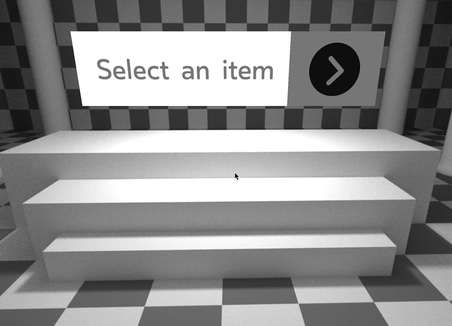
import BassDrop from 'bassdrop';import Text View VrButton Animated from 'react-vr'; // Small helper function to choose item bg color. { if selectedItem === item return 'gray'; if highlightedIndex === index return 'lightgray'; return 'white';} { return <BassDrop // /. ''. = // . // <>stateAndHelpers ...</BassDrop> render= // Prop getters getItemProps getToggleButtonProps getRootProps // State isOpen selectedItemIsHighlighted itemDisplay highlightedIndex selectedItem <View // = = > <VrButton // / = > <Text // = > itemDisplay </Text> <View // -- ! = > <Image = = /> </View> </VrButton> isOpen ? <View // = > items </View> : null </View> /> ;}…creates something like this:
Props
See the API Docs for information on the props exposed by this package. The usage example above is not an exhaustive list.
How To Render
bassdrop 🔊 uses the child callback render function pattern. This is where you render whatever you want to based on the state of bassdrop which is passed to the callback as parameters. The function is passed as the child prop of the BassDrop component:
<BassDrop> /* parameters here */ /* your render code here*/</BassDrop>or can be called from the render prop
<BassDrop = />The paramters of this function can be split into two categories: State and Prop Getters.
See the API Docs for a list of these properties.
Examples
Check out the demo site to see how bassdrop 🔊 works in VR. See the demo repo for the code behind the demo site.
Contributing
If you’d like to make bassdrop 🔊 better, please read our guide to contributing.
These wonderful people have contributed to bassdrop 🔊 in one way or another:
Contributors
 Luke Herrington
License
bassdrop is MIT licensed.