Tip 基础提示框


提示框组件,专注于带箭头的气泡框显示、隐藏、动画等交互功能。 模块内部集成了模板和样式,无须单独引用样式,可以很方便地直接使用。
注:1.2.0 版本后 Tip 模块被原来的子模块 Atip 模块所替换。
Tip 模块继承自 popup,可使用包括 overlay、widget、base、class、events、attribute、aspect 的属性和方法。
配置说明
trigger selector
触发点元素。
triggerType string
触发方式,[hover|click|focus]。
content string
提示内容,支持字符和 html 结构。
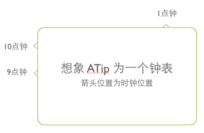
arrowPosition number
箭头位置,按钟表点位置,目前支持1、2、5、7、10、11点位置,默认 7 点钟。
theme string
配色主题,内置黄色、蓝色和白色三种提示框样式 [yellow|blue|white],默认为 yellow。
inViewport boolean
当弹出层显示在屏幕外时,是否自动转换浮层位置,默认为 false。
align object
参照 Overlay 的 align 配置,
指定此定位参数时,认为开发者要自定义提示框位置,此时 arrowPosition 属性失效。
最佳实践
; trigger: '#test' // 触发器 content: '我是内容' // 提示框显示的内容 arrowPosition: 11 // 11点钟的箭头位置;其他用法请参见 examples