Apostrophe Guides
Build guides to document your Apostrophe site.
- Why
- Getting Started
- Options
- Writing Documentation
- Adding Images
- Documenting Assets
- Colors
- Fonts
- Icons
- Components
- Customizing your Guide
Why
So, why would you use this? Maybe you're developing an Apostrophe site and you want to provide documentation for other developers. Maybe you want to document your Design System to better collaborate with your team. Maybe you want to create a User Guide so editors have a reference on how to use the site. Maybe you want to do all three.
This module allows you to write your documentation in static Markdown and serves them right alongside your Apostrophe site. And because this is an Apostrophe module, you can document your components same way you'd use them in you templates and they'll automatically be kept up to date with your living code.
Create one guide or individual guides for each of your audiences. It's up to you.
Getting Started
npm install apostrophe-guidesAfter the module has installed, enable it in your app.js;
modules: {
    "apostrophe-guides": {}
}
Options
title
- Required:
N - Default:
Guide
The title of your guide.
sections
- Required:
Y
Your guide content.
Each section is comprised of a name and an array of docs. Filenames and globs are allowed in docs. If the .md extension is omitted from the glob, we'll make sure only to look for Markdown files in the specified directory.
Example:
'apostrophe-guides': {
    sections: [
        {
            name: "Overview",
            docs: [`${__dirname}/README.md`, `${__dirname}/Overview.md`] // Files
        },
        {
            name: "Components",
            docs: ["lib/modules/components/views/**/*.md"] // A glob
        }
    ]
}
path
- Required:
N - Default:
guide
The URL of your guide. If your site is running on http://localhost:3000, by default your guide will be available on http://localhost:3000/guide. If you set this option set to styleguide, your guide would be http://localhost:3000/styleguide.
demoBodyClass
- Required:
N
If you are including demos of your components in your guide and are using a css body class to scope your styles, this will add the specified class to the body element of iframe-d demo sandbox. More on those later.
stylesheets
- Required:
N
An array of stylesheets that should be included in your demo sandbox.
scripts
- Required:
N
An array of scripts that should be included in your demo sandbox.
footer
- Required:
N
Add text to the footer of all documentation pages. Useful if you'd like to provide contact information. This may be specified as a html string in the config as a path to a Nunjucks template.
As a string:
'apostrophe-guides': {
    ...
    footer: "Contact <a href='mailto:me@mail.com'>me</a> for more information"
}
As a template:
'apostrophe-guides': {
    ...
    footer: "apostrophe-guides:guideFooter.html"
}
permission
- Required:
N - Default:
guest
permissionErrorMessage
- Required:
N - Default:
You must be logged in to view this page
Writing Documentation
All documentation is written in Markdown with some added bonuses. Check Markdown Guide for a reference on how to write Markdown. In addition to the basics, you may also include tables and code blocks.
Adding Images
Use the standard Markdown syntax to add an image to your page.

With the above example, your images would be placed in the /public/guides folder of your project.
Documenting Assets
We've also created a few Markdown-like shortcuts to allow you to visualize some special assets like Color, Fonts, Icons, and Components.
Colors
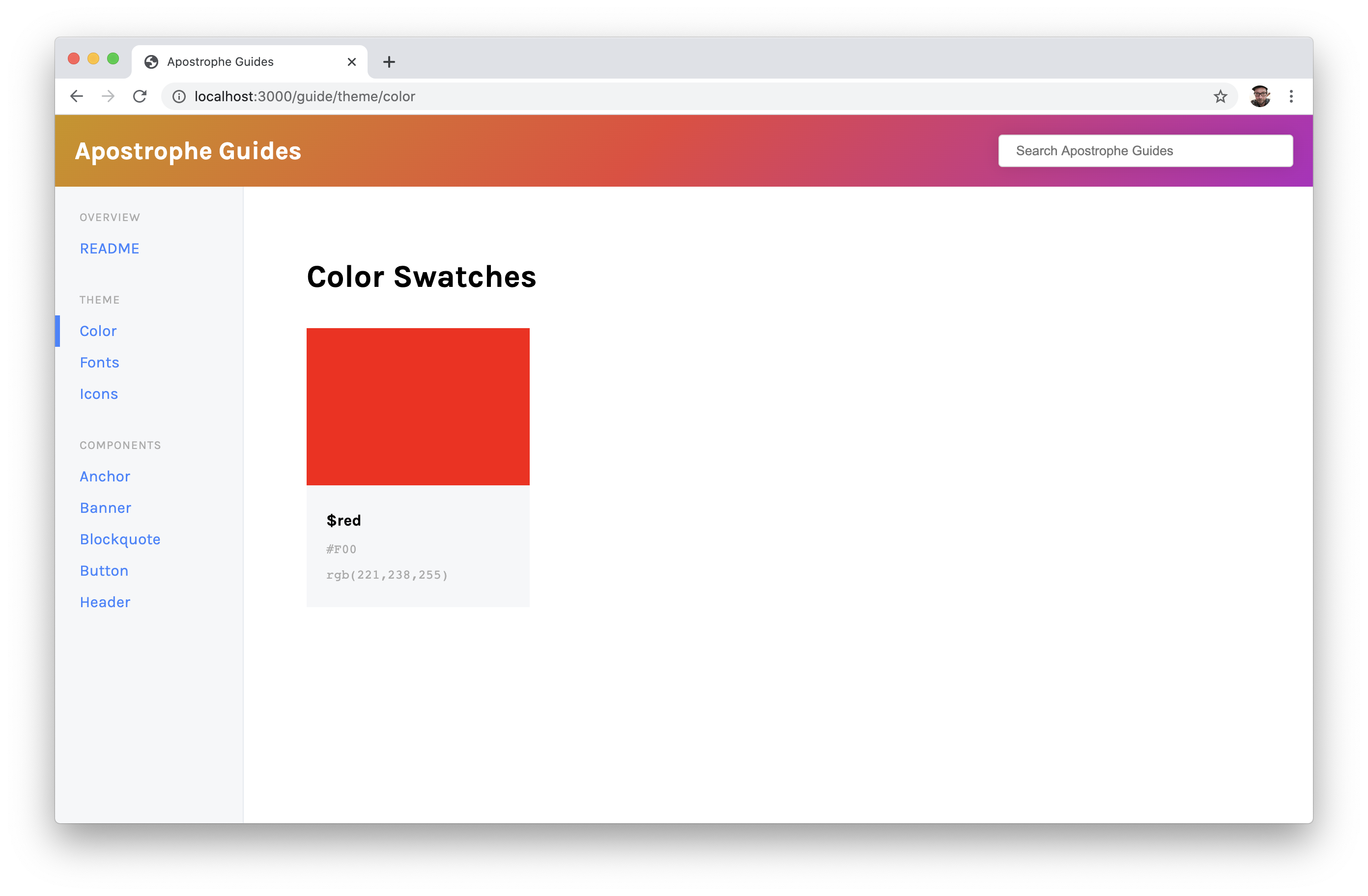
To document a color, use the swatch block.
[swatch name="$red" hex="#F00"]
You may specifiy the color value as hex or rgb but you don't need to provide both.
An example swatch:
Fonts
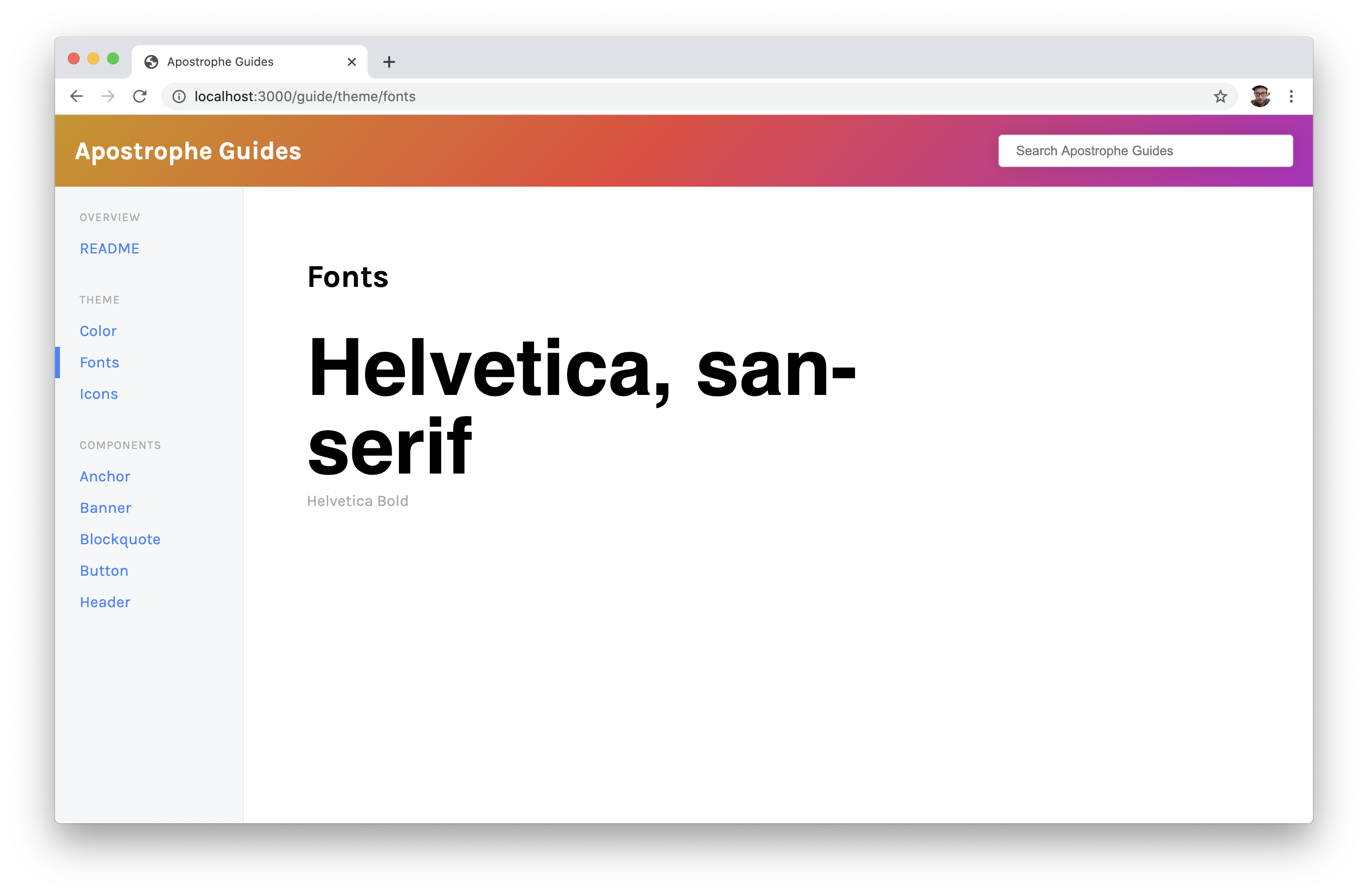
To add examples of the typefaces in your documentation, use the font block.
[font name="Helvetica" family="Helvetica, san-serif" weight="bold"]
If a name attribute is not provided the family will be used as the description of the typeface. You may also optionally include, a weight, size, and desired text. If no text is provided text will default to the family;
An example font:
Note: In order to preview custom fonts, you might need to add a link to your font definition.
Ex:
<link href="https://fonts.googleapis.com/css2?family=Karla:ital,wght@0,400;0,700;1,400;1,700&display=swap" rel="stylesheet">

# Fonts

[font family="Karla"]
Icons
To add examples of your icons, use the icon block.
[icon name="Cart" src="/images/cart.svg"]
Minimally provide a path to the src of you icon. This currently supports any image that can be rendered in an img tag.
An example icon:
Components
To document your components, you can use a slightly modified version of the standard Markdown code block.
```html button-simple.html
{% import "components:button/button.html" as button %}
{{ button.render({ text: 'Click' }) }}
```
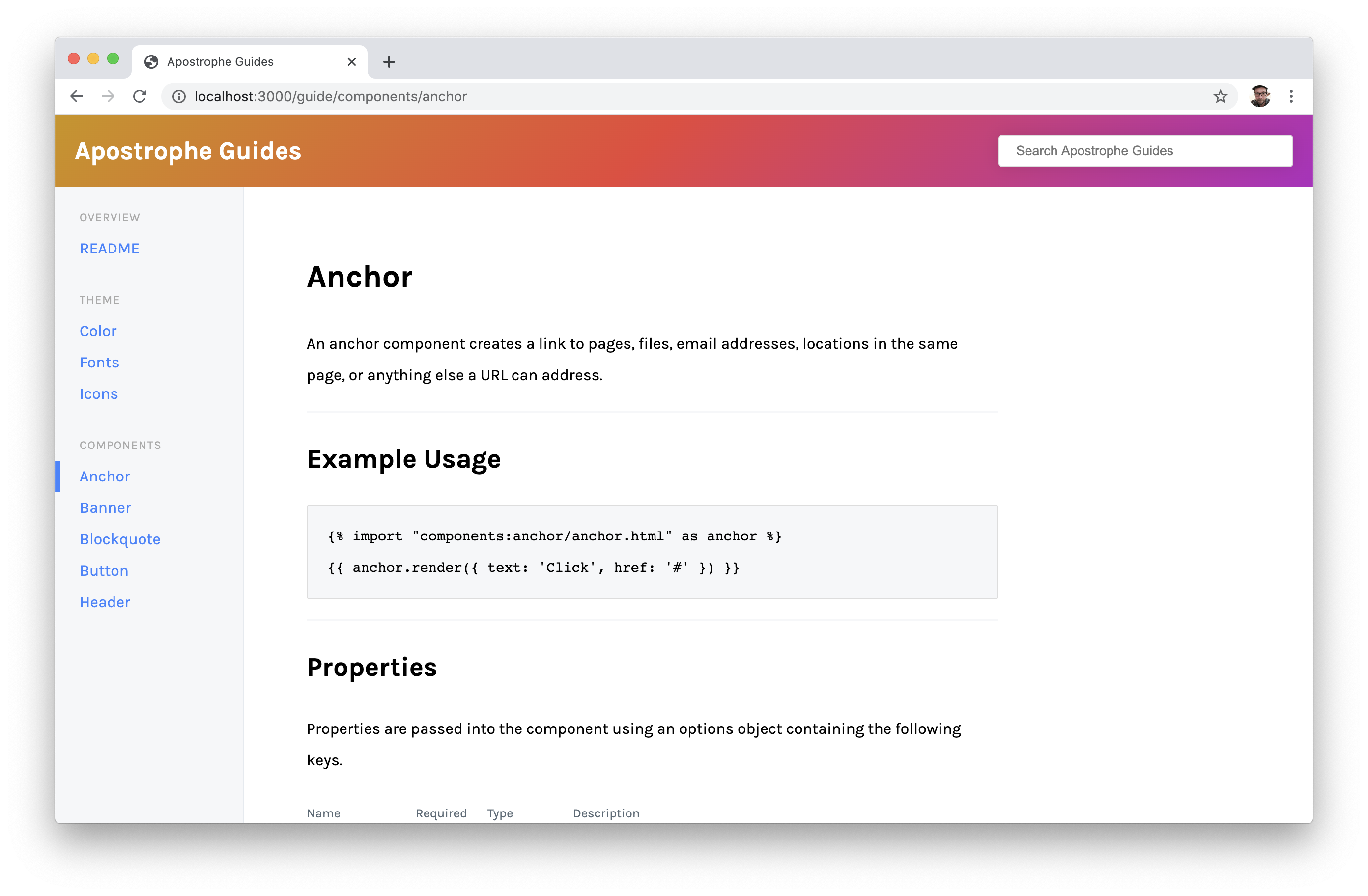
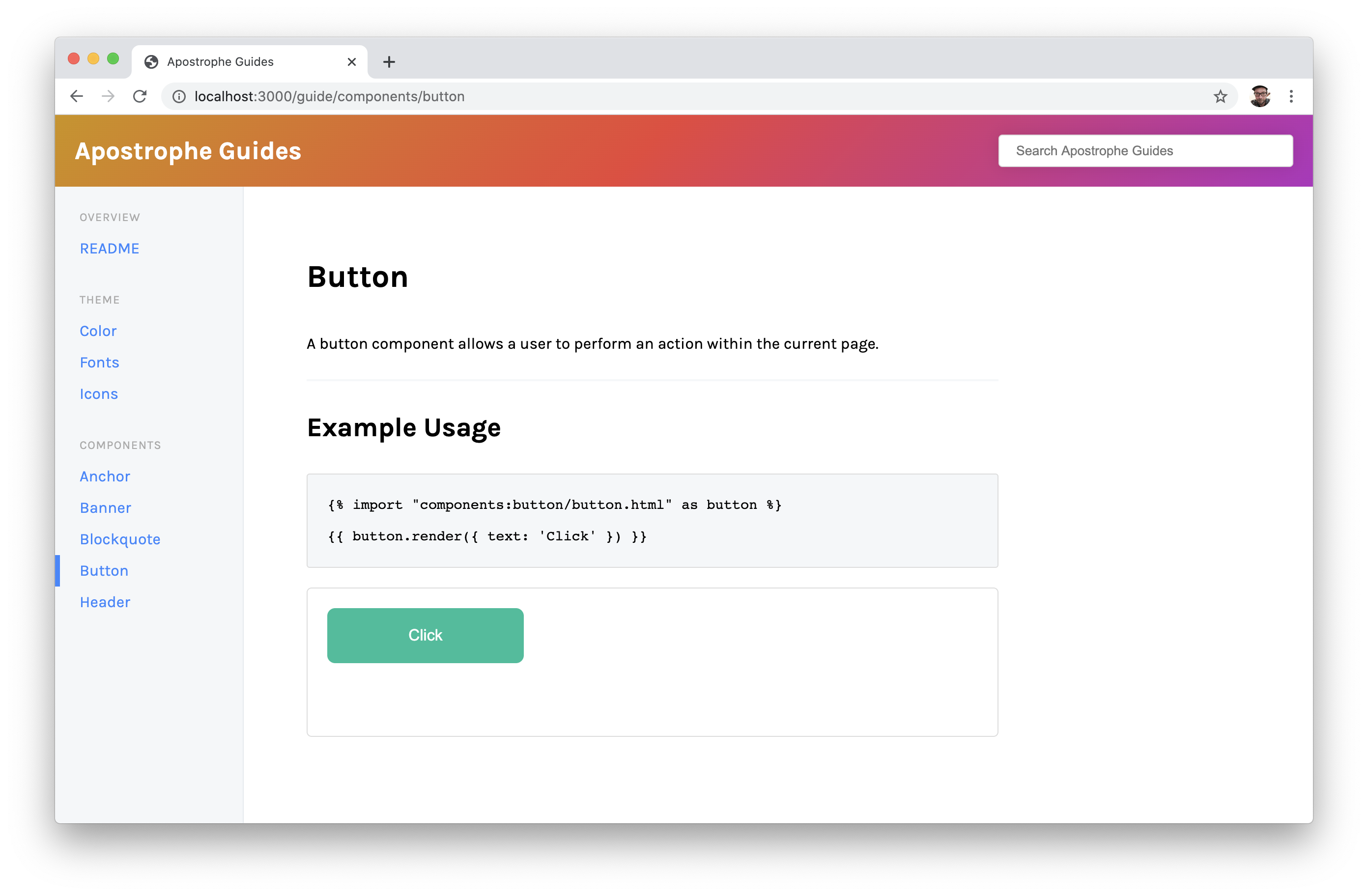
This will do two things on your guide page. First, it will render a code block that shows how another developer exactly how they would implement your component. Secondly, it generates a html file that will be rendered in an iframe on the page. This provides a live working example of your component in a sandboxed environment right in your documentation. Just be sure to include the .html extension on your example file name.
Your demo code could be a Nunjucks macro, a Nunjucks include, or even plain old static html. Be sure to configure the stylesheets and scripts options with the assets necessary to render your components. Additionally if you are scoping your css to a class on the body element, you can use the demoBodyClass option to include your class name on all component examples.
An example of a component guide page:
Note: Demos are rendered at the end of your documentation page by default. This is currently not configurable.
Customizing Your Guide
This module follows the standard Apostrophe modular system so that means everything can be customized to your needs. If you're ok with the layout but maybe just want to maybe brand your guide, the styles can be overwritten by creating a local always.css file in your apostrophe-guides/public/css directory. A custom class is also applied to a guide based on the title option. This allows you to have multiple guides with multiple themes in a single apostrophe instance.
Additionally, you can modify any of the guide templates by coping the template you wish to modify from node_modules/apostrophe-guides/views to your project's lib/modules/apostrophe-guides/views directory.
Just note that you only need to copy the files you wish to modify to your local apostrophe-guides directory. You do not need to copy them all.
Happy documenting!


