antd-spin
Enhancing Ant Design's Spin as a Service. Inspired by Element Plus's Loading component.
Motivation
Enhance the Spin component of antd to support service calls, and the global state is a singleton mode.
Usage
Install
$ npm install antd-spinService
Import Spin service:
import { antdSpin } from "antd-spin";Invoke it:
antdSpin.service(options);The parameter options is the configuration of Spin, and its details can be found in the following table. SpinService returns a Spin instance, and you can close it by invoking its close method:
const spinInstance = antdSpin.service(options);
spinInstance.close();
Note that in this case the full screen Spin is singleton. If a new full screen Spin is invoked before an existing one is closed, the existing full screen Spin instance will be returned instead of actually creating another Spin instance:
const spinInstance1 = antdSpin.service();
const spinInstance2 = antdSpin.service();

// true
console.log(spinInstance1 === spinInstance2);

setTimeout(() => {
	// Calling the `close` method on any one of them can close this full screen Spin.
	spinInstance2.close();
}, 5000);
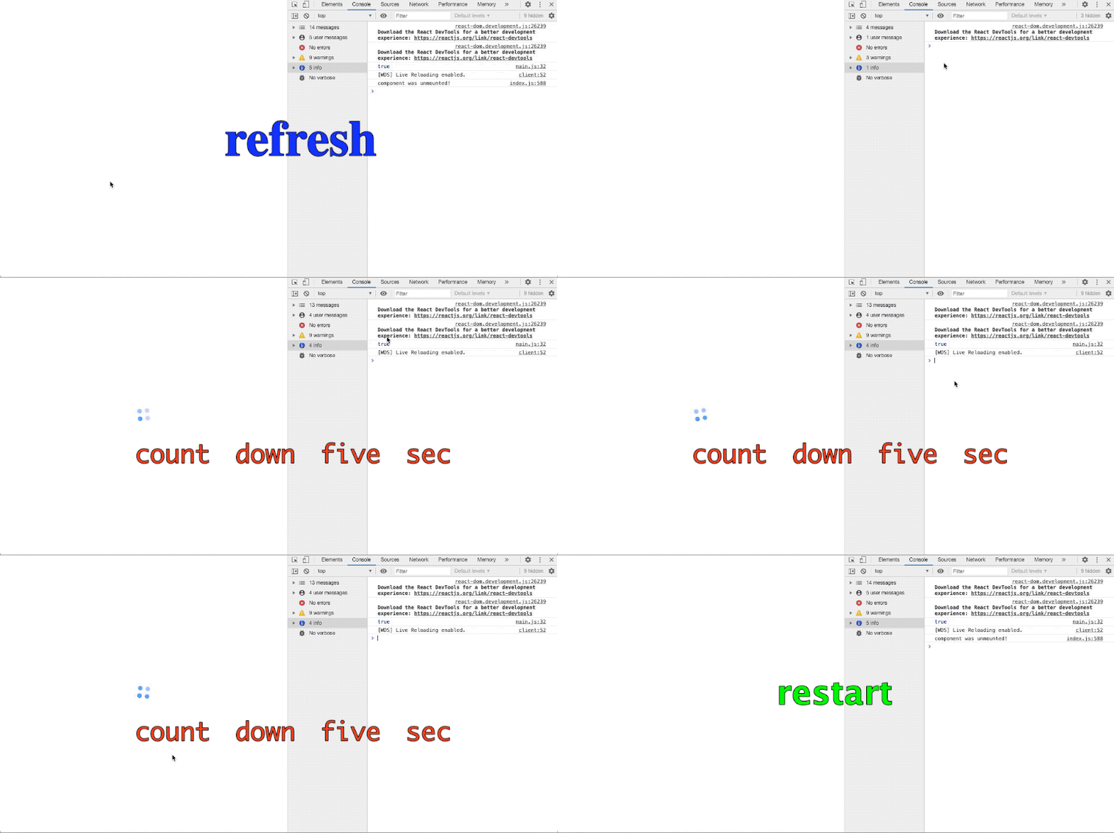
show time
Directive
import { AntdSpin } from "antd-spin";

const DemoSpin = () => {
	return (
		<AntdSpin fullscreen={true} />
	);
}-
fullscreenis true, return a fullscreen Spin. -
fullscreenis false, return a Spin.
Options
| Name | Description | Type | Default |
|---|---|---|---|
| target | The DOM node Spin needs to cover. Accepts a DOM object or a string. If it's a string, it will be passed to document.querySelector to get the corresponding DOM node |
string / HTMLElement
|
document.body |
| fullscreen | Show a full screen Spin | boolean |
true |
| lock | Disable background scrolling | boolean |
false |
| background | Background color of the mask | string |
— |
| customClass | Custom class name for Spin | string |
— |
| spinProps | The properties of antd's Spin component | SpinProps | {} |
SpinProps
| Name | Type | Description |
|---|---|---|
| prefixCls | string | Prefix class name (optional) |
| className | string | Class name (optional) |
| rootClassName | string | Root element class name (optional) |
| spinning | boolean | Whether to display the loading state |
| style | React.CSSProperties | Custom style object (optional) |
| size | SpinSize | Size (optional) |
| tip | React.ReactNode | Tip content (optional) |
| delay | number | Time in milliseconds to delay showing the loading state (optional) |
| wrapperClassName | string | Wrapper element class name (optional) |
| indicator | SpinIndicator | Custom loading indicator (optional) |
| children | React.ReactNode | Child elements (optional) |


