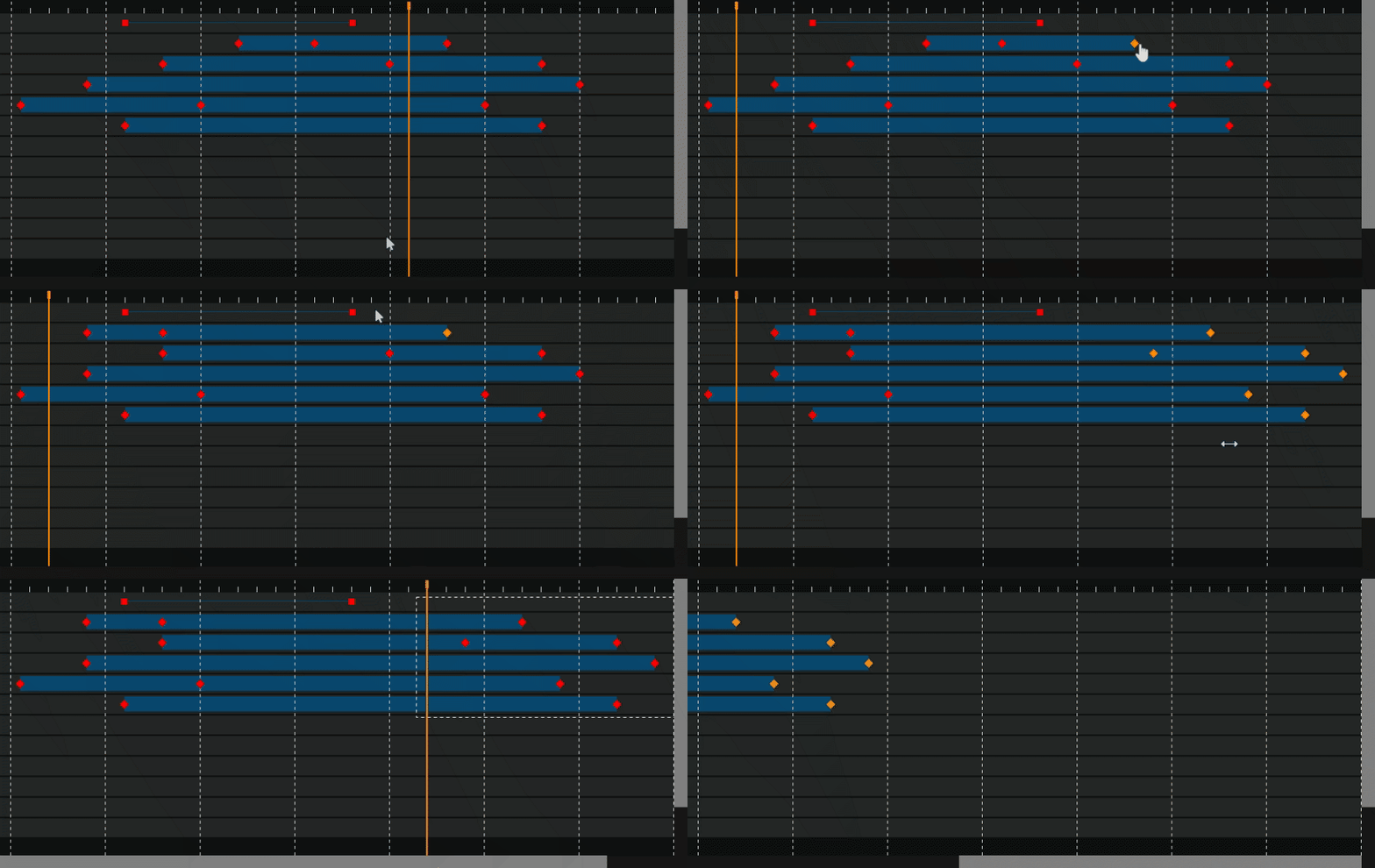
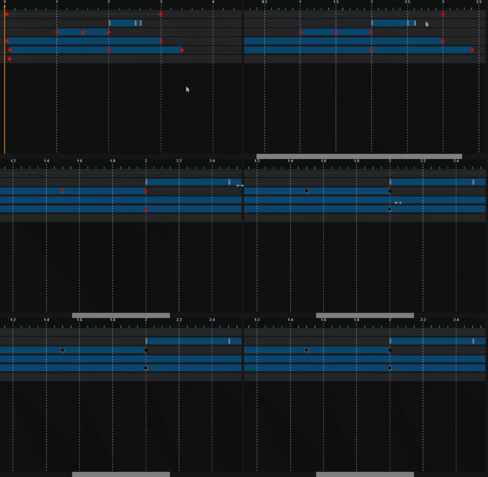
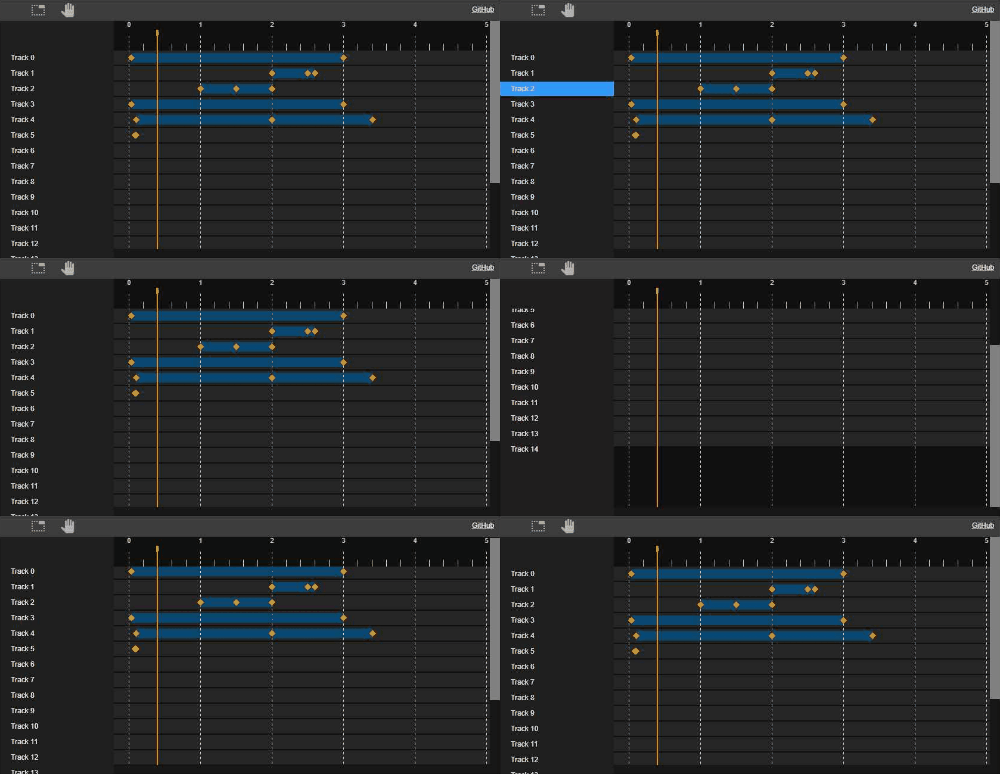
Animation timeline is a TypeScript, no-dependency, canvas component designed to visualize and manipulate animation keyframes.
Features:
- Fast and customizable, rendered on a canvas.
- Snap, Zoom, Pan mode, multiple keyframes selection.
- Keyboard support.
- Drag multiple keyframes, drag keyframe ranges.
- Area virtualization - only small displayed area is rendered.
- Native browser scrollbars are used.
- Horizontal scale with the automatically adjusted ticks.
npm i animation-timeline-js<div id="timeline"></div>
<script type="text/javascript">
let rows = [
{
keyframes: [
{
val: 40,
},
{
val: 3000
}
]
}];
let timeline = new timelineModule.Timeline({id:'timeline'})
timeline.setModel({ rows: rows });
</script>import {
Timeline,
TimelineRow,
TimelineModel,
TimelineOptions,
} from "animation-timeline-js";
const model = { rows: [] as Array<TimelineRow> } as TimelineModel;
const options = {
id: "timeline",
rowsStyle: {
height: 35,
} as TimelineRowStyle,
} as TimelineOptions;
const timeline = new Timeline(options, model);import React, { useEffect, useRef, useState } from "react";
import { Timeline, TimelineModel } from "animation-timeline-js";
type Props = {
time?: number;
model: TimelineModel;
};
function TimelineComponent(props: Props) {
const { model, time } = props;
const timelineElRef = useRef<HTMLDivElement>(null);
const [timeline, setTimeline] = useState<Timeline>();
useEffect(() => {
let newTimeline: Timeline | null = null;
// On component init
if (timelineElRef.current) {
newTimeline = new Timeline({ id: timelineElRef.current });
// Here you can subscribe on timeline component events
setTimeline(newTimeline);
}
// cleanup on component unmounted.
return () => newTimeline?.dispose();
// eslint-disable-next-line react-hooks/exhaustive-deps
}, [timelineElRef.current]);
// Example to subscribe and pass model or time update:
useEffect(() => {
timeline?.setModel(model);
}, [model, timeline]);
// Example to subscribe and pass model or time update:
useEffect(() => {
if (time || time === 0) {
timeline?.setTime(time);
}
}, [time, timeline]);
return <div style={{ width: "100%", minHeight: 300 }} ref={timelineElRef} />;
}
export default TimelineComponent;
// Usage:
<TimelineComponent
time={0}
model={{
rows: [
{
keyframes: [
{
val: 40,
},
{
val: 3000,
},
],
},
],
}}
></TimelineComponent><script lang="ts">
import { Timeline } from "animation-timeline-js";
import type { TimelineModel } from "animation-timeline-js";
import { onMount } from "svelte";
export let time: number = 0;
export let model: TimelineModel;
let timelineEl!: HTMLDivElement;
let timeline: Timeline | null = null;
// Equivalent to componentDidMount and componentWillUnmount
onMount(() => {
let newTimeline: Timeline | null = null;
if (timelineEl) {
newTimeline = new Timeline({ id: timelineEl });
}
timeline = newTimeline;
// Cleanup
return () => {
if (newTimeline) {
newTimeline.dispose();
}
};
});
$: if (model) {
// Reactive statements for model and time
timeline?.setModel(model);
}
$: if (time || time === 0) {
timeline?.setTime(time);
}
</script>
<div bind:this={timelineEl} class="editor"></div>
<style>
.editor {
width: 100%;
min-height: 300px;
}
</style>
// Usage:
<TimelineComponent
time={0}
model={{
rows: [
{
keyframes: [
{
val: 40,
},
{
val: 3000,
},
],
},
],
}}
></TimelineComponent>Outline list\tree can implemented as a separate HTML component and synchronized with the timeline. See the live demo
Keyframes model is used to pass keyframes and rows to be visualized. Component is using passed model for the visualization purpose and has no method to manage tracks or keyframes. It also means that any attached metadata can be passed and it will be preserved (Use case: you can attach additional data for each keyframe).
Read only and defined by the interfaces:
- TimelineModel
- TimelineRow
- TimelineKeyframe
Example on how to add a keyframe to existing model:
    const existingModel = timeline.getModel();
    existingModel.rows[0].keyframes.append({ val: 20 });
timeline.setModel(existingModel);| Event name | description |
|---|---|
| timeChanged | time changed. source can be used to check event sender. args type: TimelineTimeChangedEvent |
| selected | keyframe is selected. args type: TimelineSelectedEvent |
| scroll | On scroll. args type: TimelineScrollEvent |
| scrollFinished | On scroll finished. args type: TimelineScrollEvent |
| dragStarted | emitted on drag started. args type: TimelineDragEvent |
| drag | emitted when dragging. args type: TimelineDragEvent |
| dragFinished | emitted when drag finished. args type: TimelineDragEvent |
| KeyframeChanged | emitted when drag finished. args type: TimelineKeyframeChangedEvent |
Events can be prevented by calling args.preventDefault()
Example of the type strict event subscription:
this.timeline.onDragStarted((args: TimelineDragEvent) => {
    if (args) {
    }
});| Method name | description |
|---|---|
| setTime | set current active time. Returns bool to indicate whether time was set. Ex: cannot be changed when dragged. Also timeline interactions can be disabled. |
| getTime | get current position of the timeline. |
| dispose | Call to unsubscribe from all the events. Important when UI component is unmounted or page is closed. |
| setOptions | Set timeline properties |
| getOptions | Get current options of the timeline. |
| getAllKeyframes | Get array of all keyframes from the current active model. |
Options can be passed when timeline is created or by calling setOptions method. See all options in the TimelineOptions interface.
Main options:
| Property | description |
|---|---|
| groupsDraggable | keyframes group is draggable. Default: true |
| keyframesDraggable | keyframes group is draggable. Default: true |
| timelineDraggable | Timeline can be dragged or position can be changed by user interaction. Default True |
- Click - select single keyframe.
- Ctrl + Click - add new keyframe, toggle existing keyframe.
Keyframes can be marked as selectable = false to prevent interaction.
- Ctrl - reverse zoom in/zoom out.
- Ctrl + Mouse wheel - zoom to the current active cursor. (Same logic for the pan mode)
Selection - allow to select one or group of the keyframes.
- selection - Keyframe selection tool selecting single or group of keyframes.
- pan - Pan tool with the possibility to select keyframes.
- nonInteractivePan - Allow only pan without any keyframes interaction. Timeline still can be moved and controlled by option 'timelineDraggable'.
- zoom - zoom tool
- none - No iteraction, except moving a timeline. Timeline still can be moved and controlled by option 'timelineDraggable'.
Example:
timeline.setInteractionMode('none');For the TypeScript TimelineInteractionMode enum is used.
Expected that you have a component or engine that can execute playing a timeline. Ex: SVG has events to run the animations and report current time position. This component is meant only to visualize the position.
Time indicator position can be changed by a method call:
timeline.setTime(1000);Current time can be fetched by a method call or by an event:
let value = timeline.getTime();

timeline.onTimeChanged((event: TimelineTimeChangedEvent) => {
  if(event.source !== TimelineEventSource.User) {
    value = event.val;
  }
});
Displayed units text can be changed by overriding a method:
timeline._formatUnitsText = (val)=> { return val + ' ms'; };The timeline component is rendered as a canvas and has no HTML elements for CSS styling. Styles are applied as a part of the keyframes model and can be applied in a cascade order from bottom to the top:
- Global control setting (See TypeScript interface TimelineStyle)
- row styles (See TypeScript interface TimelineRowStyle)
- Keyframe group styles with the underlying keyframe styles. (TimelineGroupStyle)
- keyframe styles (See TypeScript interface TimelineKeyframeStyle)
Separate global styles for the timeline indicator are used:
- TimelineOptions - global component properties and styles.
- TimelineStyle timeline indicator styles
- TimelineCapStyle - cap of the timeline style.
- TimelineStyle timeline indicator styles
See Changelog here
run once to install development references:
npm installRun next command to pack JavaScript as a bundle:
npm run buildVSCode is used as IDE and configuration is included to the project sources.
To debug project you should run command once files are changed:
npm run buildThen navigate to the debug window and click 'Launch Debug File'. Put breakpoint in any typescript file and trigger function from the browser.
Recommended extensions:
- markdownlint
- ESLint
- esbenp.prettier-vscode
Component has no production dependencies when built. TypeScript Babel + Webpack is used to pack and transpile the library. Mocha and chai are used as test & assertion library.
To build TypeScript unittests command should be executed:
npm run build-testsTests execution can be started by opening tests/unittests.html. Mocha test libs are hosted on the internet, so connection is required.
MIT


