Angular2-datepicker v. 1.0.0
This is fork of https://github.com/kekeh/mydatepicker with slight design change. Intend to implement transition to make it look like Material Datepicker
Angular 2 date picker - Angular2 reusable UI component
Description
Simple Angular2 date picker.

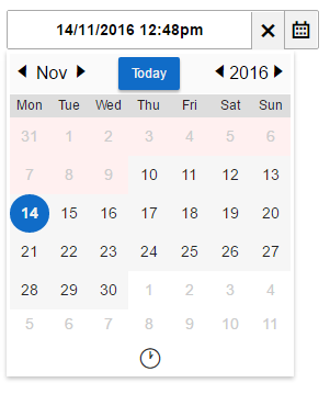
Image 1. mydatepicker in normal mode.

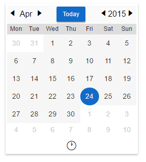
Image 2. mydatepicker in inline mode.
Getting Started
- Fork and clone this repo
- npm install
- Open a terminal and type "npm start"
- Open "http://localhost:5000" to browser
Installation
To install this component to an external project, follow the procedure:
- Make sure you're using Webpack and have installed
raw-loader,postcss-loaderandsass-loader. npm install angular2-datepicker.import {MyDatePickerModule} from 'mydatepicker';- import Datepicker module
@NgModule({
  declarations: [
    AppComponent
  ],
  imports: [
    MyDatePickerModule
  ],
  providers: [],
  bootstrap: [AppComponent]
})
-
Use the following snippet inside your template:
Usage
All input properties are optional.
options
Bind to an object containing replacements for any of the following defaults:
dayLabels
{su: 'Sun', mo: 'Mon', tu: 'Tue', we: 'Wed', th: 'Thu', fr: 'Fri', sa: 'Sat'}
monthLabels
{ 1: 'Jan', 2: 'Feb', 3: 'Mar', 4: 'Apr', 5: 'May', 6: 'Jun', 7: 'Jul', 8: 'Aug', 9: 'Sep', 10: 'Oct', 11: 'Nov', 12: 'Dec' }
dateFormat
'yyyy-mm-dd'
todayBtnTxt
'Today'
firstDayOfWeek
'mo'
sunHighlight
true
disableUntil
{year: 2016, month: 6, day: 26}
disableSince
{year: 2016, month: 7, day: 22}
disableWeekends
false
inline
false
height
'34px'
width
'100%'
locale
A two-letter ISO 639-1 language code can be provided as shorthand for several of the options listed above. Currently supported languages: ja.
selDate
Provide the initially chosen date that will display both in the text input field and provide the default for the popped-up datepicker.
defaultMonth
If selDate is not specified, when the datepicker is opened, it will
ordinarily default to selecting the current date. If you would prefer
a different year and month to be the default for a freshly chosen date
picking operation, specify a [defaultMonth] in the same format as
that for the datepicker options (yyyy.mm if not otherwise specified).
Demo
Online demo is here
Compatibility (tested with)
- Firefox (latest)
- Chromium (latest)
- Edge
- IE11
License
- License: MIT
Author
- Author: kekeh