angular-ui-switch2
This is an updated version of angular-ui-switch that includes
changes inspired by a forked repo. This version includes
ngDisabled and allows the iOS style switches to to be 'frozen' (aka disabled). When ngDisabled=true, a disabled
class will be added to the <switch> element, which can then be custom styled within your own app.
The following documentation is based on angular-ui-switch's README.
Overview
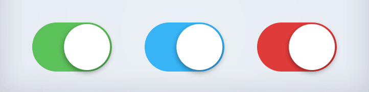
This is a simple iOS style switch directive for AngularJS. You can use this module as you would use any HTML checkbox input element. This is a lightweight module and you can completely change the design using just CSS.
Supported by all modern browsers: Chrome, Firefox, Opera, Safari, IE8+
Inspired by switchery - in an angular way.
Installation
Download the package from github. The package is also available over npm install angular-ui-switch2 or
bower install angular-ui-switch2.
Include the javascript and css files into your page to begin using the directive in your app.
... ...Declare a dependency on the module.
angular;Insert the switch in your html template.
{{ enabled }}Add optional on/off text
{{ enabled }}Disabled (no state change via click)
{{ disabledTestModel }}Design
You can completely change the design. All the magic is hidden inside a few CSS classes.
Publishing
-
Update version in
package.jsonandbower.json. -
Run
make compileto minify files. -
Run
make publishto publish.