
Angular Map Editor
Angular map editor is a canvas-based interactive editor for 2D maps, like office floor maps etc. The initial trigger to create this library was a need to define a set of objects locations on 2D map, that will be then presented on 3D visualization of office floors.
Editor currently covers whole page when used. To adjust it a little bit to own needs, we can use margin that allows us to manipulate the margin of main container. In the future it will be more flexible, probably it will fully use fxLayout.
Demo
A simple demo can be found here: DEMO.
Requirements / Peer dependencies
Library uses the newest version of Angular, for the moment of creation - 8.2.11, and this version is required. Additionally it requires following peer dependencies:
- @angular/material (8.2.3+)
- @angular/cdk (8.2.3+)
To install all dependencies at once:
npm i @angular/material @angular/cdk
Installation
Install package
npm i angular-map-editor
Import MapEditorModule and BrowserAnimationsModule in your main application module, like below
import {BrowserAnimationsModule} from '@angular/platform-browser/animations';
import {MapEditorModule} from 'angular-map-editor';  // <---- HERE

@NgModule({
  declarations: [
    AppComponent
  ],
  imports: [
    BrowserModule,
    BrowserAnimationsModule, //  <---- HERE
    MapEditorModule  //  <---- HERE
  ],
  providers: [],
  bootstrap: [AppComponent]
})
export class AppModule { }
Hint
If after installation you see grey floating buttons on left, probably you don't have default Material Design styles defined for your application.
To fix that you can try:
- Please then go to
angular.jsonfile - paste this line in all styles sections:
"./node_modules/@angular/material/prebuilt-themes/indigo-pink.css".
Example angular.json fragment:
"projects": {
    "<application-name>": {
      "architect": {
        "build": {
          ...
          "options": {
            ...
            "styles": [
              "./node_modules/@angular/material/prebuilt-themes/indigo-pink.css",
              "src/styles.css"
            ],
            "scripts": []
          },
         ...
        }
        ...
      }
      ...
    }
    ...
}
As a final result you should get correctly styles FAB's.

Usage
Default read-only version without any pre-configuration
<so-map-editor></so-map-editor>
Full interface usage
<so-map-editor
  [margin]="'60px 0 0 0'"
  (configurationSaved)="onConfigurationSaved($event)"
  [userRoles]="['admin', 'viewer', 'map-editor']"
  [configuration]="editorConfig"
></so-map-editor>
[margin]- a string representing CSS margin style, e.g. '10% 0', '60px 0 0 10px', '1em'[configuration]- an input configuration of editor. Delivers images, icons, backgrounds, menu items, floor maps with objects locations, a set of object types that we can use in editor(configurationSaved)- an event fired after "Admin" user clicked the "Save configuration" button from Admin menu.[userRoles]- an array of strings, representing a set of permissions for editor. Currently editor supports following user roles:viewer- a default role assigned always, even if no roles provided - allows to view editor in read-only modemap-editor- allows to see a toolbar menu to manipulate editor objects and gridadmin- full control over map editor (includes all roles) + new special menu for importing and exporting floor maps, saving and importing whole editor configuration
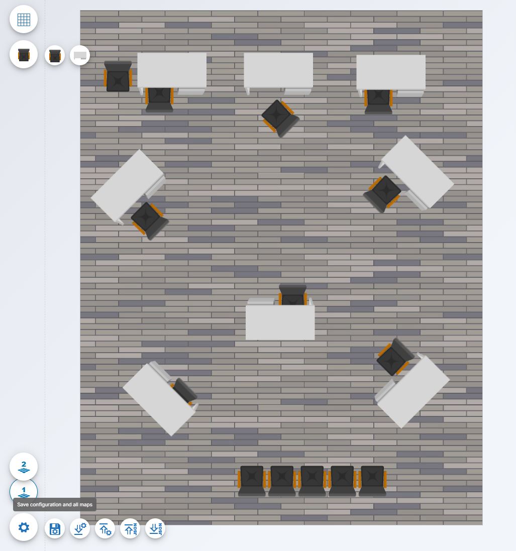
Example screenshots
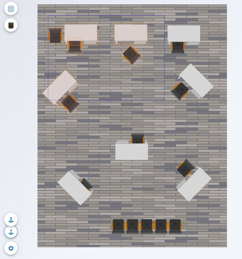
Example empty editor in Admin role mode.
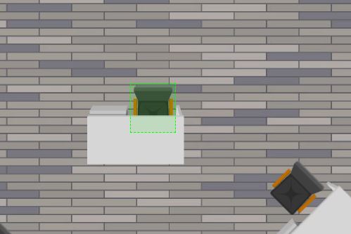
Example map created by two simple objects.
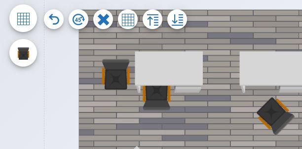
Editor tools menu.
Hovering interactive objects.
Box selection few objects by Ctrl + Mouse Drag. Simple selection of single objects by Ctrl + Click on object.
Few technical details
Editor uses a configuration as a source of all data settings. It means that to make it look as you need, you will need to create custom configuration or modify existing one. Currently you can find two configuration setups that I created for customization.
Colorful config
A colorful set of objects for creating simple flat plans that can be found here: colorful-configuration.json.
Minimal config
A very basic configuration used to make editor work: minimal-configuration.json, this configuration is used initially in library after installation.
Config - images data ("assets")
Configuration includes also base64 encoded images as an assets section in config JSON. This is related to make it more flexible and allow developers
to define own imaging and own icons for everything that is used in editor. But there are some limitations.
In the section assets.icons we can find a set of icons that are some kind of system icons:
{
    "name": "icon-clear-canvas.png",
    "data": "..."
},
{
    "name": "icon-config.png",
    "data": "..."
},
{
    "name": "icon-download-config.png",
    "data": "..."
},
{
    "name": "icon-download-json.png",
    "data": "..."
},
{
    "name": "icon-upload-config.png",
    "data": "..."
},
{
    "name": "icon-upload-json.png",
    "data": "..."
},
{
    "name": "icon-grid.png",
    "data": "..."
},
{
    "name": "icon-undo.png",
    "data": "..."
},
{
    "name": "icon-save-config.png",
    "data": "..."
},
{
    "name": "icon-rotate-45.png",
    "data": "..."
},
{
    "name": "icon-bring-top.png",
    "data": "..."
},
{
    "name": "icon-bring-bottom.png",
    "data": "..."
}
Those icons are must-have records that we need to have in our configuration. Those icons are used internally to display menu items that are not
configurable from JSON (e.g. admin menu). Please remember to always include those icons in your config if you plan to use map-editor or admin user roles.
Currently configuration contains two additional section in assets called others and objects (in the future it will be one section).
Section others is used to deliver all background images for floors (their size determine size of map editor). Names od those files are
used e.g. in floorMaps.backgroundImage.
Section objects contains all full size object images that are placed on map. Every object image must have its icon in icons section.
icon
the full-size object image

File names - name - of all assets are used as a keys to reference them in configurations.
Config - objects data ("mapObjects", "mapObjectTypes")
Configuration contains also two additional sections that will be merged in a future mapObjects and mapObjectTypes.
Section mapObjectTypes contains a set of strings that are representing all available object types that are defined for map editor, like chair, wall or desk.
"mapObjectTypes": [
    "desk",
    "office-armchair"
]
Section mapObjects contains a set of all above types definitions, with assignment of object type to its icon and image:
"mapObjects": [
    {
        "image": "desk.png",
        "icon": "icon-desk.png",
        "type": "desk"
    },
    ...
]
In other sections we use map object types to define what kind of object we placed on map.
Config - map objects ("floorMaps")
This section actually defines all floors of map, or other words, all plan layers in map. we define it using following section (here for two floors):
"floorMaps": [
        {
            "id": 1,
            "backgroundImage": "floor.jpg",
            "icon": "icon-floor-1.png",
            "renderedImage": "",
            "mapWidth": 800,
            "mapHeight": 1024,
            "items": []
        },
        {
            "id": 2,
            "backgroundImage": "floor.jpg",
            "icon": "icon-floor-2.png",
            "renderedImage": "",
            "mapWidth": 800,
            "mapHeight": 1024,
            "items": []
        }
    ]
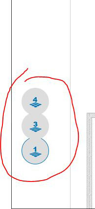
The id field is used to define unique numeric id of the map, and it is used in the caption of floors switching - FABs.
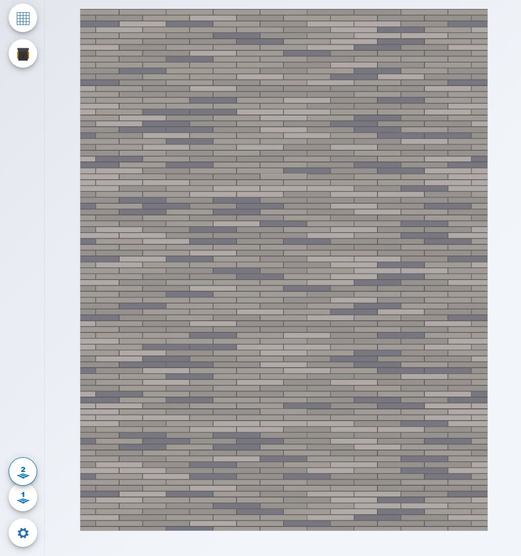
The backgroundImage field is used to reference the background image of floor (determines the floor size) from the assets.others section.
The icon field is used to reference the icon displayed in FAB of this floor from the assets.icons section.
The renderedImage field is filled in when we are exporting map or configuration from editor. It contains a snapshot of map with all its objects.
The mapWidth field contains map width in pixels. It must equal the background image width. When configuration is loaded, this param is ignored
and is not mandatory. Background image width is used as map width. The same when exporting floors/maps as JSON files, we always use background
image size as a source.
The mapHeight field contains map height in pixels. It must equal the background image height. When configuration is loaded, this param is ignored
and is not mandatory. Background image height is used as map height. The same when exporting floors/maps as JSON files, we always use background
image size as a source.
The items contains all objects located on map.
Regarding last section, below an example of few objects located on map:
"items": [
    {
        "x": 393,
        "y": 311,
        "z": 0,
        "rotation": -135,
        "type": "office-armchair"
    },
    {
        "x": 406,
        "y": 254,
        "z": 0,
        "rotation": 0,
        "type": "desk"
    },
    {
        "x": 366,
        "y": 170,
        "z": 0,
        "rotation": 0,
        "type": "office-armchair"
    },
    {
        "x": 450,
        "y": 170,
        "z": 0,
        "rotation": 0,
        "type": "office-armchair"
    }
]
Fields x and y define location on map (z is not used yet). Field rotation is used to determine rotation of image, currently in map we use only multiply of -45deg.
And the last element type is the name of object type.
Config - settings ("editorSettings")
Last section of config describes some settings for editor. Generally we define there menus for objects palette and few default settings.
"editorSettings": {
    "snapToGrid": true,
    "showGrid": false,
    "currentFloorMap": 1,
    "toolbar": [
        {
            "caption": "Objects (sub menu)",
            "icon": "icon-office-armchair.png",
            "items": [
                {
                    "caption": "Office armchair",
                    "icon": "icon-office-armchair.png",
                    "type": "office-armchair"
                },
                {
                    "caption": "Desk",
                    "icon": "icon-desk.png",
                    "type": "desk"
                }
            ]
        },
        {
            "caption": "Standalone item",
            "icon": "icon-office-armchair.png",
            "type": "office-armchair"
        }
    ]
}
The snapToGrid field is used to turn on or off grid snapping (current grid is fixed to the cell size 4x4 pixels).
The showGrid field is used to toggle grid visibility.
The currentFloorMap field contains initially opened floor map id.
The toolbar field is used to define a menu for objects palette.
The toolbar.*.caption field contains a tooltip text displayed for menu FAB (for sub menu this is the header FAB).
The toolbar.*.icon field contains a reference to the icon displayed on FAB (for sub menu this is the header FAB).
The toolbar.*.type field contains a name of object that should be set as active cursor for editor. For filled in items field
we can skip it as it is not used then.
The toolbar.*.items field contains sub menu items, sub items are defined in the same way as above (caption, icon, type)
Currently editor config supports only one sub hierarchy level.