angular-klaxon
Bootstrap-compatible, configurable alerts for your angular app.


Usage
- Install from:
- NPM:
npm install angular-klaxon - Bower:
bower install angular-klaxon
- Register it as an angular dependency:
// option 1 (include the built javascript in your page)var app = angular; // option 2 (use commonjs, like browserify or webpack)var app = angular;- Include the
klaxon-alert-containerdirective in your html somewhere:
- Trigger alerts from your app!
app;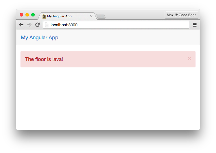
Documentation
Inject KlaxonAlert. It's a constructor function with the following API:
alert = msg options-
msg(String): The message that should be displayed on the alert -
options(Object, optional): Additional configuration for your alerttype(String, default"info"): Your alert will be given the classalert-<class>. We recommend you use one of the bootstrap defaults:successinfowarningdanger
closable(Boolean, defaulttrue): Whether or not to display a "close" button on the alert.timeout(Number): If this is set, the alert will disappear aftertimeoutmilliseconds have passed.callToAction(String): If this is set, this string will be displayed after the message as a clickable link.onCallToActionClick(Function): If this is set in addition to callToAction, clicking on the call to action message will call this function. function.onClick(Function): If this is set, clicking on the alert will call this function.debugInfo(String): If this is set, it will be displayed below the klaxon with a class ofdebug-info. (Good for UUIDs that can be displayed alongside error messages, for example.)priority(Number): Theklaxon-alert-containerwill display messages in order ofpriority, highest first.key(String): Theklaxon-alert-containerwon't ever show more than one alert with the same key. This is useful if you want to avoid displaying the same message over and over again. The message with the highestpriority(or the most recent message if they all have the samepriority) will be the one that is displayed.
-
alert(KlaxonAlert): An instance with the following methods:add: Adds the alert to theklaxon-alert-containerclose: Removes the alert from theklaxon-alert-containerclick: Calls theonClickhandler for the alert, if one is set.
Contributing
Please follow our Code of Conduct when contributing to this project.
$ git clone https://github.com/goodeggs/ng-klaxon && cd ng-klaxon
$ npm install
$ npm test
Module scaffold generated by generator-goodeggs-npm.