angular-keypad
An Angular directive that creates a numeric keypad.

Comments and Pull Requests welcome!
Contents
- Installation
- Dependencies
- Usage
- Directive
- Plug'n'Play Buttons
bcKeypadConfigProvider- Styles
- angular-ripple
- Development
Installation
NPM
npm install angular-keypad --saveBower
bower install angular-keypad --saveManually
Add the script and styles to your HTML:
Dependencies
- Angular.js (>=1.4.0)
Usage
Include bc.AngularKeypad as a dependency in your project:
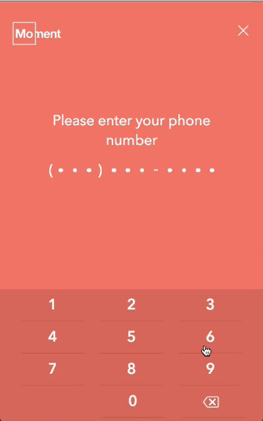
angular;Use the directive anywhere in your HTML. The keypad will expand to fill the width of it's container while maintaining the aspect ratio of the keypad buttons.
<!-- Show the number model in your UI: -->{{ vm.numbers }} <!-- Define the keypad: -->bc-number-model
Required: String
The directive will store the current string of numbers here. This is the only required attribute.
bc-max-length
Optional: Integer
The directive will use this number to set a hard limit on how many characters are allowed in the
number model (vm.numbers in the example below).
<!-- Restrict 'vm.numbers' to the length of 4 -->bc-left-button
Optional: String
You can define a custom Plug'n'Play button type by passing in the name of any valid (PnP) button.
📺 Plunker demo for Plug'n'Play button types with custom methods
<!-- This would generate a backspace button in the bottom left of the keypad -->bc-right-button
Optional: String
You can define a custom Plug'n'Play button type by passing in the name of any valid (PnP) button.
📺 Plunker demo for Plug'n'Play button types with custom methods
<!-- This would generate a submit button in the bottom right of the keypad -->Custom Methods
bc-left-button-method
Optional: method
You can pass in a custom method that will be called each time the button is interacted with. This allows you to track interaction or handle custom validation in your controller.
Available Parameters:
| Param | Type | Details |
|---|---|---|
$event |
Object | The original event object from the ng-click |
numbers |
String | The current value of bc-number-model |
📺 Plunker demo for Plug'n'Play button types with custom methods
<!-- This would create a backspace button in the bottom left corner of the keypad --> { thisnumbers = ''; } // I will be called each time the left (backspace) button is interacted with { console; console console } bc-right-button-method
Optional: method
You can pass in a custom method that will be called each time the button is interacted with. This allows you to track interaction or handle custom validation in your controller.
Available Parameters:
| Param | Type | Details |
|---|---|---|
$event |
Object | The original event object from the ng-click |
numbers |
String | The current value of bc-number-model |
📺 Plunker demo for Plug'n'Play button types with custom methods
<!-- This would create a submit button in the bottom right corner of the keypad --> { thisnumbers = ''; } // I will be called each time the right (submit) button is interacted with { console; console console } bc-empty-backspace-method
Optional: method
You can pass in a custom method that will be called when the backspace button is
interacted with and bc-number-model is already empty. This can be useful
for allowing users to step backwards through a multi-part form.
{ thisnumbers = ''; } // I will be called when the backspace button is clicked and the numbers // model is empty { console; } Plug'n'Play Buttons
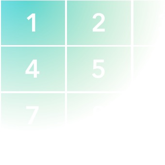
This directive now supports Plug'n'Play (PnP) button types to the left and right of the final digit. These button types can be used on either side (or both if you really wanted to).
📺 Plunker demo for Plug'n'Play button types with custom methods
Available (PnP) Button Types
Even when using a (PnP) button, any defined custom methods will still be called.
Any (PnP) button template can be overwritten using methods exposed via the provider.
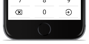
<!-- Example directive setup for the above image -->Backspace
<!-- This would create a backspace button in the bottom left corner of the keypad -->This will create a backspace button with styles and functionality already wired together.
Functionality
Each time a backspace button instance is interacted with, the last number will be removed from
bc-number-model.
If a custom method was passed to bc-empty-backspace-method it will
be called when the backspace button is interacted with and bc-number-model
is already empty. This can be useful for allowing users to step backwards through a multi-part form.
Any defined custom methods will still be called.
Style
By default the button is using a raw SVG version of ion-backspace-outline
from ionicons since this allows you to customize the SVG styles with your project's CSS.

A special class is added to the backspace button which can be used to target specific styles:
.bc-keypad__key-button--backspace Submit
This is a purely aesthetic (PnP) button type. No functionality is attached, but any defined custom methods will still be called.
Style
By default the button is using a raw SVG version of ion-log-in from
ionicons since this allows you to customize the SVG styles with your project's CSS.

A special class is added to the submit button which can be used to target specific styles:
.bc-keypad__key-button--submit bcKeypadConfigProvider
This module exposes bcKeypadConfigProvider which can be used to set custom defaults for the
directive. Setting options here will overwrite the directive's default options for all instances
within your module.
// ES6 Config Example { 'ngInject'; // Set a default of '7' for the max length of all keypads within your module bcKeypadConfigProvider; } // ES5 Config Exampleangular ;setBackspaceTemplate
This allows you to specify a custom template for the backspace key.
By default it is using a raw SVG version of ion-backspace-outline from
ionicons since this allows you to overwrite the SVG styles with CSS.
bcKeypadConfigProvider;setSubmitTemplate
This allows you to specify a custom template for the submit key.
By default it is using a raw SVG version of ion-log-in from
ionicons since this allows you to overwrite the SVG styles with CSS.
bcKeypadConfigProvider;setMaxLength
The directive will use this number to impose a hard limit on how many characters the model can hold. This is useful for specific data items such as a phone number:
bcKeypadConfigProvider;Styles
The included styles are 99% layout with just enough style to work out of the box. The true styles should be written at your project level using the associated classes.
Your project CSS should always be included after any library CSS files. This makes it easy for you to override or add to any styles defined by this module. Below are the classes available for styling.
| Class | Element | Details |
|---|---|---|
.bc-keypad |
<div> |
Primary container (<div>) around the keypad. |
.bc-keypad__key |
<div> |
Individual wrapper for each key. |
.bc-keypad__key--left |
<div> |
Target the left customizable key. |
.bc-keypad__key--center |
<div> |
Target the last number key (between the two customizable keys). |
.bc-keypad__key--right |
<div> |
Target the right customizable key. |
.bc-keypad__key-button |
<button> |
The button inside each key. |
.bc-keypad__key-button--backspace |
<button> |
Target the backspace key (if used) |
.bc-keypad__key-button--submit |
<button> |
Target the submit key (if used) |
angular-ripple
The bc-keypad directive was written primarily for mobile so it supports the Google Material
'ripple' style feedback via a module called angular-ripple. As
not everyone may want that style of interaction, this project does not automatically install the
angular-ripple library, but is however built to support it out of the box.
Just install the angular-ripple library:
$ npm install nelsoncash/angular-ripple --save# or $ bower install angular-ripple --saveInclude it as a dependency in your primary project:
angular;And you should see it working!
- angular-ripple: The
angular-ripplelibrary. - KL-Moment/angular-ripple: A custom fork of
angular-ripplelibrary with better mobile support.
Development
npm run build- Build JS/CSS/HTML/SVGnpm run build:js- Build JSnpm run build:css- Build CSSnpm run watch:css- Watch CSS and rebuild on changenpm run watch:js- Watch JS/HTML and rebuild on changenpm run watch- Watch JS/CSS/HTML and rebuild on change