Adaptive Placeholders
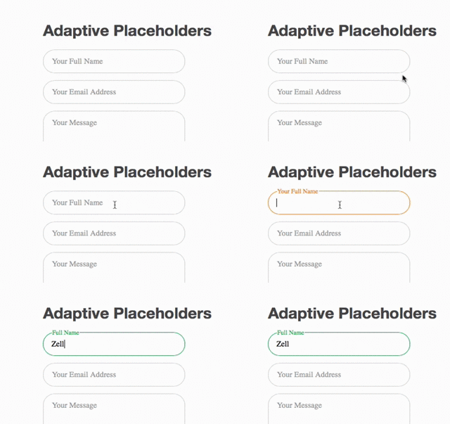
Adaptive placeholders is a Sass mixin for an interactive form placeholder initially made by Danny King.
This Sass mixin comes with additional settings to help you easily configure the placeholder to match your design.
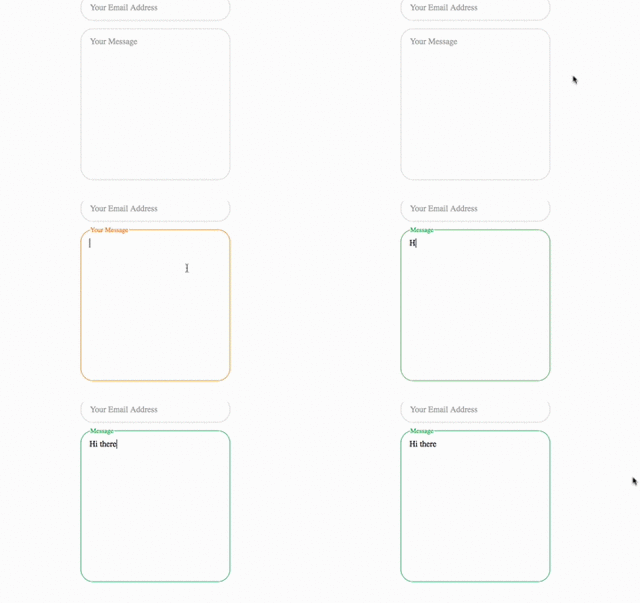
Screenshot
Adaptive Placeholder works with both text input fields and textarea.


Requirements
- Sass v3.3 and above
- You have Normalize.css in the project
Installation
Download the project either by downloading the zip, or using Bower
$ bower install adaptive-placeholders
Usage
Add Adaptive Placeholders into your project and import it into your main stylesheet with
@import "pathToAdaptivePlaceholders/adaptive-placeholders";
Write your HTML in this way:
<form action="#">
    <!-- input must have an required attribute -->
    <input type="text" name="input" id="input" required>
    <!-- labels must have placeholder and alt attributes -->
    <label for="input" placeholder="First Placeholder Label" alt="Second Placeholder Label"></label>
</form>
Then call the mixin.
input {
    @include adaptive-placeholder();
}
Customizing Adaptive Placeholder.
Adaptive placeholder comes with a set of defaults ready to use.
$adaptive-placeholder: (
  height: 3em,
  margin: 1em,
  border: 1px,
  border-radius: 1.5em,
  font-size: 1em,
  border-color: #cccccc,
  label-color: #999999,
  active-color: #e87e22,
  valid-color: #23a045,
  placeholder-background-color: white,
  textarea: false
  );
You can create your own settings for adaptive-placeholder by creating a Sass map named $adaptive-placeholder. Any defaults not overwritten will be added to the Sass map.
// Defining new defaults
$adaptive-placeholder: (
    height: 4em;
)

// Calling Adaptive placeholders
input {
    @include adaptive-placeholder();
}
The adaptive placeholders provides you with a optional argument to insert a sass map if you would like to keep the defaults intact, or would like to include a second style.
input {
    @include adaptive-placeholder($optional-map);
}
Working with Textareas
Textareas are styled differently from inputs items. To use adaptive placeholders with textareas, write your html the same way as you would use adaptive placeholders for input.
<form action="">
    <textarea name="textarea" id="textarea" required></textarea>
    <label for="textarea" placeholder="First Textarea Placeholder" alt="Second Textarea Placeholder"></label>
</form>
Create a new sass map for textareas and call it. Make sure textarea is set to true in the sass map.
$textarea-placeholder : (
    height: 18em,
    border-radius: 6px,
    textarea: true,
)
// Call textarea placeholder
textarea {
    @include adaptive-placeholder($textarea-placeholder);
}
Alternatively, you can insert the sass map directly into the mixin.
// Call textarea placeholder
textarea {
    @include adaptive-placeholder((height: 18em, border-radius: 6px, textarea:true));
}
Browser Tests
Works on IE10+, Firefox 28+, Chrome 31+, Safari 7+, Opera 22+
Changelog
1.1.4
- Remove Normalize.scss import statement
1.1.0
- Fix translateY bug with calc for IE 10.
- Tested and proved to work with IE 10 & IE 11
- Reworked bower file structure
- Placed demo into
appfolder
1.0.1:
- Added browser prefixes for all transitions and transformations used in Adaptive Placeholders
Credits
@ Danny King for the concept and initial code. The original Less code can be found here
License
MIT License.