z-ui
Install
yarn add '@zzxcncz/z-ui'Config
edit main.js:
import zui from '@zzxcncz/z-ui'
import '@zzxcncz/z-ui/lib/zui.css'
Usage
<z-button></z-button>
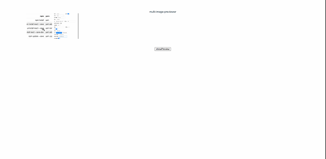
<z-image-preview :img-list="imgList"></z-image-preview>plugins
z-button
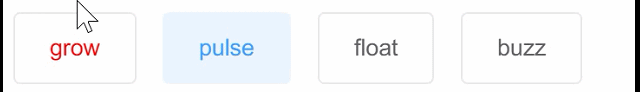
button with effects
options
| Attribute | Default | Type | Description |
|---|---|---|---|
| type | '' | string | |
| hover | '' | string | grow,pulse,float,buzz |
| color | '' | string | |
| backgroundColor | '' | string | |
| borderColor | '' | string |
usages
      <z-button hover="grow" @click="preview" background-color="#ffffff" color="red">grow</z-button>
      <z-button hover="pulse" @click="preview" color="#409eff" background-color="#ecf5ff" border-color="#ecf5ff">pulse</z-button>
      <z-button hover="float" @click="preview">float</z-button>
      <z-button hover="buzz" @click="preview">buzz</z-button>
overview
z-image-preview
options
| Attribute | Default | Type | Description |
|---|---|---|---|
| imgList | [] | Array | image list |
| width | 150px | string | |
| height | 150px | string | |
| fit | cover | string | refer to native object-fit style |
| customClass | cover | string | custom class name |
usages
e.g.
<template>
    <div id="app">
        <z-image-preview :img-list="imgList"></z-image-preview>
        <button @click="preview">showPreview</button>
    </div>
</template>
<script>
    export default {
        name: 'App',
        data() {
            return {
                imgList: ['https://chevereto.zhuangzexin.top/images/2021/07/27/image.png',
                    'https://chevereto.zhuangzexin.top/images/2021/04/06/imagec8d56ccba4b0c67d.png']
            }
        },
        methods: {
            preview () {
                this.$ZPreviewer({
                    imgList: this.imgList,
                    nowImgIndex: 1
                })
            }
        }
    }
</script>
overview
ZPreviewer
it can be used to preview image by invoke global function
usages
                this.$ZPreviewer({
                    imgList: this.imgList,
                    nowImgIndex: 1
                })
ZRank
a simple ranking component
options
| Attribute | Default | Type | Description |
|---|---|---|---|
| title | [] | string | 排行榜 |
| shadow | false | boolean | |
| width | '' | string | |
| customClass | '' | custom style | |
| list | [] | string | rank data |
usage
    <div>
      <z-rank title="排榜行" width="600px" :list="rankList" @click="rankClick"></z-rank>
    </div>
    <script>
    export default {
        name: 'App',
        data() {
            return {
                rankList: [{
                    name: '张三',
                    count: '100',
                    desc: '这是一个描述'
                },{
                    name: '李四',
                    count: '100'
                },{
                    name: '王五',
                    count: '100'
                },{
                    name: '赵六',
                    count: '100'
                },{
                    name: '孙七',
                    count: '100'
                },{
                    name: '周八',
                    count: '100'
                },{
                    name: '吴九',
                    count: '100'
                },{
                    name: '郑十',
                    count: '100'
                },{
                    name: '王十一',
                    count: '100'
                }]
            }
        },
        methods: {
            rankClick (data) {
                console.log(data)
            }
        }
    }
    </script>