
 React Loading


Loading Skleton component building block to easily create placholder loadings.

Features
Docs
Getting Started
Install via yarn or npm
npm install @yisheng90/react-loading --saveor
yarn add @yisheng90/react-loadingUsage
There are two ways to use it.
1. Use it as a component
import Skeleton from "@yisheng90/react-loading";

<Skeleton />;
2. Use it as a building block
import Skeleton from "@yisheng90/react-loading";

const CardSkleton = () => (
  <div style={{ display: "flex", padding: "20px" }}>
    <Skeleton width={45} circle color="pink" />
    <div
      style={{
        display: "flex",
        flexDirection: "column",
        justifyContent: "space-evenly",
        width: "100%",
        marginLeft: "20px",
      }}
    >
      <Skeleton color="pink" />
      <Skeleton width="50%" color="pink" />
    </div>
  </div>
);
Props
rows?: number
Defaults to 1. It is used to determine the number of rows to be display.
notes: This option will be ignored if circle is set as true
width?: number | string
Defaults to 100%. It is used to set the width of the skeleton. You can set it using %, rem or px.
height?: number | string
Defaults to 100%. It is used to set the height of the skeleton. You can set it using %, rem or px.
circle?: boolean
Defaults to false. It is used to set shape of the skleton.
color?: string
It is used to set the color of the skleton. You can set it using hex, rgb or rgba.
translucent?: boolean
Defaults to false. It is used to set the opacity of the skleton.
radius?: number
Defaults to 4px. It is used to determine the border radius of the rows. The unit is in px.
notes: This option will be ignored if circle is set as true
Examples
Rows

<Skeleton width={250} rows={6} />Width
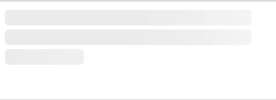
    <Skeleton width={250}/>
    <Skeleton width="250px"/>
    <Skeleton width="5rem"/>
Height

    <Skeleton height={25} />
    <Skeleton height="25px" />
    <Skeleton height="3rem" />
Circle

    <Skeleton circle width={35} />
    <Skeleton circle width={55} />
    <Skeleton circle width={75} />
    <Skeleton circle width={95} />
    <Skeleton circle width={115} />
Color
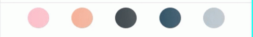
    <Skeleton color="pink" circle width={35}/>
    <Skeleton color="#F8B195" circle width={35}/>
    <Skeleton color="#2A363B" circle width={35}/>
    <Skeleton color="rgb(25,67,89)" circle width={35}/>
    <Skeleton color="rgba(25,67,89, 0.3)" circle width={35}/>
Translucent

<Skeleton color="black" width={250} height={30} translucent />Contributing
Pull requests are welcome. For major changes, please open an issue first to discuss what you would like to change.
Please make sure to update tests as appropriate.
