

Web3UIKit!
Beautiful and lightweight UI components for web3 developers. This UI library will speed up your dapp development no matter which chain you build on.
Live StoryBook DEMO: https://web3ui.github.io/web3uikit/

⭐️ Star us
If this ui-kit helps you build your dApps faster - please star this project, every star makes us very happy!
🤝 Need help?
If you need help with setting up the boilerplate or have other questions - don't hesitate to write in our community forum and we will check asap. Forum link. The best thing about this boilerplate is the super active community ready to help at any time! We help each other.
🚀 Quick Start
💿 Installation
npm install @web3uikit/coreor
yarn add @web3uikit/core🧰 Usage
import { CryptoCards, Button } from 'web3uikit';

const App = () => (
    <>
        <CryptoCards
            chain="ethereum"
            bgColor="blue"
            chainType="Network"
            onClick={console.log}
        />
        <Button theme="primary" type="button" text="Launch Dapp" />
    </>
);
▲ Usage with Next.js
If you are using web3uikit with Next.js, be sure to follow the official guide, since we are using styled-components under the hood.
🧭 Table of contents
- Web3UIKit!
⭐️ Star us🤝 Need help?-
🚀 Quick Start 🧭 Table of contents-
📖 UI Components -
⚙️ Interaction Components -
🎉 Popup
📖 UI Components
<Accordion />
The accordion component is a nice user interface element that can allow you to show and hide text or other components, so you do not overwhelm your user with too much awesome content

Try the <Accordion /> component in the interactive documentation
<Avatar />

Try the <Avatar /> component in the interactive documentation
<Badge />

Try the <Badge /> component in the interactive documentation
<BannerStrip />

Try the <BannerStrip /> component in the interactive documentation
<Breadcrumbs />

Try the <Breadcrumbs /> component in the interactive documentation
<Card />
Try the <Card /> component in the interactive documentation
<CryptoCards />

Try the <CryptoCards /> component in the interactive documentation
<CryptoLogos />

Try the <CryptoLogos /> component in the interactive documentation
<Icon />

Try the <Icon /> component in the interactive documentation
<Illustration />

Try the ` component in the interactive documentation
<Information />
Try the <Information /> component in the interactive documentation
<LinkTo />
LinkTo component is a simple link component that can be used to navigate to another page or to another component.

Try the <LinkTo /> component in the interactive documentation
<Logo />
Logo component is a simple logo component having moralis or other icons that can be used in any layout.

Try the <Logo /> component in the interactive documentation
<Notification />

To call the Notification component use the useNotification() hook. Example:
const App = () => {
    const dispatch = useNotification();

    const handleNewNotification = () => {
        dispatch({
            type: 'info',
            message: 'Somebody messaged you',
            title: 'New Notification',
            icon,
            position: position || 'topR',
        });
    };

    return (
        <>
            <Button
                text="Error"
                onClick={handleNewNotification}
                theme="colored"
                color="red"
                isFullWidth={true}
            />
        </>
    );
};
Requires the application to be within a <NotificationProvider>
Example:
<NotificationProvider>
    <App />
<NotificationProvider>
Try the <Notification /> component in the interactive documentation
<Table />
Try the <Table /> component in the interactive documentation
<Tag />

Try the <Tag /> component in the interactive documentation
<Todo />

Try the <Todo /> component in the interactive documentation
<Widget />

Try the <Widget /> component in the interactive documentation
⚙️ Interaction Components
<Button />

Try the <Button /> component in the interactive documentation
<Checkbox />
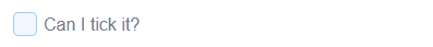
Try the <Checkbox /> component in the interactive documentation
<CodeArea />

Try the <CodeArea /> component in the interactive documentation
<Credentials />

Try the <Credentials /> component in the interactive documentation
<Form />
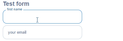
Try the <Form /> component in the interactive documentation
<Input />
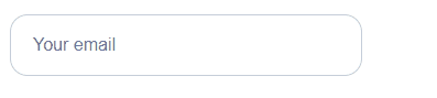
Try the <Input /> component in the interactive documentation
<Radios />

Try the <Radios /> component in the interactive documentation
<Select />

Try the <Select /> component in the interactive documentation
<TextArea />

Try the <TextArea /> component in the interactive documentation
🎉 Popup
<Modal />
Modal is a popup that can have arbitary elements and can be closed by clicking on the close or cancel buttons.

Try the <Modal /> component in the interactive documentation
<Tooltip />

Try the <Tooltip /> component in the interactive documentation