
react-native-modal
An enhanced, animated and customizable react-native modal.
The aim of react-native-modal is expanding the original react-native Modal component by adding animations and styles customization options while still providing a plain-simple API.
Features
- Smooth enter/exit animations
- Plain simple and flexible APIs
- Customizable backdrop opacity, color and timing
- Listeners for the modal animations ending
- Resize itself correctly on device rotation
- Swipeable
- Scrollable
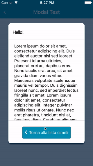
Demo


Setup
This library is available on npm, install it with: npm install --save react-native-modal or yarn add react-native-modal.
Usage
Since react-native-modal is an extension of the original react native modal, it works in a similar fashion react-native original modal.
- Import react-native-modal:
import Modal from "react-native-modal";- Create a modal and nest its content inside of it:
render () {
    return (
      <View>
        <Modal>
          <View style={{ flex: 1 }}>
            <Text>I am the modal content!</Text>
          </View>
        </Modal>
      </View>
    )
}- Then simply show it by setting the
isVisibleprop to true:
render () {
    return (
      <View>
        <Modal isVisible={true}>
          <View style={{ flex: 1 }}>
            <Text>I am the modal content!</Text>
          </View>
        </Modal>
      </View>
    )
  }
The isVisible prop is the only prop you'll really need to make the modal work: you should control this prop value by saving it in your state and setting it to true or false when needed.
A complete example
The following example consists in a component (ModalTester) with a button and a modal.
The modal is controlled by the isModalVisible state variable and it is initially hidden, since its value is false.
Pressing the button sets isModalVisible to true, making the modal visible.
Inside the modal there is another button that, when pressed, sets isModalVisible to false, hiding the modal.
import React, { Component } from "react";
import { Text, TouchableOpacity, View } from "react-native";
import Modal from "react-native-modal";

export default class ModalTester extends Component {
  state = {
    isModalVisible: false
  };

  _toggleModal = () =>
    this.setState({ isModalVisible: !this.state.isModalVisible });

  render() {
    return (
      <View style={{ flex: 1 }}>
        <TouchableOpacity onPress={this._toggleModal}>
          <Text>Show Modal</Text>
        </TouchableOpacity>
        <Modal isVisible={this.state.isModalVisible}>
          <View style={{ flex: 1 }}>
            <Text>Hello!</Text>
            <TouchableOpacity onPress={this._toggleModal}>
              <Text>Hide me!</Text>
            </TouchableOpacity>
          </View>
        </Modal>
      </View>
    );
  }
}
For a more complex example take a look at the /example directory.
Available props
| Name | Type | Default | Description |
|---|---|---|---|
| animationIn | string or object | 'slideInUp' | Modal show animation |
| animationInTiming | number | 300 | Timing for the modal show animation (in ms) |
| animationOut | string or object | 'slideOutDown' | Modal hide animation |
| animationOutTiming | number | 300 | Timing for the modal hide animation (in ms) |
| avoidKeyboard | bool | false | Move the modal up if the keyboard is open |
| backdropColor | string | 'black' | The backdrop background color |
| backdropOpacity | number | 0.70 | The backdrop opacity when the modal is visible |
| backdropTransitionInTiming | number | 300 | The backdrop show timing (in ms) |
| backdropTransitionOutTiming | number | 300 | The backdrop hide timing (in ms) |
| children | node | REQUIRED | The modal content |
| isVisible | bool | REQUIRED | Show the modal? |
| onBackButtonPress | func | () => null | Called when the Android back button is pressed |
| onBackdropPress | func | () => null | Called when the backdrop is pressed |
| onModalHide | func | () => null | Called when the modal is completely hidden |
| onModalShow | func | () => null | Called when the modal is completely visible |
| onSwipe | func | null | Called when the swipeThreshold has been reached |
| scrollOffset | number | 0 | When > 0, disables swipe-to-close, in order to implement scrollable content |
| scrollOffsetMax | number | 0 | Used to implement overscroll feel when content is scrollable. See /example directory |
| scrollTo | func | null | Used to implement scrollable modal. See /example directory for reference on how to use it |
| swipeThreshold | number | 100 | Swiping threshold that when reached calls onSwipe
|
| swipeDirection | string | null | Defines the direction where the modal can be swiped (can be 'up', 'down', 'left, or 'right') |
| useNativeDriver | bool | false | Defines if animations should use native driver |
| hideModalContentWhileAnimating | bool | false | Enhances the performance by hiding the modal content until the animations complete |
| style | any | null | Style applied to the modal |
Frequently Asked Questions
The component is not working as expected
Under the hood react-native-modal uses react-native original Modal component.
Before reporting a bug, try swapping react-native-modal with react-native original Modal component and, if the issue persists, check if it has already been reported as a react-native issue.
The backdrop is not completely filled/covered on some Android devices (Galaxy, for one)
Checkout the package react-native-extra-dimensions-android
To use, here's an example:
const IOS = Platform.OS === "ios";
const WIDTH = Dimensions.get("window").width;
const HEIGHT = IOS
  ? Dimensions.get("window").height
  : require("react-native-extra-dimensions-android").get("REAL_WINDOW_HEIGHT");
How can I hide the modal by pressing outside of its content?
The prop onBackdropPress allows you to handle this situation:
<Modal
  isVisible={this.state.isVisible}
  onBackdropPress={() => this.setState({ isVisible: false })}
>
  <View style={{ flex: 1 }}>
    <Text>I am the modal content!</Text>
  </View>
</Modal>
How can I hide the modal by swiping it?
The prop onSwipe allows you to handle this situation (remember to set swipeDirection too!):
<Modal
  isVisible={this.state.isVisible}
  onSwipe={() => this.setState({ isVisible: false })}
  swipeDirection="left"
>
  <View style={{ flex: 1 }}>
    <Text>I am the modal content!</Text>
  </View>
</Modal>
The modal flashes in a weird way when animating
Unfortunately this is a know issue that happens when useNativeDriver=true and must still be solved.
In the meanwhile as a workaround you can set the hideModalContentWhileAnimating prop to true: this seems to solve the issue.
Also, do not assign a backgroundColor property directly to the Modal. Prefer to set it on the child container.
The modal background doesn't animate properly
Are you sure you named the isVisible prop correctly? Make sure it is spelled correctly: isVisible, not visible.
The modal doesn't change orientation
Add a supportedOrientations={['portrait', 'landscape']} prop to the component, as described in the React Native documentation.
Available animations
Take a look at react-native-animatable to see the dozens of animations available out-of-the-box. You can also pass in custom animation definitions and have them automatically register with react-native-animatable. For more information on creating custom animations, see the react-native-animatable animation definition schema.
Acknowledgements
Thanks @oblador for react-native-animatable, @brentvatne for the npm namespace and to anyone who contributed to this library!
Pull requests, feedbacks and suggestions are welcome!