
@themak/react-navigation

React Navigation for React js that tries to ensure that the elements of the navigators display correctly on devices with notches (e.g. iPhone X) and UI elements which may overlap the app content. Such items include:
- Currently only Home activity indicator on iOS is supported
The area not overlapped by such items is referred to as "safe area".
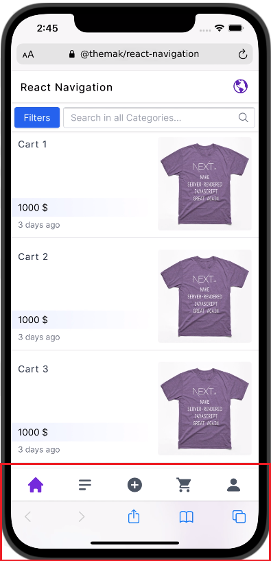
Bottom Navigation in new iPhones

Getting Started
Install
npm install @themak/react-navigationUsage
import Navigation from '@themak/react-navigation'

;<Navigation variant="bottom" columns={2} breakPoint="lg">
  <div>Home</div>
  <div>About</div>
</Navigation>
Props
| Name | Type | Default | Description |
|---|---|---|---|
| backgroundColor | string |
#ffffff |
The color of the component background can be customized by changing. |
| breakPoint |
false sm md lg
|
false |
Each breakpoint (a key) matches with a fixed screen width (a value): sm: 640px md: 768px lg: 978px |
| children | node |
- |
Contents to be displayed within root element. |
| className |
false string
|
false |
Apply classes to the Navigation component. |
| columns |
false number
|
false |
Set number of columns of grid. |
| safeAriaHeight | string |
84px |
The height of bottom navigation when is in safe area (for new iPhones) |
| height | string |
56px |
The height of navigation |
| shadow |
false string
|
0px 0px 6px 0px rgba(0,0,0,0.1) |
Set shadow for Navigation component |
| style | object |
{} |
Apply styles to the Navigation component. |
| variant |
top bottom
|
top |
Select position of Navigation component |
| zIndex |
false number
|
10 |
Employing a z-index scale for Navigation component |
License
MIT Licensed. © Copyright MohammadAli Karimi