
Superset of HTML select box contains specific features such as data binding, grouping, sorting, filtering, and templates.
The Angular DropDown package includes the following list of components.
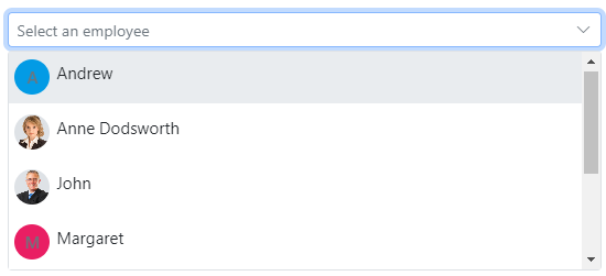
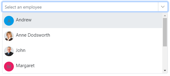
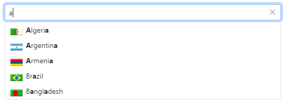
The Angular DropdownList component is a quick replacement of the HTML select tags. It has a rich appearance and allows users to select a single value that is non-editable from a list of predefined values.
Getting Started . Online demos . Learn more
- Data binding - Binds and accesses the list of items from the local or server-side data source.
- Grouping - Groups the logically related items under a single or specific category.
- Sorting - Sorts the list items in alphabetical order (either ascending or descending).
- Filtering - Filters the list items based on a character typed in the search box.
- Templates - Customizes the list items, selected value, header, footer, category group header, and no records content.
- Accessibility - Provided with built-in accessibility support used to access all the DropDownList component features using keyboard, screen readers, or other assistive technology devices.
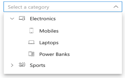
The Angular DropDownTree component is a textbox control that allows the user to select single or multiple values from hierarchical data in a tree-like structure. It has several out-of-the-box features, such as data binding, check boxes, templates, UI customization, accessibility, and preselected values.
Getting Started . Online demos . Learn more
- Data binding - Binds and accesses the list of items from the local or remote data source.
- Checkbox - Built-in support for checkboxes, allowing users to select single or multiple items.
- Template - To change the appearance of the selection pop-up for tree items, plus the header and footer of the pop-up tree.
- Filtering - Filters the list items based on a character typed in the search box.
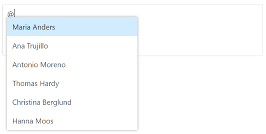
The Angular Mention component is an autocomplete-like control to tag or select a user/group from the suggestion list. The control opens the suggestion list when a user starts typing with the character ‘@’ in popular social media sites such as Facebook, Twitter, and more. It supports several out-of-the-box features: Data binding, grouping, UI customization, accessibility, and more.
Getting Started . Online demos . Learn more
- Sorting - Sorts the list items in alphabetical order (either ascending or descending).
- Filtering - Filters the list items based on a character typed in the search box.
The Angular ComboBox component is a drop-down list with editable textbox that also allows users to choose an option from a predefined pop-up list.
Getting Started . Online demos . Learn more
- Data binding - Binds and accesses the list of items from local or server-side data source.
- Custom values - Sets user-defined values that is not in the pop-up list.
- Grouping - Groups the logically related items under a single or specific category.
- Sorting - Sorts the list items in alphabetical order (either ascending or descending).
- Filtering - Filters the list items based on a character typed in the component.
- Templates - Customizes the list items, selected value, header, footer, category group header, and no records content.
- Accessibility - Provided with built-in accessibility support that helps to access all the ComboBox component features using the keyboard, screen readers, or other assistive technology devices.
The Angular AutoComplete component is a textbox control that provides a list of suggestions to select from as the user types. It has several out-of-the-box features such as data binding, filtering, grouping, UI customization, accessibility, and more.
Getting Started . Online demos . Learn more
- Data binding - Binds and accesses the list of items from local or server-side data source.
- Grouping - Groups the logically related items under a single or specific category.
- Sorting - Sorts the list items in alphabetical order (either ascending or descending).
- Highlight search - Highlights the typed text in the suggestion list.
- Templates - Customizes the list item, header, footer, category group header, no records, and action failure content.
- Accessibility - Provided with built-in accessibility support that helps to access all the AutoComplete component features using keyboard, on-screen readers, or other assistive technology devices.
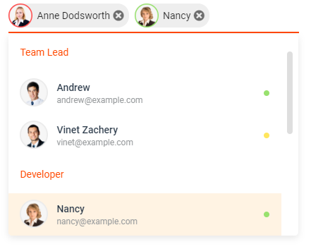
The Angular MultiSelect Dropdown component is a quick replacement for the HTML select tag for selecting multiple values. HTML MultiSelect Dropdown is a textbox control that allows the user to type or select multiple values from a list of predefined options.
Getting Started . Online demos . Learn more
- Data binding - Binds and accesses the list of items from local or server-side data source.
- Grouping - Groups the logically related items under a single or specific category.
- Templates - Customizes the list items, selected value, header, footer, category group header, and no records content.
- Sorting - Sorts the list items in alphabetical order (either ascending or descending).
- Filtering - Filters the list items based on a character typed in the search box.
- Custom value - Allows users to select a new custom value.
- Accessibility - Provided with built-in accessibility support that helps to access all the DropDownList component features using the keyboard, screen readers, or other assistive technology devices.
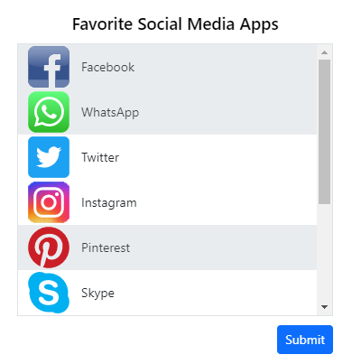
The Angular ListBox component is a graphical user interface for displaying a list of items with multi-selection options. It has a rich appearance and allows users to select one or more items from the list using checkboxes or keyboard interactions.
Getting Started . Online demos . Learn more
- Data binding - Binds and accesses the list of items from local or server-side data source.
- Dual listbox - Allows transferring and reordering the list item between two ListBoxes.
- Drag and drop - Allows drag and drop the list item with the same/multiple ListBox.
- Grouping - Groups the logically related items under a single or specific category.
- Templates - Customizes the list items.
- Sorting - Sorts the list items in alphabetical order (either ascending or descending).
- Accessibility - Provided with built-in accessibility support that helps to access all the ListBox component features using the keyboard, screen readers, or other assistive technology devices.
Trusted by the world's leading companies

To install dropdowns and its dependent packages, use the following command.
npm install @syncfusion/ej2-angular-dropdowns
DropDown components are also supports the following frameworks.
 JavaScript |
 React |
 Vue |
 ASP.NET Core |
 ASP.NET MVC |
|---|
- Expanse Tracker - Source, Live Demo
- Loan Calculator - Source, Live Demo
- Web Mail - Source, Live Demo
Product support is available through following mediums.
- Support ticket - Guaranteed Response in 24 hours | Unlimited tickets | Holiday support
- Community forum
- GitHub issues
- Request feature or report bug
- Live chat
Check the changelog here. Get minor improvements and bug fixes every week to stay up to date with frequent updates.
This is a commercial product and requires a paid license for possession or use. Syncfusion’s licensed software, including this component, is subject to the terms and conditions of Syncfusion's EULA. To acquire a license for 80+ Angular UI components, you can purchase or start a free 30-day trial.
A free community license is also available for companies and individuals whose organizations have less than $1 million USD in annual gross revenue and five or fewer developers.
See LICENSE FILE for more info.
© Copyright 2024 Syncfusion, Inc. All Rights Reserved. The Syncfusion Essential Studio license and copyright applies to this distribution.