
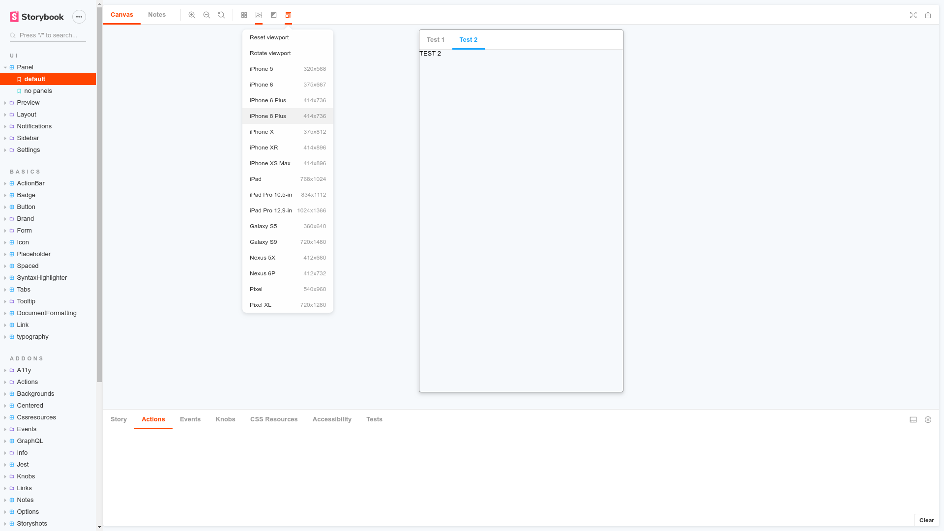
Storybook Viewport Addon allows your stories to be displayed in different sizes and layouts in Storybook. This helps build responsive components inside of Storybook.
Viewport is part of essentials and so is installed in all new Storybooks by default. If you need to add it to your Storybook, you can run:
npm i -D @storybook/addon-viewportThen, add following content to .storybook/main.js:
export default {
  addons: ['@storybook/addon-viewport'],
};
You should now be able to see the viewport addon icon in the the toolbar at the top of the screen.
The usage is documented in the documentation.