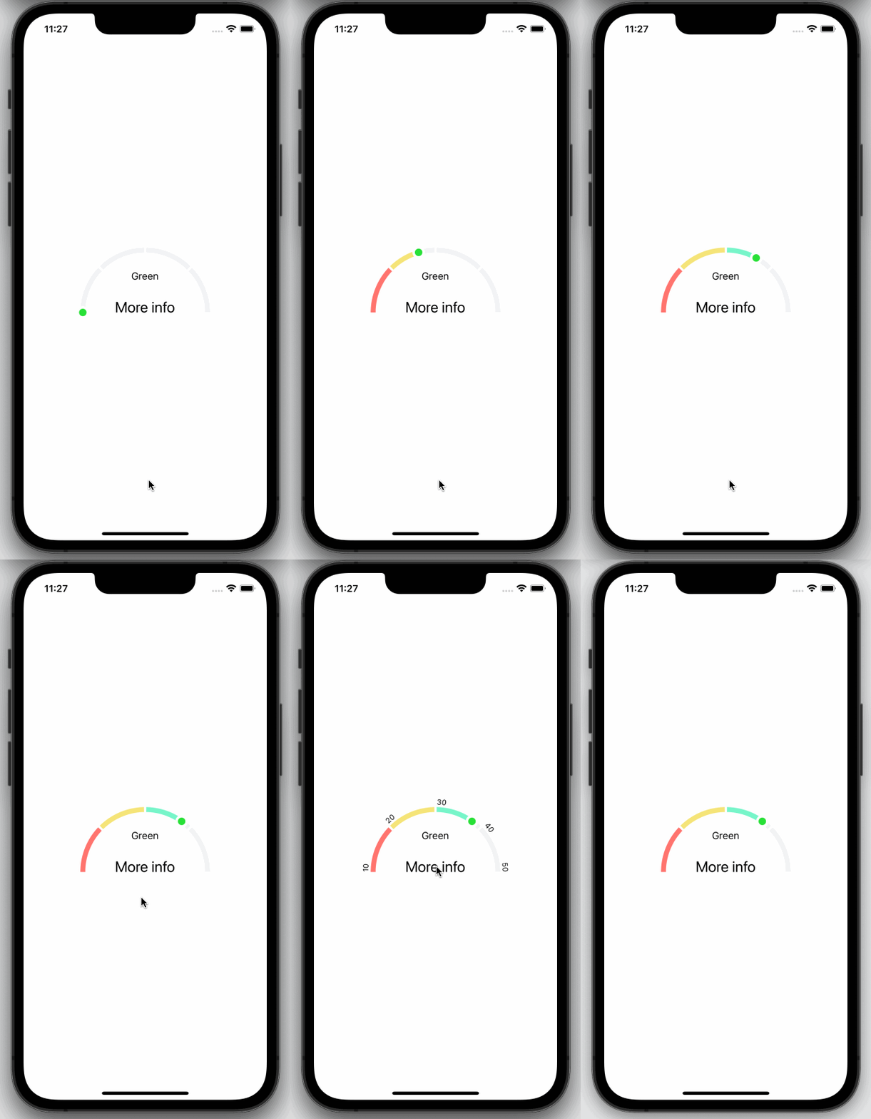
Segmented arc component for React Native. Check out our documentation below to learn how to get started.
There are two steps to get this package up and running.
-
Install
react-native-svglibrary by following their instructions. -
Install
@shipt/segmented-arc-for-react-native:
yarn add @shipt/segmented-arc-for-react-nativeor if you prefer to use npm:
npm install --save @shipt/segmented-arc-for-react-nativeHere is a basic example of how to use this component. It covers all the main features.
import React, { useState } from 'react';
import { View, Text, Pressable } from 'react-native';
import { SegmentedArc } from '@shipt/segmented-arc-for-react-native';

const App = () => {
  const [showArcRanges, setShowArcRanges] = useState(false);

  const segments = [
    {
      scale: 0.25,
      filledColor: '#FF746E',
      emptyColor: '#F2F3F5',
      data: { label: 'Red' }
    },
    {
      scale: 0.25,
      filledColor: '#F5E478',
      emptyColor: '#F2F3F5',
      data: { label: 'Yellow' }
    },
    {
      scale: 0.25,
      filledColor: '#78F5CA',
      emptyColor: '#F2F3F5',
      data: { label: 'Green' }
    },
    {
      scale: 0.25,
      filledColor: '#6E73FF',
      emptyColor: '#F2F3F5',
      data: { label: 'Blue' }
    }
  ];

  const ranges = ['10', '20', '30', '40', '50'];

  const _handlePress = () => {
    setShowArcRanges(!showArcRanges);
  };

  return (
    <View style={{ flex: 1, alignItems: 'center', justifyContent: 'center' }}>
      <SegmentedArc
        segments={segments}
        fillValue={70}
        isAnimated={true}
        animationDelay={1000}
        showArcRanges={showArcRanges}
        ranges={ranges}
      >
        {metaData => (
          <Pressable onPress={_handlePress} style={{ alignItems: 'center' }}>
            <Text style={{ fontSize: 16, paddingTop: 16 }}>{metaData.lastFilledSegment.data.label}</Text>
            <Text style={{ lineHeight: 80, fontSize: 24 }}>More info</Text>
          </Pressable>
        )}
      </SegmentedArc>
    </View>
  );
};

export default App;
Try this example yourself here.
| Name | Type | Default | Description |
|---|---|---|---|
| fillValue | number (0-100) | 0 | Current progress value |
| segments | Array of { scale: number, filledColor: string, emptyColor: string, data: object } | [] | Segments of the arc. Here, scale is a percentage value out of 100%, filledColor for filled part of a segment, and emptyColor is background color for an empty segment, data could be any object that you'd want to receive back for a segment. See example above. |
| filledArcWidth | number | 8 | Thickness of progress line |
| emptyArcWidth | number | 8 | Thickness of background line |
| spaceBetweenSegments | number | 2 | Space between segments |
| arcDegree | number | 180 | Degree of arc |
| radius | number | 100 | Arc radius |
| isAnimated | bool | true | Enable/disable progress animation |
| animationDuration | number | 1000 | Progress animation duration |
| animationDelay | number | 0 | Progress animation delay |
| ranges | Array of strings | [] | Arc ranges (segments) display values |
| rangesTextColor | string | '#000000' | Color of ranges text |
| rangesTextStyle | object | { fontSize: 12 } | Ranges text styling |
| showArcRanges | bool | false | Show/hide arc ranges |
| middleContentContainerStyle | object | {} | Extra styling for the middle content container |
| capInnerColor | string | '#28E037' | Cap's inner color |
| capOuterColor | string | '#FFFFFF' | Cap's outer color |
| children | function | Pass a function as a child. It receives metaData with the last filled segment's data as an argument. From there you can extract data object. See example above. | |
Read the Attributions here.
Please read our CONTRIBUTING.md for details on our community guidelines and the process for submitting pull requests to us.
To find out who our Maintainers are, check out MAINTAINERS.md.
We use SemVer for versioning. For the versions available, see the tags on this repository.
To update versions, run the yarn version and follow the prompts.
This project is licensed under the MIT License - see the LICENSE.md file for details.
Check out NOTICE.md.
Check out SECURITY.md.
