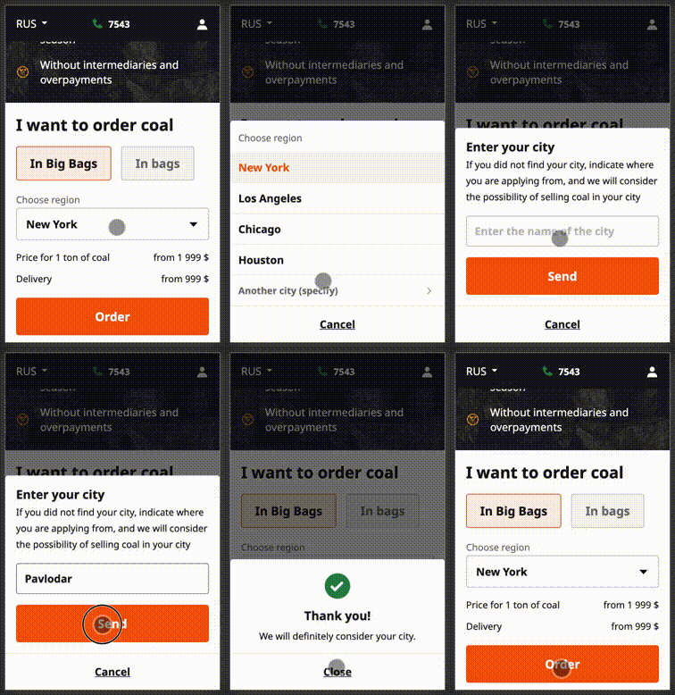
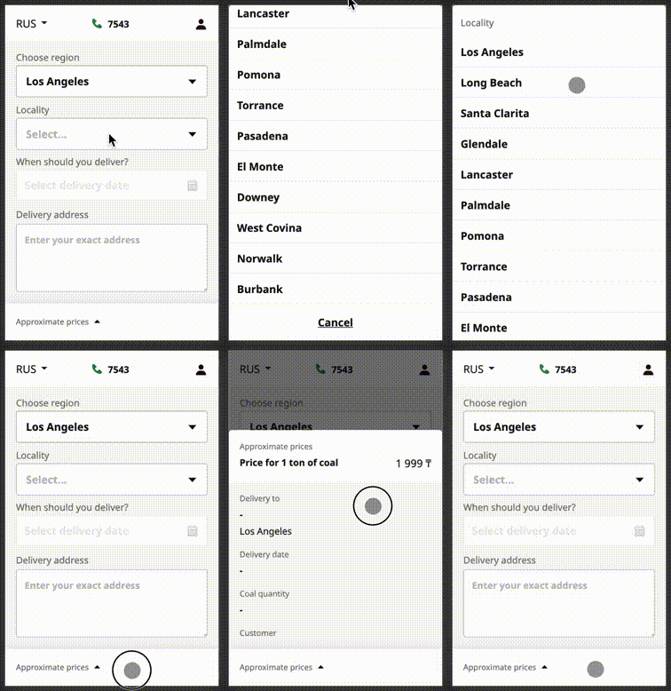
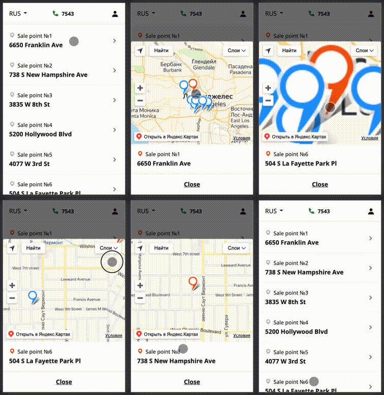
Swipeable bottom sheet
Swipeable bottom sheet implementation, that uses react-swipeable-views.
Installation
Open a Terminal in the project root and run:
npm install @sergeymyssak/swipeable-bottom-sheetor
yarn add @sergeymyssak/swipeable-bottom-sheetQuick start
BottomSheet.js
import React, { memo } from "react";
import classNames from "classnames";
import SwipeableBottomSheet from '@sergeymyssak/swipeable-bottom-sheet';
import '@sergeymyssak/swipeable-bottom-sheet/lib/min.css';
import "./index.css";

const BottomSheet = ({
  isOpen,
  disableSwipe = false,
  onChange,
  children,
  containerClassName,
  bodyClassName
}) => (
  <SwipeableBottomSheet
    isOpen={isOpen}
    onChange={onChange}
    swipeableViewsProps={{ disabled: disableSwipe }}
    containerClassName={classNames("custom-bottom-sheet", containerClassName)}
    bodyClassName={classNames("custom-bottom-sheet__body", bodyClassName)}
  >
    {children}
  </SwipeableBottomSheet>
);

export default memo(BottomSheet);
index.css
.custom-bottom-sheet {
  z-index: 8;
  display: none;
  background-color: "white";
}

.custom-bottom-sheet__body {
  border-top-left-radius: 4px;
  border-top-right-radius: 4px;
}

@media only screen and (max-width: 767px) {
  .custom-bottom-sheet {
    display: unset;
  }
}
You can see the example here
Options
marginTop (optional): number
The top margin applied to the top of the sheet when open. Defaults to 0.
overflowHeight (optional): number
Height(px) of the visible part when the bottom sheet is closed. Defaults to 0.
isOpen (required): boolean
Use this property to control the state of the bottom sheet.
isFullScreen (optional): boolean
If true, the bottom sheet will stretch to the full height of the window.
isScrollTopOnClose (optional): boolean
If true, content scrolls to the top when the bottom sheet will be closed.
containerClassName (optional): string
Classname applied on the container of the bottom sheet.
bodyClassName (optional): string
Classname applied on the body of the bottom sheet.
overlayClassName (optional): string
Classname applied on the overlay of the bottom sheet.
swipeableViewsProps (optional): SwipeableViews
Use react-swipeable-views (v0.13.9) props.
See props
SwipeableViews.propTypes = {
  /**
   * This is callback property. It's called by the component on mount.
   * This is useful when you want to trigger an action programmatically.
   * It currently only supports updateHeight() action.
   *
   * @param {object} actions This object contains all posible actions
   * that can be triggered programmatically.
   */
  action: PropTypes.func,
  /**
   * If `true`, the height of the container will be animated to match the current slide height.
   * Animating another style property has a negative impact regarding performance.
   */
  animateHeight: PropTypes.bool,
  /**
   * If `false`, changes to the index prop will not cause an animated transition.
   */
  animateTransitions: PropTypes.bool,
  /**
   * The axis on which the slides will slide.
   */
  axis: PropTypes.oneOf(['x', 'x-reverse', 'y', 'y-reverse']),
  /**
   * Use this property to provide your slides.
   */
  children: PropTypes.node.isRequired,
  /**
   * This is the inlined style that will be applied
   * to each slide container.
   */
  containerStyle: PropTypes.object,
  /**
   * If `true`, it will disable touch events.
   * This is useful when you want to prohibit the user from changing slides.
   */
  disabled: PropTypes.bool,
  /**
   * This is the config used to disable lazyloding,
   * if `true` will render all the views in first rendering.
   */
  disableLazyLoading: PropTypes.bool,
  /**
   * If `true`, it will enable mouse events.
   * This will allow the user to perform the relevant swipe actions with a mouse.
   */
  enableMouseEvents: PropTypes.bool,
  /**
   * Configure hysteresis between slides. This value determines how far
   * should user swipe to switch slide.
   */
  hysteresis: PropTypes.number,
  /**
   * If `true`, it will ignore native scroll container.
   * It can be used to filter out false positive that blocks the swipe.
   */
  ignoreNativeScroll: PropTypes.bool,
  /**
   * This is the index of the slide to show.
   * This is useful when you want to change the default slide shown.
   * Or when you have tabs linked to each slide.
   */
  index: PropTypes.number,
  /**
   * This is callback prop. It's call by the
   * component when the shown slide change after a swipe made by the user.
   * This is useful when you have tabs linked to each slide.
   *
   * @param {integer} index This is the current index of the slide.
   * @param {integer} indexLatest This is the oldest index of the slide.
   * @param {object} meta Meta data containing more information about the event.
   */
  onChangeIndex: PropTypes.func,
  /**
   * @ignore
   */
  onMouseDown: PropTypes.func,
  /**
   * @ignore
   */
  onMouseLeave: PropTypes.func,
  /**
   * @ignore
   */
  onMouseMove: PropTypes.func,
  /**
   * @ignore
   */
  onMouseUp: PropTypes.func,
  /**
   * @ignore
   */
  onScroll: PropTypes.func,
  /**
   * This is callback prop. It's called by the
   * component when the slide switching.
   * This is useful when you want to implement something corresponding
   * to the current slide position.
   *
   * @param {integer} index This is the current index of the slide.
   * @param {string} type Can be either `move` or `end`.
   */
  onSwitching: PropTypes.func,
  /**
   * @ignore
   */
  onTouchEnd: PropTypes.func,
  /**
   * @ignore
   */
  onTouchMove: PropTypes.func,
  /**
   * @ignore
   */
  onTouchStart: PropTypes.func,
  /**
   * The callback that fires when the animation comes to a rest.
   * This is useful to defer CPU intensive task.
   */
  onTransitionEnd: PropTypes.func,
  /**
   * If `true`, it will add bounds effect on the edges.
   */
  resistance: PropTypes.bool,
  /**
   * This is the className that will be applied
   * on the slide component.
   */
  slideClassName: PropTypes.string,
  /**
   * This is the inlined style that will be applied
   * on the slide component.
   */
  slideStyle: PropTypes.object,
  /**
   * This is the config used to create CSS transitions.
   * This is useful to change the dynamic of the transition.
   */
  springConfig: PropTypes.shape({
    delay: PropTypes.string,
    duration: PropTypes.string,
    easeFunction: PropTypes.string,
  }),
  /**
   * This is the inlined style that will be applied
   * on the root component.
   */
  style: PropTypes.object,
  /**
   * This is the threshold used for detecting a quick swipe.
   * If the computed speed is above this value, the index change.
   */
  threshold: PropTypes.number,
};


