Semiorbit iSpinner
A simple react spinner like iOS UIActivityIndicatorView. Custom size and color features have been added.
Usage
import ISpinner from "@semiorbit/ispinner";
<ISpinner />
// dark background
<div className="black-div">
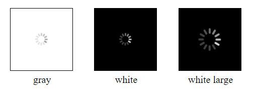
<ISpinner white />
</div>
// custom color
<ISpinner color="red" large />
// custom size
<ISpinner size={40} />iSpinner Props
| Property | Type | Default Value | Description |
|---|---|---|---|
| white | boolean | false | White spinner for dark background |
| large | boolean | false | Spinner large size "35px", normal size "20px" |
| size | number | null | Spinner width and height |
| color | string | null | Spinner color eg. "red" or "#FF0000" |
| animating | boolean | true | Animating spinner if true |
Other properties are added to "ispinner" div element.
NB. Spinner css has been forked from this source: Demo
Preview
License
MIT