css-grid-helper
css-grid-helper is a small utility that you can use for working with CSS grid from javascript in a more declarative way.
Installation
Install using either yarn or npm:
# yarn
$ yarn add '@react-frontend-developer/css-grid-helper'
# npm
$ npm install '@react-frontend-developer/css-grid-helper'
Usage
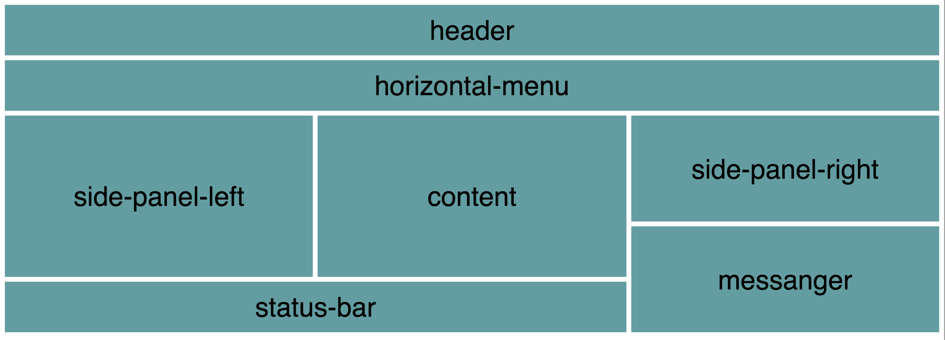
Let's assume that you build a grid-based layout, and you want your grid to look like this:
We recommend using the helper with one of the available css-in-js frameworks. Below we show how to use it with Glamorous which allows you to specify css styles in object syntax. If you prefer a closer to pure css way, you can try styled-components, which uses interpolated strings to specify the styles. For new projects though, I would recommend using emotion, which supports both object syntax and interpolated strings and it is smaller, faster, and more memory efficient.
With glamorous we can settle down on some conventions on how to approach styling in our javascript code - specially when we have component-based architecture in mind. An example convention might be as follows. If you have a React component that needs a grid, just create a file with Grid suffix with the content similar to the one below (here we have a component named Main and thus the grid module is MainGrid.js):
import glamorous from 'glamorous'
import { Grid } from '@react-frontend-developer/css-grid-helper'

let grid = new Grid([
  'header         header         header',
  'horizontalMenu horizontalMenu horizontalMenu',
  'sidePanelLeft  content        sidePanelRight',
  'sidePanelLeft  content        sidePanelRight',
  'sidePanelLeft  content        messenger',
  'statusBar      statusBar      messenger'
], {
  gridTemplateRows: 'max-content max-content 1fr 1fr 1fr 1fr'
})

const gridItemLayout = {
  display: 'flex',
  justifyContent: 'center',
  alignItems: 'center',
  fontSize: '28px',
  backgroundColor: 'CadetBlue',
  padding: '5px'
}

const MainGrid = glamorous.div(grid.container, {height: '100vh', padding: '5px', boxSizing: 'border-box'})

const HeaderGridItem = glamorous.div(grid.header, gridItemLayout)

const HorizontalMenuGridItem = glamorous.div(grid.horizontalMenu, gridItemLayout)

const SidePanelLeftGridItem = glamorous.div(grid.sidePanelLeft, gridItemLayout)

const ContentGridItem = glamorous.div(grid.content, gridItemLayout)

const SidePanelRightGridItem = glamorous.div(grid.sidePanelRight, gridItemLayout)

const MessengerGridItem = glamorous.div(grid.messenger, gridItemLayout)

const StatusBarGridItem = glamorous.div(grid.statusBar, gridItemLayout)

export { MainGrid, HeaderGridItem, HorizontalMenuGridItem, SidePanelLeftGridItem,
  ContentGridItem, SidePanelRightGridItem, MessengerGridItem,
  StatusBarGridItem }
The Grid constructor now takes two arguments: the value of grid-template-areas CSS property (as an array of strings, each element corresponding to a row), and optionally an object containing the values for the properties we want to overwrite. Here we modify the gridTemplateRows so that it accommodates the height of the header and the horizontalMenu by using the max-content property value.
After construction, the returned grid object provides properties named after the grid template areas, holding the necessary styling for the given grid item. Additionally, the grid object will have a container property holding the style for grid container element.
We want all the grid items to receive the following basic styling:
const gridItemLayout = {
  display: 'flex',
  justifyContent: 'center',
  alignItems: 'center',
  fontSize: '28px',
  backgroundColor: 'CadetBlue',
  padding: '5px'
}
It should be very basic as the components that you put inside the gird cells should style themselves - they know better how they want to look like. In our example, the last three properties are added just to make example slightly more visually attractive.
Using glamorous, we conveniently merge the grid styling with the gridItemLayout. Where appropriate, we modify the basic styling of the container or the grid items to accommodate our specific needs. Glamorous makes that all very easy.
In the end we export the grid container (here MainGrid) and the remaining grid components that we then import and use in the Main.js file to create the actual grid:
import React, { Component } from 'react'

import { MainGrid, HeaderGridItem, HorizontalMenuGridItem, SidePanelLeftGridItem,
  ContentGridItem, SidePanelRightGridItem, MessengerGridItem,
  StatusBarGridItem } from './MainGrid'

class Main extends Component {

  render() {
    return (
      <MainGrid>
        <HeaderGridItem>
          HeaderComponent
        </HeaderGridItem>
        <HorizontalMenuGridItem>
          HorizontalMenuComponent
        </HorizontalMenuGridItem>
        <SidePanelLeftGridItem>
          SidePanelLeftComponent
        </SidePanelLeftGridItem>
        <ContentGridItem>
          ContentComponent
        </ContentGridItem>
        <SidePanelRightGridItem>
          SidePanelRightComponent
        </SidePanelRightGridItem>
        <MessengerGridItem>
          MessengerComponent
        </MessengerGridItem>
        <StatusBarGridItem>
          StatusBarComponent
        </StatusBarGridItem>
      </MainGrid>
    );
  }
}

export { Main }
With this, we nicely separate the actual rendering of the grid in the Main component from the grid configuration that is provided by the Grid helper. We use css-in-js framework Glamorous to make the grid more React-like.
See also
For a more complete story behind css-grid-helper, please consult the nextbuild-2017-css-grid repository.