

Kendo UI for Angular Inputs Package (Checkbox, ColorGradient, ColorPalette, ColorPicker, FlatColorPicker, FormField, MaskedTextBox, NumericTextBox, RadioButton, RangeSlider, Slider, Switch, TextArea, and TextBox Components)
Important
- This package is part of Kendo UI for Angular—a commercial library designed and built for developing business applications with Angular. Every UI component in the Kendo UI for Angular suite has been built from the ground-up specifically for Angular.
- You will need to install a license key when adding the package to your project. For more information, please refer to the Kendo UI for Angular My License page.
- To receive a license key, you need to either purchase a license or register for a free trial. Doing so indicates that you accept the Kendo UI for Angular License Agreement.
- The 30-day free trial gives you access to all the Kendo UI for Angular components and their full functionality. Additionally, for the period of your license, you get access to our legendary technical support provided directly by the Kendo UI for Angular dev team!
Start using Kendo UI for Angular and speed up your development process!
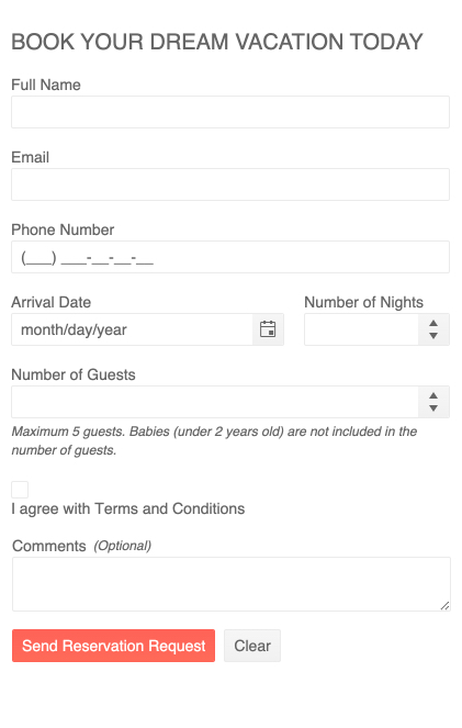
The Kendo UI for Angular Inputs package is a collection of components that render interactive and accessible input fields, each specialized for their specific format. The Inputs are built from the ground-up and specifically for Angular, so that you get high-performance input controls which integrate tightly with your application.
What's Included in The Package:
- Angular Checkbox Component
- Angular ColorGradient Component
- Angular ColorPalette Component
- Angular ColorPicker Component
- Angular FlatColorPicker Component
- Angular FormField Component
- Angular MaskedTextBox Component
- Angular NumericTextBox Component
- Angular RadioButton Component
- Angular RangeSlider Component
- Angular Slider Component
- Angular Switch Component
- Angular TextArea Component
- Angular TextBox Component
These features are common across all components in the packatge.
- Delaying Input Value Changes—By default, value updates are processed immediately after the input.But, if you need to allow time for complex scenarios and operations, you can configure a slight delay before the components accept the new input value.
- Disabled Inputs—Display the Inputs in their read-only state.
- Forms Support—The Inputs provide support both for the asynchronous template-driven Angular forms and the predominantly synchronous reactive Angular forms. This feature allows you to draw on the logic set either in the template, or in the component or typescript code.
- Appearance—All aspects of the Inputs can be customized by theme variables or configuration options. Kendo UI for Angular delivers a set of popular themes including Bootstrap and Material, all of which can be easily customized with the Progress ThemeBuilder online utility.
- Globalization—The Kendo UI for Angular Inputs support globalization to ensure that each Inputs component can fit well in any application, no matter what languages and locales need to be supported. Additionally, the Inputs support rendering in a right-to-left (RTL) direction.
- Accessibility—The Inputs are accessible for screen readers and support WAI-ARIA attributes.
- Keyboard Navigation—The Inputs support a number of keyboard shortcuts which alow users to accomplish various commands.
The Angular Checkbox Component is a directive that helps you style checkbox input elements. It supports all regular HTML checkbox attribures and Angular bindings.
- Indeterminate State—Render the checkbox in indeterminate state whether or not it is checked.
- Labels—Associate a label through HTML elements or use the Kendo UI for Angular Label Component.
The Angular ColorGradient Component renders a gradient with hue and alpha sliders for interactive color picking as well as inputs to manually enter a desired color.
- Contrast Tool—This optional tool checks the contrast ratio between two colors to ensures that the selected color meets certain contrast requirements like AA or AAA.
- Customization—Choose to show or hide certain controls such as opacity.
The Angular ColorPalette Component renders sets of predefined colors from which users can choose. A common example is swithcing clothing colors when online shopping.
- Color Presets—This component provides a set of preset palettes or you can define your own.
- Customization—Built-in options help you specify rendering, columns, and tile sizes, and to customize the color formats palettes.
The Angular ColorPicker Component combines the ColorGradient and ColorPalette to provide a rich color selection tool that appears in a popup and provides a variety of ways to select colors as well as a preview of selected colors.
- Contrast Tool—This optional tool checks the contrast ratio between two colors to ensures that the selected color meets certain contrast requirements like AA or AAA.
- Customization—For ultimate flexibility, you can configure each building block including views toggles, clear button, action buttons, palette view, gradient view, and icons.
- Control the Open State—Determine whether the popup is open or closed when the component loads.
The Angular FlatColorPicker Component is the same as the Angular ColorPicker, except the picker is not hidden in a popup. It renders directly on the page.
- Contrast Tool—This optional tool checks the contrast ratio between two colors to ensures that the selected color meets certain contrast requirements like AA or AAA.
- Customization—For ultimate flexibility, you can configure each building block including views toggles, clear button, action buttons, palette view, gradient view, and icons.
The Angular FormField Component helps you group form related content to layout out and configure fields, labels, hints, and error messages.
The Angular MaskedTextBox Component enables you to control input by enforcing format using a mask. A common example is requiring phone number formats.
- Masks—The Angular NumericTextBox includes a set of predefined masks, but also allows you to create your own.
- Validation—A built-in validator enforces formatting rules.
The Angular NumericTextBox Component provides spin buttons to help users enter and edit numeric bvalues.
- Restrictions—Control user input by restricting elements such as fraction length, value ranges, and maximum length.
- Predefined Steps—Specify the value by which the value increments up or down when the spin buttons are clicked.
The Angular RadioButton Component is a directive that helps you style the radio input element.
- Labels—Associate a label through HTML elements or use the Kendo UI for Angular Label Component.
The Angular RangeSlider Component allows users to visually specify numberic ranges by dragging its handles or clicking its track.
- Orientation—Choose to render the Angular RangeSlider horizontally or vertically.
- Ticks—Configure the placement, titles, and width or the ticks that designate value steps along the track.
- Predefined Steps—Configure the way the RangeSlider divides its range and updates the value by using the step options.
The Angular Slider Component enables the user to increase, decrease, and select predefined values by dragging its handle along the track, or by clicking its side arrow buttons.
- Orientation—Choose to render the Angular Slider horizontally or vertically.
- Ticks—Configure the placement, titles, and width or the ticks that designate value steps along the track.
- Predefined Steps—Configure the way the Slider divides its range and updates the value by using the step options.
- Side Buttons—Configure the side buttons that increase or decrease value by showing or hiding and displaying titles.
The Angular Switch Component is a visual toggle that switches between checked and unchecked states.
The Angular TextArea Component provides a highly customizable UI for entering and displaying multiple lines of text.
- Character Counter—Set a maximum length and show the character count and the max value.
- Adornments—Add custom items such as close buttons, insert attachement buttons, and settings buttons.
The Angular TextBox Component provides options for creating composite inputs that you can integrate within forms or use as standalone items.
- Character Counter—Set a maximum length and show the character count and the max value.
- Adornments—Add custom items such as close buttons, insert attachement buttons, and settings buttons.
- Validation Icons—Use built-in or custom icons to indicate successful and erroneous processes based on different conditions or validation.
- Get Started with Kendo UI for Angular (requires trial registration)
- Demos, documentation, and component reference
- Blogs
- Kendo UI for Angular pricing and licensing
Copyright © 2024 Progress Software Corporation and/or one of its subsidiaries or affiliates. All rights reserved.
Progress, Telerik, and certain product names used herein are trademarks or registered trademarks of Progress Software Corporation and/or one of its subsidiaries or affiliates in the U.S. and/or other countries.