

Kendo UI for Angular DropDowns Package (AutoComplete, ComboBox, DropDownList, DropDownTree, MultiColumnComboBox and MultiSelect Components)
Important
- This package is part of Kendo UI for Angular—a commercial library designed and built for developing business applications with Angular. Every UI component in the Kendo UI for Angular suite has been built from the ground-up specifically for Angular.
- You will need to install a license key when adding the package to your project. For more information, please refer to the Kendo UI for Angular My License page.
- To receive a license key, you need to either purchase a license or register for a free trial. Doing so indicates that you accept the Kendo UI for Angular License Agreement.
- The 30-day free trial gives you access to all the Kendo UI for Angular components and their full functionality. Additionally, for the period of your license, you get access to our legendary technical support provided directly by the Kendo UI for Angular dev team!
Start using Kendo UI for Angular and speed up your development process!
The Angular Dropdowns package includes variety of highly configurable drop-down types that allow you to quickly and easily create the exact Dropdowns component you need to statisfy requirements for functionality and appearance. The Dropdowns are built from the ground-up and specifically for Angular, so that you get high-performance drop-down controls which integrate tightly with your application.
What's Included in This Package:
- Data Binding—Bind the Angular Dropdowns to remote or local data list that can contain primitive or complex items.
- Virtualization—Improve performance when loading large data sets by displaying a fixed amount of items in the dropdown lists.
- Forms Support—All Dropdowns provide support both for the asynchronous template-driven Angular forms and the predominantly synchronous reactive Angular forms. This feature allows you to draw on the logic set either in the template, or in the component or typescript code.
- Filtering—Filter functionality is included. Also, the Dropdowns provide further options for fine-tuning and customizing the funtion such as setting a minimum length of the search symbols, using the built-in filter directive, and more.
- Grouping—Aside from DropDownTree and MultiSeelctTree components, the dropdowns all support data grouping.
- Disabled Options—You can choose to disable some of the predefined list options of the Dropdowns so that, if need be present, users will not be able to interact with them.
- Appearance—Each component provides options for customizing the look and feel such as size, border radius, and fill modes.
- Templates—Customize the content and the general look and feel of the items and elements list by utilizing the ready-to-use header, footer, and other templates.
- Globalization—The Kendo UI for Angular Dropdowns support globalization to ensure that they can fit well in any application, no matter what languages and locales need to be supported. Additionally, the Dropdowns support rendering in a right-to-left (RTL) direction.
- Accessibility—The Dropdowns are accessible for screen readers and support WAI-ARIA attributes.
- Keyboard Navigation—The Dropdowns support a number of keyboard shortcuts which allow users to accomplish various commands.
The Angular AutoComplete Component is a text field that shows suggested values in a drop down as the user types.
The Angular ComboBox Component is a form component in which a user chooses an item from a list of options that appear in a drop down or enter their own in the text field.
- Custom values—While you typically provide the list manually or through data binding, you can also allow users to enter their own values.
- Cascading ComboBoxes—Render a series of two or more ComboBoxes where each ComboBox is filtered based on the selected option in the previous ComboBox.
The Angular DropDownList Component is a form component that allows users to selct one value from a list created manually or through data binding. Items can only be added by the user through an "Add Item" button.
- Add New Item—Render an "Add New Item" button when the user enters text that does not match one of the predefined items.
- Cascading DropDownLists—Render a series of two or more DropDownLists where each DropDownList is filtered based on the selected option in the previous DropDownList.
The Angular DropDownTree Component renders data in a tree-like structure and lets users choose a single predefined value.
- Control the open state—Show or hide items in the options list when the component is loaded.
- Persist expanded state of nodes—The DropDownTree can remember the open or closed stated of nodes when a the component is reloaded.
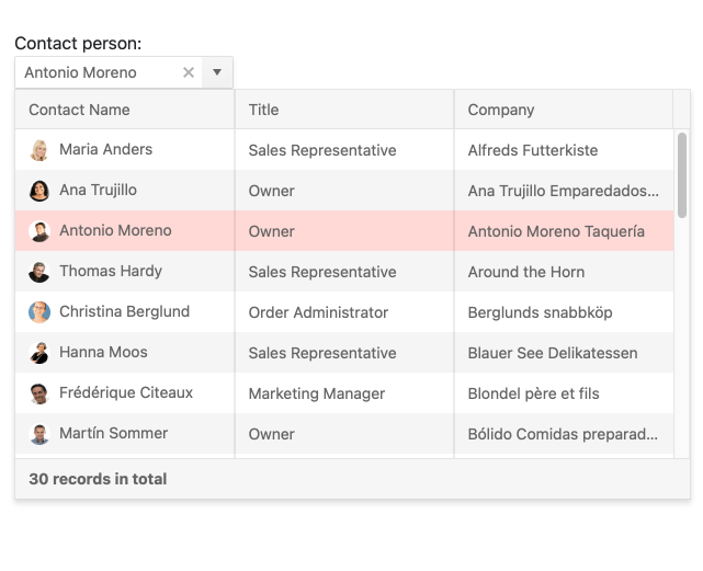
The Angular MultiColumnComboBox Component is a form component that allows users to choose from a list of items in a table (or grid) strucutre.
- Custom values—Allow users to enter their own values when they do not exist in the predefined list.
- Contol the open state—Show or hide items in the options list when the component is loaded.
The Angular MultiSelect Component displays a list of options and allows users to select one or more.
- Custom values—Allow users to enter their own values when they do not exist in the predefined list.
- Contol the open state—Show or hide items in the options list when the component is loaded.
- Summary-tag mode—Customize the display of the selected tags with a summary, chips, and more.
The Angular MultiSelectTree is a form component that renders data in a tree-like structure and allows for multiple selection.
- Contol the open state—Show or hide items in the options list when the component is loaded.
- Persist expanded state of nodes—The MultiSelectTree can remember the open or closed stated of nodes when a the component is reloaded.
- Summary-tag mode—Customize the display of the selected tags with a summary, chips, and more.
- Get Started with Kendo UI for Angular (requires trial registration)
- Demos, documentation, and component reference
- Blogs
- Kendo UI for Angular pricing and licensing
Copyright © 2024 Progress Software Corporation and/or one of its subsidiaries or affiliates. All rights reserved.
Progress, Telerik, and certain product names used herein are trademarks or registered trademarks of Progress Software Corporation and/or one of its subsidiaries or affiliates in the U.S. and/or other countries.