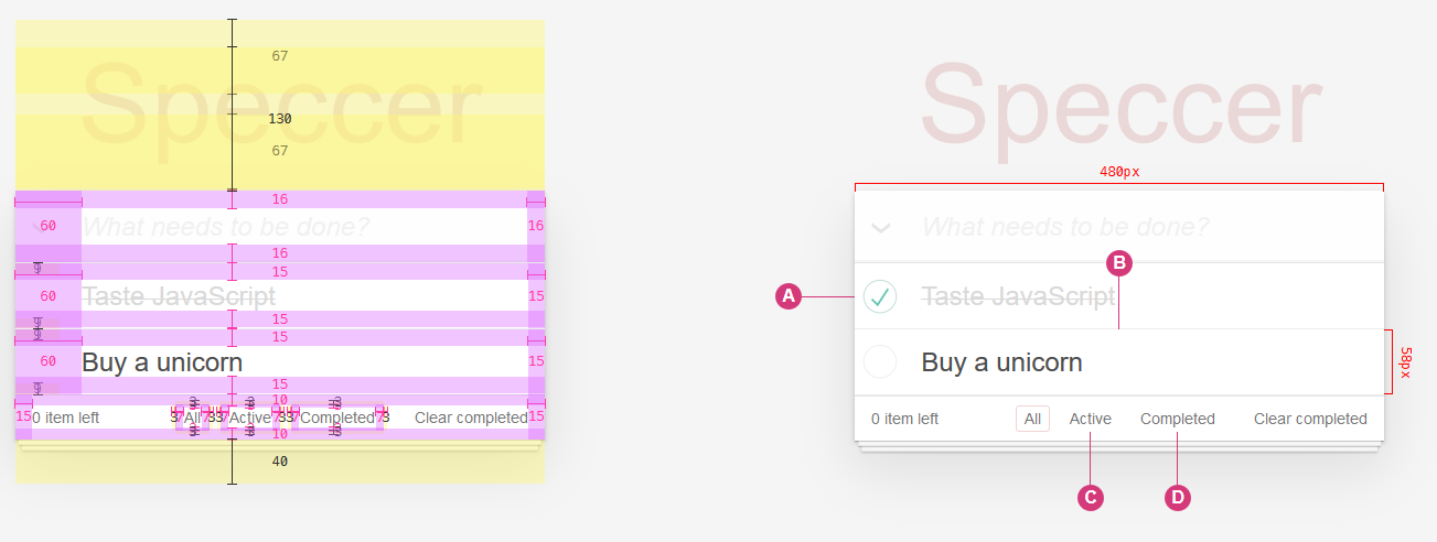
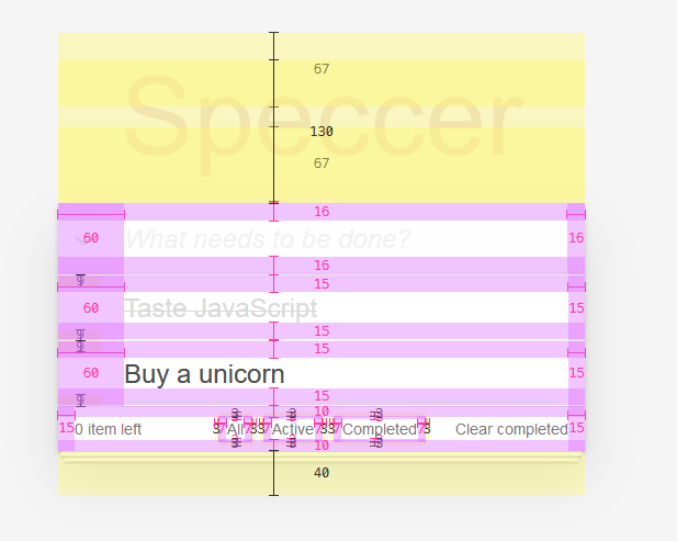
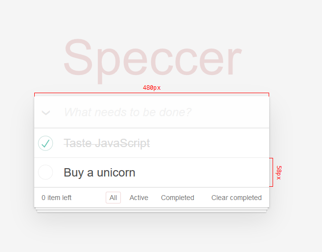
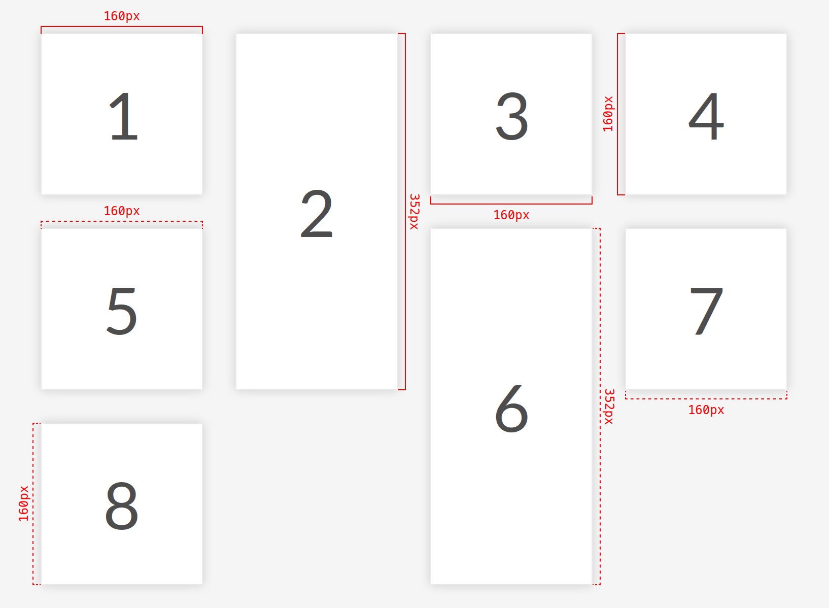
A zero dependency package to highlight elements
Speccer was originally created to make it easier to document components in a design system, but you can use it to whatever you like, if you are in the need to highlight any element!
npm i @phun-ky/speccer
See demo here: https://codepen.io/phun-ky/pen/xaOrYX
Go here to read the full API documentation.
Types can be found in @phun-ky/speccer/dist/speccer.d.ts.
Either import and run the required functions:
import '@phun-ky/speccer/dist/speccer.min.css';
import speccer from '@phun-ky/speccer';

// do stuff
speccer();Or place these script and link tags in your web page:
<link rel="stylesheet" href="../path/to/speccer.min.css" />
<script src="../path/to/speccer.js"></script>
Or with a CDN:
<link
  rel="stylesheet"
  href="https://unpkg.com/@phun-ky/speccer/dist/speccer.min.css"
/>
<script src="https://unpkg.com/@phun-ky/speccer/dist/speccer.js"></script>
And then follow the steps below to display the specifications you want :)
If you use React, you can use an effect like this:
import React, { useEffect } from 'react';
import PropTypes from 'prop-types';

import debounce from './lib/debounce';
import '@phun-ky/speccer/dist/speccer.min.css';

const Component = () => {
  let speccerEventFunc;

  useEffect(async () => {
    const { default: speccer } = await import('@phun-ky/speccer');

    speccer();

    speccerEventFunc = debounce(function () {
      speccer();
    }, 300);

    window.addEventListener('resize', speccerEventFunc);
    return () => {
      window.removeEventListener('resize', speccerEventFunc);
    };
  }, []);

  return <div />;
};

export default Component;If you want to control speccer a bit more, you have some options. Apply one of these attributes to the script element for different types of initialization:
<script src="../speccer.js" data-<manual|instant|dom|lazy></script>Or with a CDN:
<script src="https://unpkg.com/@phun-ky/speccer/dist/speccer.js" data-<manual|instant|dom|lazy></script>| Tag | Description |
|---|---|
data-manual |
Makes window.speccer() available to be used when you feel like it |
data-instant |
fires off speccer() right away |
data-dom |
Waits for DOMContentLoaded
|
data-lazy |
Lazy loads speccer() per specced element |
If no attribute is applied, it will default to data-dom, as in, it will initialize when DOMContentLoaded is fired.
If you're importing speccer instead of with a script tag, you can use the following approach to apply lazy loading:
import { dissect, ElementDissectionResult } from "https://esm.sh/@phun-ky/speccer";

/**
 * Function to dissect an HTML element
 * @param {Element} target - The element to be dissected
 * @returns {Promise<ElementDissectionResult>} Promise that resolves with the dissection result
 */
const dissectElement = (target: Element): Promise<ElementDissectionResult> => {
  return dissect.element(target);
};

/**
 * Callback function for IntersectionObserver
 * @param {IntersectionObserverEntry[]} entries - Array of entries being observed
 * @param {IntersectionObserver} observer - The IntersectionObserver instance
 * @returns {Promise<void>} Promise that resolves when element dissection is complete
 */
const intersectionCallback: IntersectionObserverCallback = async (entries, observer) => {
  entries.forEach(async (entry) => {
    if (entry.intersectionRatio > 0) {
      await dissectElement(entry.target);
      observer.unobserve(entry.target);
    }
  });
};

// Creating IntersectionObserver instance with the callback
const dissectElementObserver = new IntersectionObserver(intersectionCallback);

/**
 * Function to observe elements using IntersectionObserver
 * @param {Element} el - The element to be observed
 */
const observeElement = (el: Element): void => {
  dissectElementObserver.observe(el);
};

// Observing elements with the specified data attribute
document.querySelectorAll('[data-anatomy-section]').forEach((el) => {
  observeElement(el);
});In your component examples, use the following attribute:
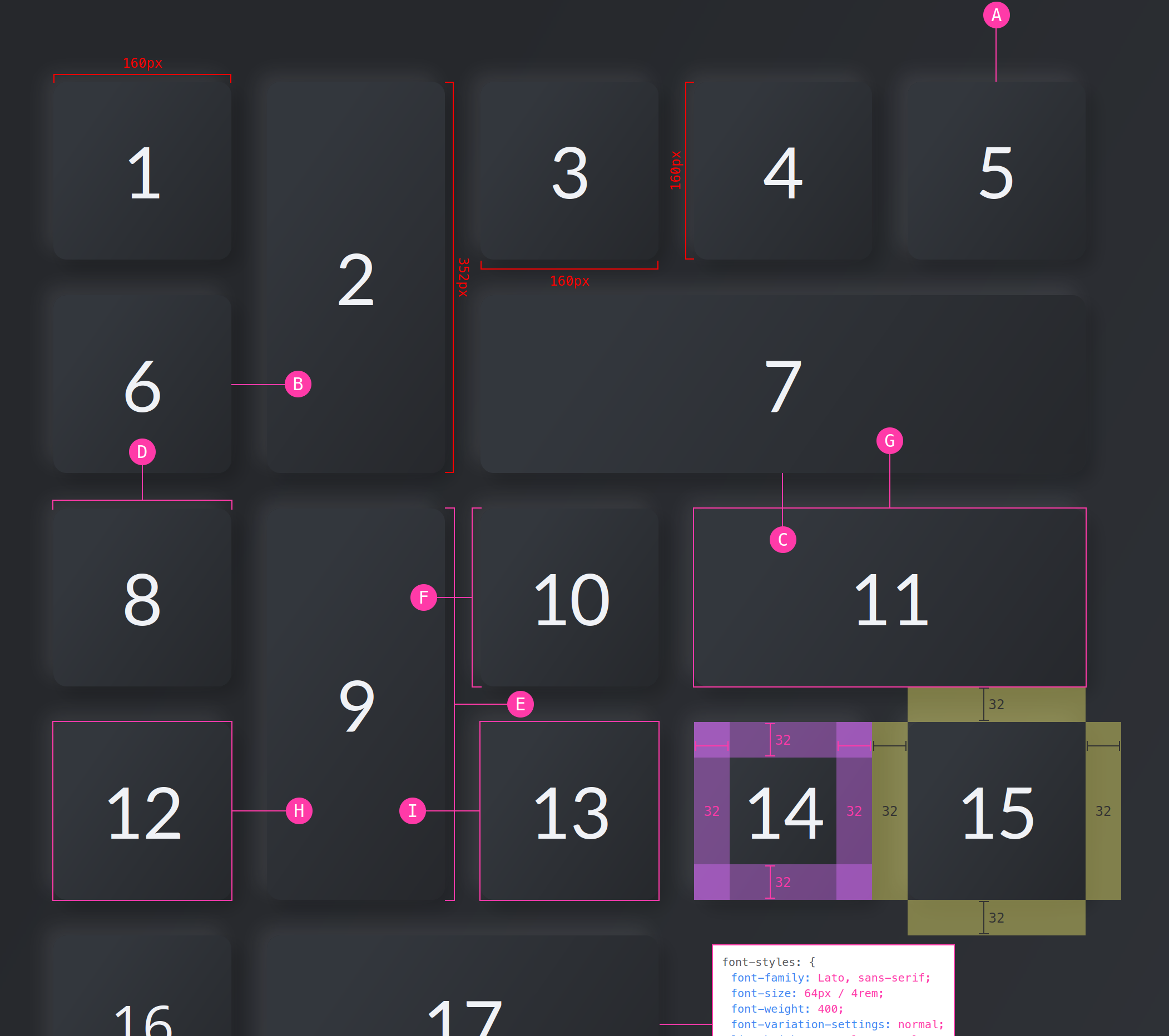
<div data-speccer class="..."></div>This will display the element and all of it's children padding and margin.
In your component examples, use the following attribute:
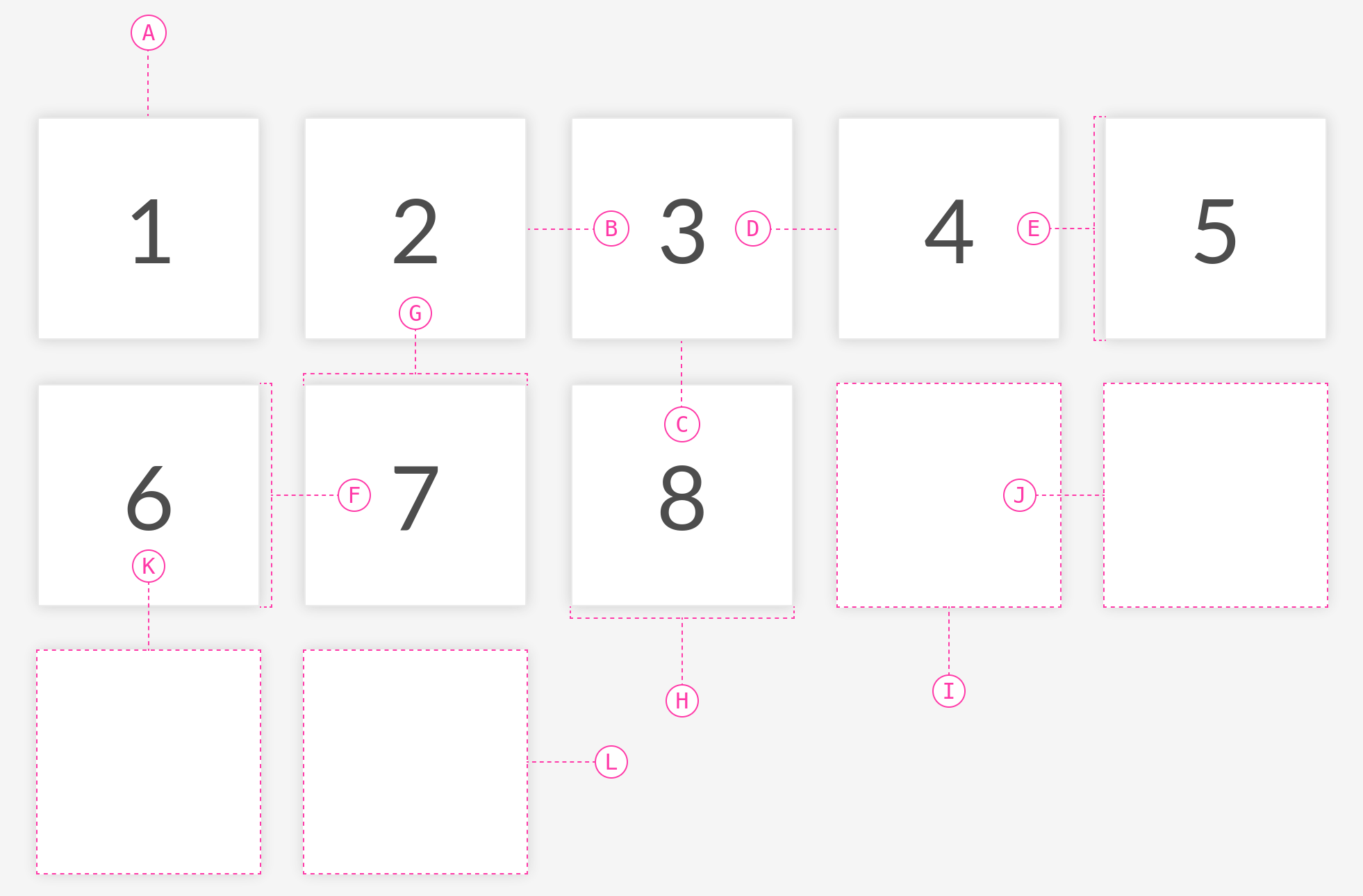
<div
  data-speccer-measure="[height right|left] | [width top|bottom]"
  class="..."
></div>
Where height and width comes with placement flags. Default for height is left, default for width is top.
You can also give a more subtle touch to the measure elements.
<div data-speccer-measure="height left subtle" class="..."></div>This will give a dashed border.
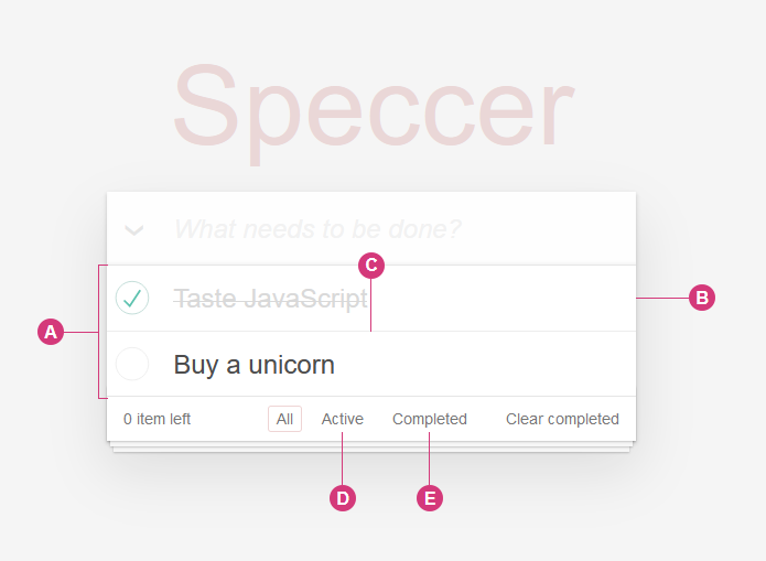
In your component examples, use the following attribute. Remember to use the data-anatomy-section as an attribute on a parent element to scope the marking.
<div data-anatomy-section>
  <div
    data-anatomy="outline [full|enclose][curly] [left|right|top|bottom]"
    class="..."
  ></div>
</div>
This will place a pin to the outline of the element. Default is top.
You can also give a more subtle touch to the anatomy elements.
<div data-anatomy-section>
  <div data-anatomy="outline top subtle" class="..."></div>
</div>You can use curly brackets with the curly tag in data-anatomy along side outline full to provide a more sleek look to the style.
[!NOTE]
Only works withoutline full
The curly brackets are made with SVG paths, and it is required to have the following snippet on your page for it to render:
<svg
  class="ph-speccer"
  viewBox="0 0"
  id="ph-speccer-svg"
  xmlns="http://www.w3.org/2000/svg"
>
  <path
    class="ph-speccer path original"
    id="ph-speccer-path"
    fill="none"
    stroke-width="1"
    stroke="currentColor"
  />
</svg>
This will give a dashed border, and a more subtle pin style.
In your component examples, use the following attribute.
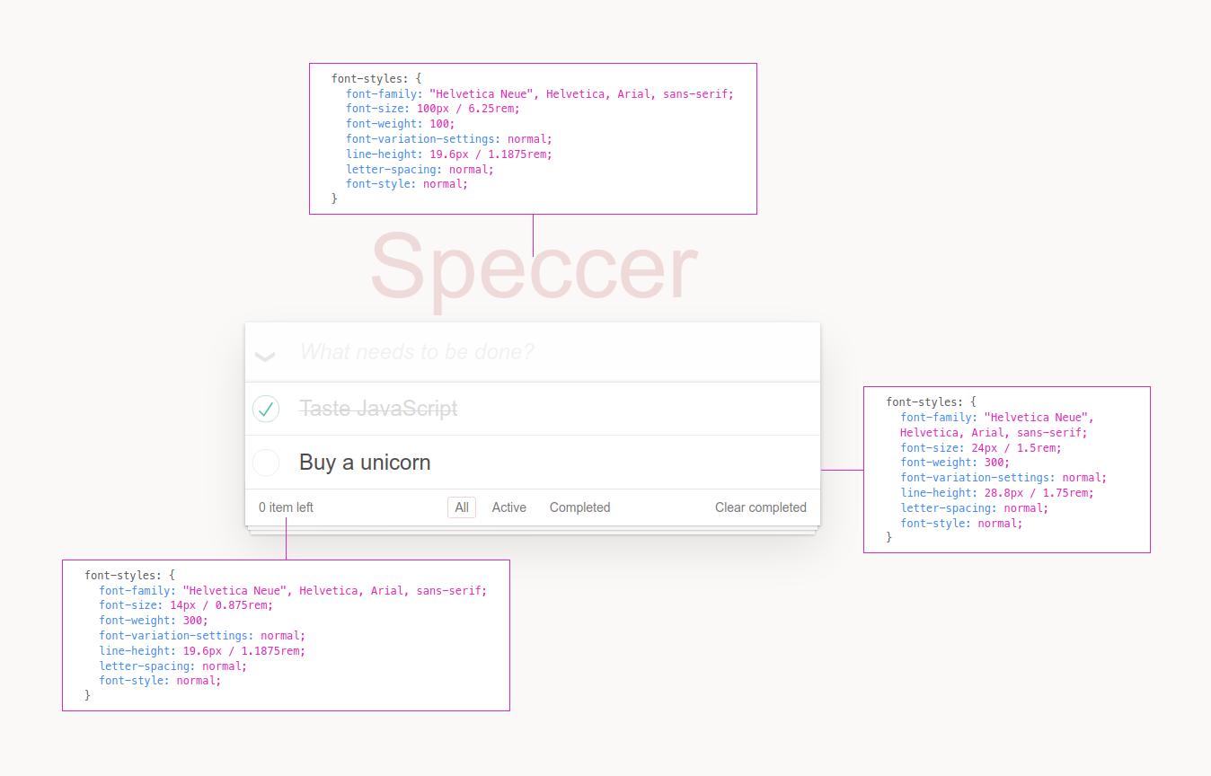
<div data-speccer-typography="[left|right|top|bottom]" class="...">
  Some text
</div>
This will place a box to display typography information. Default is left.
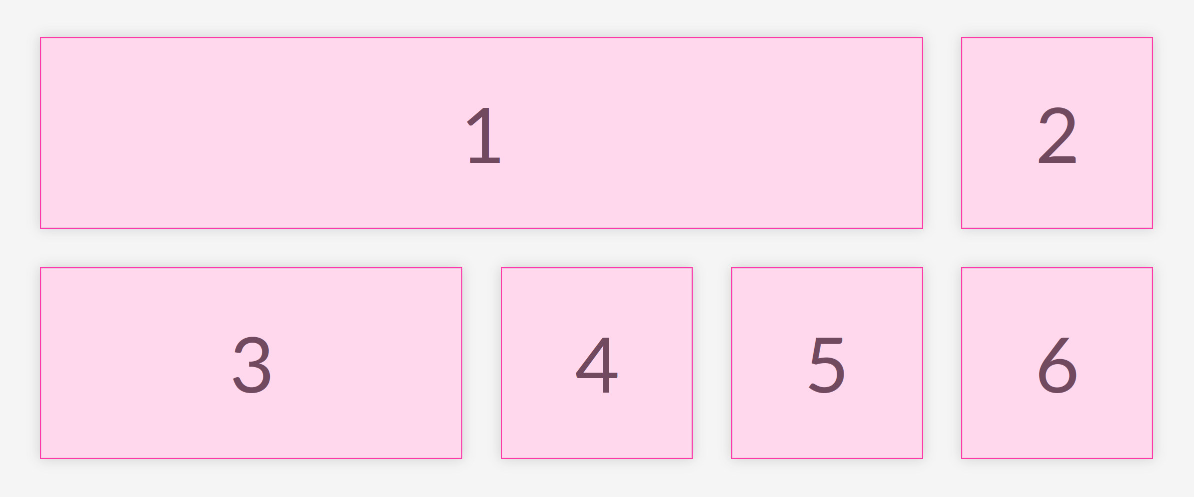
This will mark the given elements.
In your component examples, use the following attribute.
<div data-speccer-mark …>…</div>With speccer, you can also display accessibility notation, like Accessibility Bluelines:
Prior art: Jeremy Elder
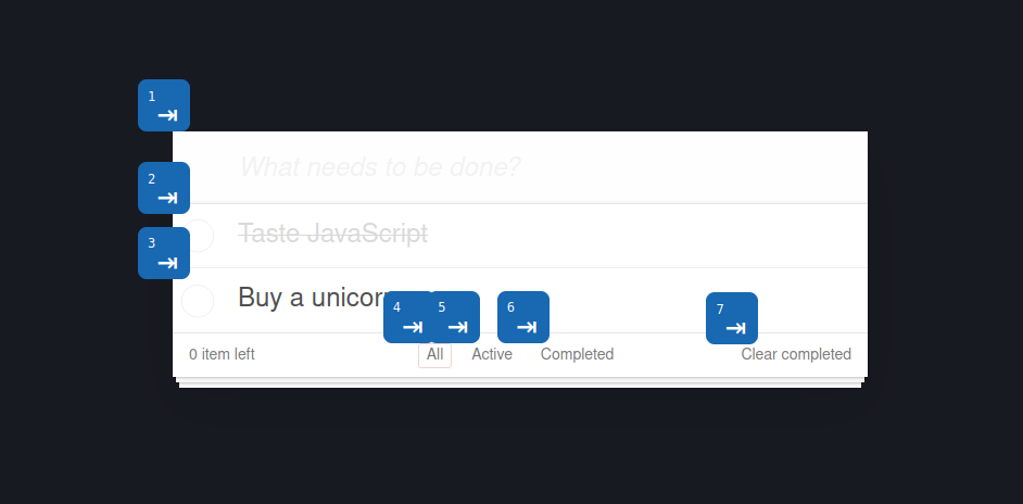
If you want to display tab stops, append data-speccer-a11y-tabstops as an attribute to the container you want to display the tab stops in.
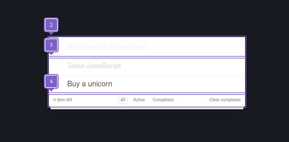
If you want to display landmarks and regions, append data-speccer-a11y-landmark as an attribute to the container you want to display the landmarks and regions in.
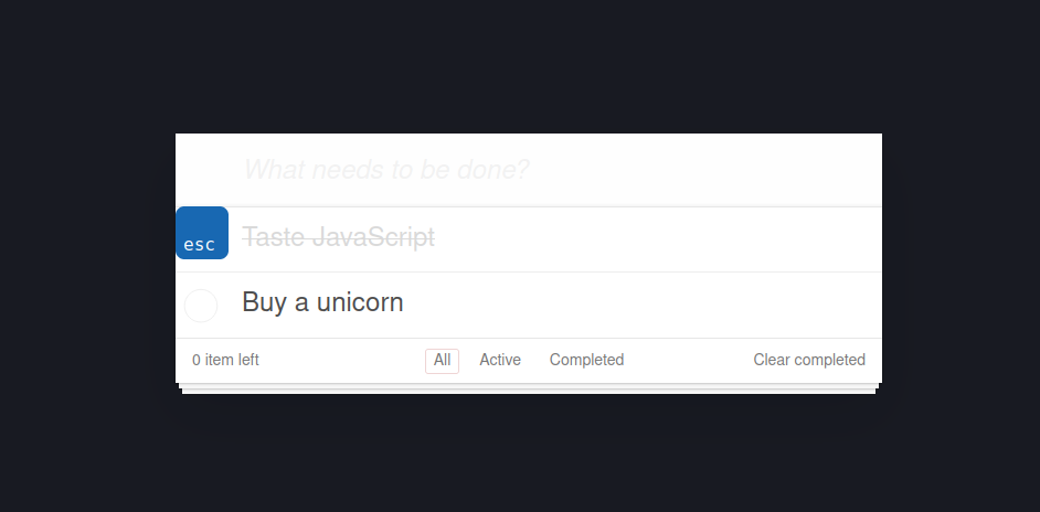
If you want to display the shortcut with keys used for elements, use data-speccer-a11y-shortcut="<shortcut>" on the element that uses this shortcut:
<button type="button" data-speccer-a11y-shortcut="ctrl + s">Save</button>Allthough the styling works nicely with dark mode, you can use the provided CSS variables to customize the look and feel. If more control is needed, you can use CSS overrides :)
.ph-speccer.speccer {
  --ph-speccer-color-padding: rgba(219, 111, 255, 0.4);
  --ph-speccer-color-padding-hover: #db6fff;
  --ph-speccer-color-margin: rgba(255, 247, 111, 0.4);
  --ph-speccer-color-margin-hover: #fff76f;
  --ph-speccer-color-text-light: #fff;
  --ph-speccer-color-text-dark: #333;
  --ph-speccer-color-contrast: #ff3aa8;
  --ph-speccer-spacing-color: var(--ph-speccer-color-contrast);
  --ph-speccer-measure-color: #f00;
  --ph-speccer-pin-color: var(--ph-speccer-color-contrast);
  --ph-speccer-typography-background-color: #fff;
  --ph-speccer-typography-color-property: #3f85f2;
  --ph-speccer-typography-color-text: #57575b;
  --ph-speccer-typography-color-value: var(--ph-speccer-color-contrast);
  --ph-speccer-depth-opacity-400: 0.4;
  --ph-speccer-font-family: 'Menlo for Powerline',
    'Menlo Regular for Powerline', 'DejaVu Sans Mono', Consolas, Monaco,
    'Andale Mono', 'Ubuntu Mono', monospace;
  --ph-speccer-font-size: 12px;
  --ph-speccer-line-height: 12px;
  --ph-speccer-pin-size: 24px;
  --ph-speccer-pin-space: 48px;
  --ph-speccer-line-width: 1px;
  --ph-speccer-line-width-negative: -1px;
  --ph-speccer-measure-size: 8px;
}If you want to contribute, please read the CONTRIBUTING.md and CODE_OF_CONDUCT.md
I'm an Open Source evangelist, creating stuff that does not exist yet to help get rid of secondary activities and to enhance systems already in place, be it documentation or web sites.
The sponsorship is an unique opportunity to alleviate more hours for me to maintain my projects, create new ones and contribute to the large community we're all part of :)


