multi-select
Presents a list of options and allows the user to select more than one
Installation
npm install @oscbco/multi-selectProps
-
items: This is an array of items available to select, it consists of objects with at least the property names described by theidandlabelprops. Although these two props can be equal. -
id: The property name that uniquely identifies an item -
label: The property name that servers as a label for the item -
placeholder: Text that will be presented to the user when no item has been selected yet -
width: The width of the control. Default styles use the box-sizing property to border-box -
selected: The array of selected items -
setSelected: Callback that will be executed every time the user selects an item. It is passed the complete array of selected items -
classes: This is an object containing the css classes that will be assigned to the various elements of the control. They are as follows:-
select: Outermost element that contains the control. Defaults to "oscbco-multi-select" -
header: Contains the placeholder or the selected item label (or value as previously discussed). Defaults to "oscbco-multi-select-header" -
input: The textbox element. Defaults to "oscbco-multi-select-input" -
downArrow: The down arrow. Defaults to "oscbco-multi-select-down-arrow" -
itemContainer: This is the element that provides the curtain effect of growing and shrinking when the control is opened or closed respectively. Defaults to "oscbco-multi-select-item-container" -
list: The actual element holding the items, this element does not change size. Defaults to "oscbco-multi-select-list" -
item: The element holding an individual item. Defaults to "oscbco-multi-select-item" -
activeItem: The active item. Defaults to "oscbco-multi-active-item" -
removeItem: The remove item button. Defaults to "oscbco-multi-select-remove-item" -
selectedItem: Applies to selected items. Defaults to "oscbco-multi-select-selected-item"
-
Justification for the classes prop
Note that passing css classes like this fits very well with the css modules technique where a file containing classes is imported and assigned to a variable, in this case it's ok to just pass the imported variable to the classes prop (Extra classes will be ignored).
Also, classes are very powerful, for example you can add a hover effect on the items or extra padding to the first and last items only. It is possible to change even the duration of the growing and shrinking transition
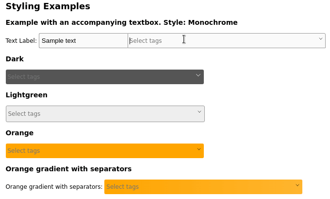
Example
<div className={cssBasic.wrapper}>
<span className={cssBasic.lblBasic}>
<span>
Text Label:
</span>
</span>
<input type='text' defaultValue='Sample text' className={cssBasic.txtControl} />
<MultiSelect id='id'
label='label'
items={programmingLanguages}
width='400px'
classes={cssBasic}
setSelected={setTags}
selected={tags}
placeholder='Select tags' />
</div>To run the examples:
  $ git clone https://github.com/oscbco/multi-select.git
  $ cd multi-select
  $ npm install
  $ npm start
Visit http://localhost:9000 to see and edit the examples. The development server is set up to be available from everywhere, even your mobile phone in your LAN.
Tests
npm test