
Angular Material Search-select control
This library implements a "search select" or "select with search" control, to match (and building on) Angular Material. To provide the UI, the Material mat-autocomplete control is used; but the result is not quite an autocomplete per se, it really is a search select, intended to pick an item from a list.
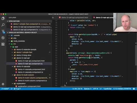
Video demo and explanation
How it works, and why
This control handles cases where the displayed 'name' does not match the internal ID. As a developer using this control, you supply methods to translate from ID to displayed name, and to search data during selection.
Both directions of data lookup/search are handles asynchronously, suitable for a database-based, long list of searchable items.
We have found this problem comes up regularly on our projects, and have finally created this reusable solution. This repository/project contains both the component itself, and screens that demonstrate its use.
Try it
Demo running at:
https://oasisdigital.github.io/angular-material-search-select/
NPM package:
https://www.npmjs.com/package/@oasisdigital/angular-material-search-select
To use this in a project
npm install --save @oasisdigital/angular-material-search-select
There are two ways to consume this code. You can see examples of them in the various tabs of the demo.
- Use the provided search-select component, as shown in "simple", "Long slow", "real API".
- Write a custom component using only the base class provided in this package;
your component will provide all the visuals, but typically doesn't need to
provide any code at all. For an example of this, look in the source code,
directory
demo-5-multicolumnand the corresponding multi-column demo tab.
For better or worse, various aspects of HTML, CSS, Angular, and other tools conspire to frequently require option 2. This is the only way to provide full flexibility in the appearance of the component, to match your application's needs.
Regardless of which layout approach you choose, at run time you must provide a DataSource, which is similar conceptually to the DataSource concept used by a mat-table; that interface defines (and application code must provide) methods:
- Method which searches for a values, and provides corresponding display text.
- Method which takes a search query fragment and provides a list of match candidates.
- Optionally, a match method that can widen the definition of a matching entry - for example, make it a user can type an entry that varies from a list entry only in upper/lowercase.
Study the example code in the various demo-N-* for more about these methods.
It shows several ways to provide such a data source.
Also an example of how to publish a component
In addition to being a useful component, we have been using this repository as an example of how to publish a Angular component to NPM. You can see these patterns in use here, and borrow them for other components:
- Start with an Angular CLI project.
- Add a module inside, for the components to be packaged.
- Make the overall application provide a demo, test environment, etc. for the components in the to-be-packaged module.
- Use ng-packagr: outsource the complexity in bundling to that brilliant package.
Who?
Primary authors:
- Kyle Cordes, twitter
@kylecordes - Paul Spears, twitter
@TheEvergreenDev
We both work at Oasis Digital / Angular Boot Camp.