Fork of cm-chessboard
cm-chessboard
A JavaScript chessboard which is lightweight, ES6 module based, responsive, SVG rendered and without dependencies.
It works on desktop (current versions of Chrome, Firefox, Safari, Edge), and mobile (Android and iOS).
cm-chessboard is the main chessboard of chessmail.eu and chessmail.de. It is also used in chess-console and in cm-fen-editor. They are all nice written ES6 Modules to handle different aspects of chess games.
Features
- Mobile friendly and responsive
- Can handle moves input via click or drag
- Styleable via css
- Supports multiple piece sets
- Uses SVG for rendering
- Vanilla JavaScript modules in ECMAScript 6 syntax
- No dependencies
Demo and repository
Install
Option 1: Install the npm package with npm install cm-chessboard.
Option 2: Download the code from GitHub.
After installation, copy the sprite in cm-chessboard/assets/images/ to your projects assets/images/
folder. If you put the sprite somewhere else you have to configure the location with {sprite.url: "./url/of/chessboard-sprite.svg"}
(see section 'Configuration' below).
To run the unit tests in /test you first have to npm install the dev dependencies. Without tests there are no
dependencies.
Example usage
Preconditions for using cm-chessboard in a web page:
-
include the css:
assets/styles/cm-chessboard.css -
import the ES6 module:
import {Chessboard} from "PATH/TO/src/cm-chessboard/Chessboard.js"
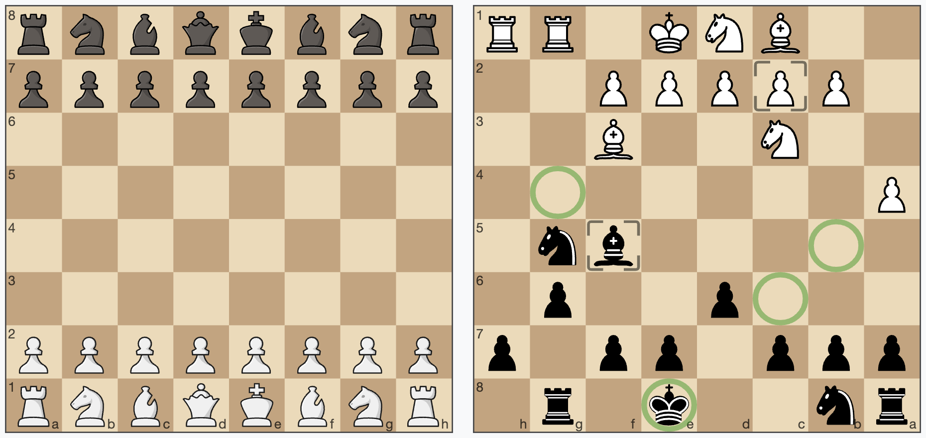
Example, showing a FEN:
<script type="module">
    import {Chessboard} from "./src/cm-chessboard/Chessboard.js"

    new Chessboard(document.getElementById("containerId"),
            {position: "rn2k1r1/ppp1pp1p/3p2p1/5bn1/P7/2N2B2/1PPPPP2/2BNK1RR"})
</script>
Take a look at the /examples folder for more simple examples.
Configuration
Below is the default configuration
props = {
    position: "empty", // set as fen, "start" or "empty"
    orientation: COLOR.white, // white on bottom
    style: {
        cssClass: "default",
        showCoordinates: true, // show ranks and files
        borderType: BORDER_TYPE.thin, // thin: thin border, frame: wide border with coordinates in it, none: no border
        aspectRatio: 1, // height/width. Set to `undefined`, if you want to define it only in the css.
        moveFromMarker: MARKER_TYPE.frame, // the marker used to mark the start square
        moveToMarker: MARKER_TYPE.frame // the marker used to mark the square where the figure is moving to
    },
    responsive: true, // resizes the board based on element size
    animationDuration: 300, // pieces animation duration in milliseconds
    sprite: {
        url: "./assets/images/chessboard-sprite-staunty.svg", // pieces and markers are stored as svg sprite
        size: 40, // the sprite size, defaults to 40x40px
        cache: true // cache the sprite inline, in the HTML
    }
}
API
constructor
new Chessboard(containerElement, props = {})
-
containerElement: a HTML DOM element being the container of the widget -
props: The board configuration (properties)
setPiece(square, piece)
Sets a piece on a square. Example: board.setPiece("e4", PIECE.blackKnight) or
board.setPiece("e4", "bn"). Remove a Piece with board.setPiece("e4", null).
getPiece(square)
Returns the piece on a square or undefined if the square is empty.
movePiece(squareFrom, squareTo, animated = true)
Move a piece from squareFrom to squareTo. Returns a Promise, which is resolved, when the animation finished.
setPosition(fen, animated = true)
Sets the position as fen. Special values are "start", sets the chess start position and
"empty", sets an empty board. When animated is set false, the new position will be shown instant.
Returns a Promise, which is resolved, when the animation finished.
getPosition()
Returns the board position as fen.
addMarker(square, type)
Adds a marker on a square.
Default types are: MARKER_TYPE.frame, MARKER_TYPE.square, MARKER_TYPE.dot, MARKER_TYPE.circle exportet by Chessboard.js.
You can create your own marker types:
Just create an object like const myMarker = {class: "markerCssClass", slice: "markerSliceId"}, where class is the css class of the marker for styling
and slice is the id in sprite.svg. See also Create your own custom markers
below.
Example for addMarker, getMarkers and removeMarkers
getMarkers(square = undefined, type = undefined)
Returns the board's markers as an array.
Set square to undefined, to get all markers of a type on the board. Set type to undefined, to get all types.
Set both to undefined to get all markers on the board.
removeMarkers(square = undefined, type = undefined)
Removes markers from the board.
Set square to undefined to remove markers of type from all squares. Set type to undefined, to remove all types
from a square. Set both to undefined to remove all markers from the board.
setOrientation(color)
Sets the board orientation (color at bottom). Allowed values are COLOR.white or COLOR.black.
getOrientation()
Returns the board orientation.
destroy()
Removes the board from the DOM.
enableMoveInput(eventHandler, color = undefined)
Enables moves via user input (mouse or touch). Set optional color, if you want to enable the move input for a specific
side, COLOR.white or COLOR.black.
eventHandler is called on specific events of the user interaction. Receives the parameter event.
board.enableMoveInput((event) => {
    // handle user input here
}, COLOR.white)The event has the following event.type:
-
INPUT_EVENT_TYPE.moveStart: User started the move input,event.squarecontains the coordinates -
INPUT_EVENT_TYPE.moveDone: User finished the move input,event.squareFromandevent.squareTocontain the coordinates -
INPUT_EVENT_TYPE.moveCanceled: User canceled the move with clicking again on the start square or clicking outside of the board
chessboard.enableMoveInput((event) => {
    switch (event.type) {
        case INPUT_EVENT_TYPE.moveStart:
            console.log(`moveStart: ${event.square}`)
            // return `true`, if input is accepted/valid, `false` aborts the interaction, the piece will not move
            return true
        case INPUT_EVENT_TYPE.moveDone:
            console.log(`moveDone: ${event.squareFrom}-${event.squareTo}`)
            // return true, if input is accepted/valid, `false` takes the move back
            return true
        case INPUT_EVENT_TYPE.moveCanceled:
            console.log(`moveCanceled`)
    }
}, COLOR.white)
disableMoveInput()
Disables moves via user input.
enableSquareSelect(eventHandler)
Enables primary and secondary pointer events on squares. On desktop devices this means left and right click on squares.
board.enableSquareSelect((event) => {
    switch (event.type) {
        case SQUARE_SELECT_TYPE.primary:
        // left click
        case SQUARE_SELECT_TYPE.secondary:
        // right click
    }
})
Example for enableSquareSelect
event.square contains the coordinates of the user input.
disableSquareSelect()
Disables the square select.
Piece sets
cm-chessboard supports alternative piece sets. A piece set is defined in an SVG sprite. cm-chessboard is shipped with two sets, the default staunty ( chessboard-sprite-staunty.svg) and a sprite of the Wikimedia standard pieces (chessboard-sprite.svg).
Sprites must be 40x40px in size where the piece elements must have ids like "bp" (black pawn) or "wq" (white queen). Just open the sprite in a text editor, SVG is readable like HTML. Also the markers are defined in the sprite.
Create your own custom markers
The ability to add custom markers is build in. You can use the existing marker shapes in the SVG sprite and create your own markers with just css or create your own custom SVG shapes. With a program like InkScape or Sketch this should be relatively easy.
Example: The markerCircle is defined in the SVG like this.
<g id="markerCircle" transform="translate(2.000000, 2.000000)" fill="#000000" fill-opacity="0">
    <circle cx="18" cy="18" r="18"/>
</g>
It's a circle with the radius 18 and its center at 20/20.
Important is the id "markerCircle". You can set the marker
with board.addMarker("e4", {class: "markerSquare", slice: "markerSquare"})
"emphasize" is the css class, which defines the color and opacity of the marker. "slice" is the id of the marker in the SVG. This is
also demonstrated in the mark squares example
.
The color and stroke-width of the marker is defined in the css (or scss). You could also define your marker completely in the sprite, but then that is not so flexible.
These are the css styles of the markers "markerSquare" and "markerCircleRed".
marker.markerSquare {
  fill: black;
  opacity: 0.11;
}
marker.markerCircleRed {
   stroke: #aa0000;
   stroke-width: 3px;
   opacity: 0.4;
 }
So you can simply add a marker with the id myMarkerIdInSvg to the SVG, and add the class myMarkerCssClass to the
css. Then you can show it on the field "e4" with
addMarker("e4", {class: "myMarkerCssClass", slice: "myMarkerIdInSvg"})
To allow easy removing of the marker, you have to define the marker type in your code.
const myMarkerType = {class: "myMarkerCssClass", slice: "myMarkerIdInSvg"}
// add
chessboard.addMarker("e4", myMarkerType)
// remove
chessboard.removeMarkers("e4", myMarkerType)
// remove all "myMarkerType"
chessboard.removeMarkers(undefined, myMarkerType)
Usage with React
There exists a ticket from someone who is using cm-chessboard with react: https://github.com/shaack/cm-chessboard/issues/20
Licenses
- License for the code: MIT
- License for the Staunty SVG-pieces ( chessboard-sprite-staunty.svg): CC BY-NC-SA 4.0
- License for the Wikimedia SVG-pieces ( chessboard-sprite.svg): CC BY-SA 3.0
cm-chess
You may also be interested in cm-chess, it is like chess.js, but in ES6 and can handle games and PGNs with variants, NAGs and comments.