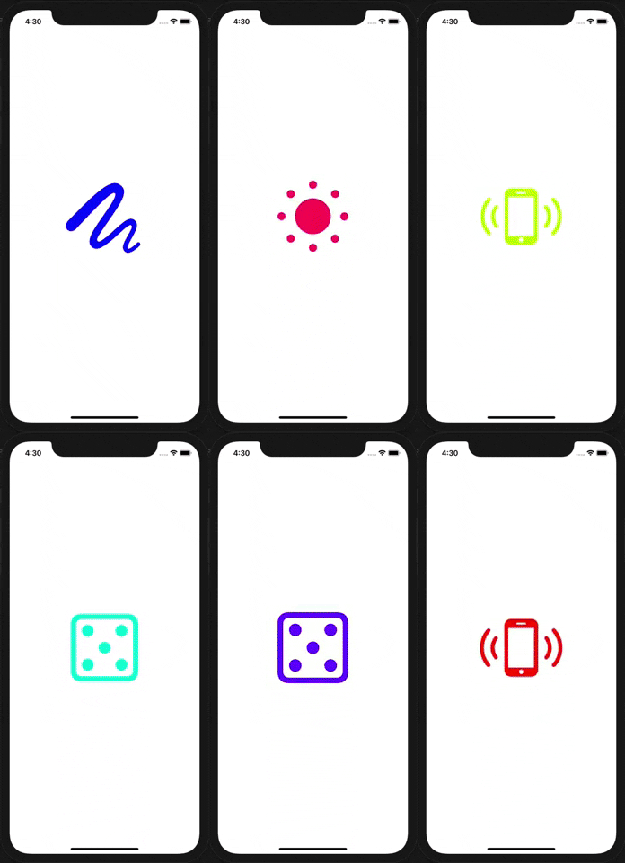
react-native-sfsymbols
Use SF Symbols in React Native for iOS
⚠️ iOS 13+ only (& more soon)💔 Android or other platforms cannot be supported
Setup
npm install --save react-native-sfsymbols

# --- or ---

yarn add react-native-sfsymbols
Don't forget to run cd ios && pod install && cd .. after that !
Manual installation
iOS
- In XCode, in the project navigator, right click
Libraries➜Add Files to [your project's name] - Go to
node_modules➜react-native-sfsymbolsand addRNSfsymbols.xcodeproj - In XCode, in the project navigator, select your project. Add
libRNSfsymbols.ato your project'sBuild Phases➜Link Binary With Libraries - Run your project (
Cmd+R)<
Usage
Note that some symbols require higher minimum iOS targets. handbag for instance, requires iOS 16.1, whereas lightbulb has been available since iOS 13.0.
import { SFSymbol } from "react-native-sfsymbols";

export function Example() {
  return (
    <SFSymbol
      name="sun.and.horizon"
      fallback="sun.haze.fill"
      weight="semibold"
      scale="large"
      color="red"
      size={16}
      resizeMode="center"
      multicolor={false}
      style={{ width: 32, height: 32 }}
    />
  );
}
They can be animated with Animated
import { Animated } from "react-native";
import { SFSymbol } from "react-native-sfsymbols";

const AnimatedSFSymbol = Animated.createAnimatedComponent(SFSymbol);

<AnimatedSFSymbol
  name="sun.min.fill"
  style={{
    opacity: new Animated.Value(1),
  }}
/>;
Props
name
The symbol name you want to display, can be seen in the SF Symbols application.
color (optional)
The color of the symbol written as a hex or color value. PlatformColor and DynamicColorIOS also works.
weight (optional)
The (font) weight of the symbol.
ultralight
light
thin
regular
medium
semibold
bold
heavy
Multicolor has issues with this "thin" weight.
scale (optional)
The scale of the symbol, it will optimise the thickness of detail strokes in the icon for different sizes.
small
medium
large
multicolor (optional)
Enable multicolor, don't pass a "color" for it to work properly.
size (optional)
Font size of the icon as a number.
resizeMode (optional)
Resize mode of the icon. When "size" is given, it will default to "center" otherwise "scale-aspect-fill".
scale-to-fill
scale-aspect-fit
scale-aspect-fill
redraw
center
top
bottom
left
right
top-left
top-right
bottom-left
bottom-right
cover
contain
stretch


