
Slate gallery
An image gallery for slate editor
Installation
yarn add @mercuriya/slate-gallerynpm install @mercuriya/slate-gallery --savePeer dependencies
It uses react-dropzone, react-sortable-hoc, array-move so, please, install them, if you don't have them yet:
yarn add react-dropzone react-sortable-hoc array-movenpm install react-dropzone react-sortable-hoc array-move --saveConfiguration
In your file with Slate component:
import React from 'react';
import { createEditor } from 'slate';
import { Slate, Editable, withReact } from 'slate-react';
import { withGallery, } from '@mercuriya/slate-gallery';

const initialValue = Value.fromJSON({ ... });
const plugins = [galleryPlugin({ ...options })];

export default function EditorComponent(props) {
  const [value, setValue] = useState([ /* some initial state here */ ]);
  const editor = useMemo(
    () =>
      withGallery(withReact(createEditor()), {
        // slate-gallery options
      }),
    [],
  );
  const renderElement = useCallback(({ attributes, children, element }) => {
    switch (element.type) {
      case 'gallery':
        return editor.galleryElementType({
          attributes,
          children,
          element,
          // ❗️ we use this prop internally, so you must provide it here
          readOnly: false, // or true
        });
      default:
        return <p {...attributes}>{children}</p>;
    }
  }, []);

  return (
    <Slate editor={editor} value={value} onChange={value => setValue(value)}>
      <Editable renderElement={renderElement} />
    </Slate>
  );
}
Description
This plugin adds a void block which can show images as an image grid. It allows to cover each image in something like image lightbox if you want.
Each image can have a description, which is not related with image tag alt props. It is stored as data of this gallery block.
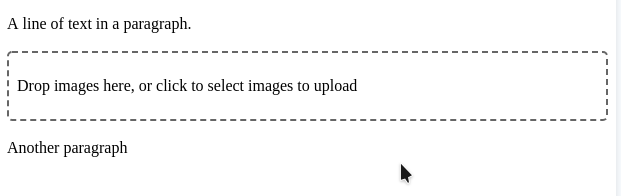
readOnly: false mode:
readOnly: true mode:

Please, see stories for more usage examples.
Options
| Name | Type | Description |
|---|---|---|
| size? (default: 9) | number | Min: 1, max: 9. It represents a grid size. A number of images which will be visible within readOnly: true mode. The remaining images will be hidden, but user will see them in the images lightbox if you will implement this. |
| dropzoneProps? | object | An object of react-dropzone props which is applies to Dropzone component |
| sortableContainerProps? | object | An object of react-sortable-hoc props which is applies to SortableContainer's component |
| renderControls? | args => React.ReactNode | A render function that allows you to customize controls block. See types definitions for more example |
| renderEditModal? | args => React.ReactNode | A render function that allows you to use custom modal while editing images descriptions |
| renderExtra? | args => React.ReactNode | A render function that allows you to place additional component near image gallery. It could be handy to build image-lightbox functionality |
| renderImage? | args => React.ReactNode | A render function that allows you to customize and image component |
| gridClassName? | string | Grid component custom class name |
| imageClassName? | string | Image component custom class name |
| imageWrapperClassName? | string | Image wrapper custom class name |
| leftClassName? | string | Number of left images (+x) custom className |