Selection controls: checkboxes
Selection controls allow the user to select options.
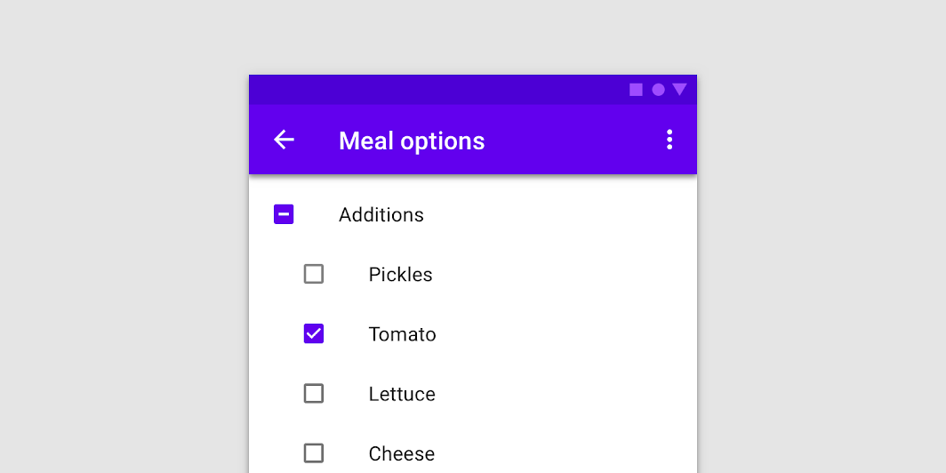
Use checkboxes to:
- Select one or more options from a list
- Present a list containing sub-selections
- Turn an item on or off in a desktop environment
Contents
Using checkboxes
Checkboxes allow the user to select one or more items from a set. Checkboxes can be used to turn an option on or off.
Installing checkboxes
npm install @material/checkbox
Styles
@use "@material/checkbox";
@use "@material/form-field";

@include checkbox.core-styles;
@include form-field.core-styles;
Note: The form field styles are only required when the checkbox is used with the form field.
JavaScript instantiation
The checkbox will work without JavaScript, but you can enhance it with a ripple interaction effect by instantiating MDCCheckbox on the mdc-checkbox element. To activate the ripple effect upon interacting with the label, you must also instantiate MDCFormField on the mdc-form-field element and set the MDCCheckbox instance as its input.
import {MDCFormField} from '@material/form-field';
import {MDCCheckbox} from '@material/checkbox';

const checkbox = new MDCCheckbox(document.querySelector('.mdc-checkbox'));
const formField = new MDCFormField(document.querySelector('.mdc-form-field'));
formField.input = checkbox;
See Importing the JS component for more information on how to import JavaScript.
Making checkboxes accessible
Material Design spec advises that touch targets should be at least 48px x 48px.
To meet this requirement, add the mdc-checkbox--touch class to your checkbox as follows:
<div class="mdc-touch-target-wrapper">
  <div class="mdc-checkbox mdc-checkbox--touch">
    <input type="checkbox"
           class="mdc-checkbox__native-control"
           id="checkbox-1"/>
    <div class="mdc-checkbox__background">
      <svg class="mdc-checkbox__checkmark"
           viewBox="0 0 24 24">
        <path class="mdc-checkbox__checkmark-path"
              fill="none"
              d="M1.73,12.91 8.1,19.28 22.79,4.59"/>
      </svg>
      <div class="mdc-checkbox__mixedmark"></div>
    </div>
    <div class="mdc-checkbox__ripple"></div>
    <div class="mdc-checkbox__focus-ring"></div>
  </div>
</div>
Note that the outer mdc-touch-target-wrapper element is only necessary if you want to avoid potentially overlapping touch targets on adjacent elements (due to collapsing margins).
The mdc-checkbox__focus-ring element ensures that a focus indicator is displayed in high contrast mode around the active/focused checkbox.
Checkboxes
We recommend using MDC Checkbox with MDC Form Field for enhancements such as label alignment, label activation of the ripple interaction effect, and RTL-awareness.
Checkbox example
<div class="mdc-form-field">
  <div class="mdc-checkbox">
    <input type="checkbox"
           class="mdc-checkbox__native-control"
           id="checkbox-1"/>
    <div class="mdc-checkbox__background">
      <svg class="mdc-checkbox__checkmark"
           viewBox="0 0 24 24">
        <path class="mdc-checkbox__checkmark-path"
              fill="none"
              d="M1.73,12.91 8.1,19.28 22.79,4.59"/>
      </svg>
      <div class="mdc-checkbox__mixedmark"></div>
    </div>
    <div class="mdc-checkbox__ripple"></div>
    <div class="mdc-checkbox__focus-ring"></div>
  </div>
  <label for="checkbox-1">Checkbox 1</label>
</div>
Note: If you are using IE, you need to include a closing </path> tag if you wish to avoid console warnings.
Checkbox states
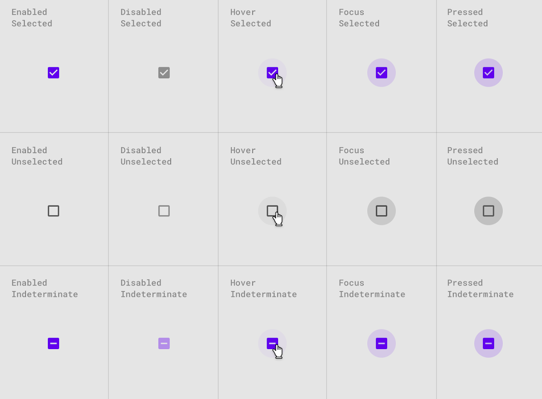
Checkboxes can be selected, unselected, or indeterminate. Checkboxes have enabled, disabled, hover, focused, and pressed states.
Other variants
Disabled checkboxes
Note that mdc-checkbox--disabled is necessary on the root element of CSS-only checkboxes to prevent hover states from activating. Checkboxes that use the JavaScript component do not need this class; a disabled attribute on the <input> element is sufficient.
<div class="mdc-checkbox mdc-checkbox--disabled">
  <input type="checkbox"
         id="basic-disabled-checkbox"
         class="mdc-checkbox__native-control"
         disabled />
  <div class="mdc-checkbox__background">
    <svg class="mdc-checkbox__checkmark"
         viewBox="0 0 24 24">
      <path class="mdc-checkbox__checkmark-path"
            fill="none"
            d="M1.73,12.91 8.1,19.28 22.79,4.59"/>
    </svg>
    <div class="mdc-checkbox__mixedmark"></div>
  </div>
  <div class="mdc-checkbox__ripple"></div>
  <div class="mdc-checkbox__focus-ring"></div>
</div>
<label for="basic-disabled-checkbox" id="basic-disabled-checkbox-label">This is my disabled checkbox</label>
Indeterminate checkboxes
Note that data-indeterminate="true" is necessary on the input element for initial render, or in a CSS-only mode. Checkboxes that use the Javascript component can modify the indeterminate property at runtime.
<div class="mdc-checkbox">
  <input type="checkbox"
         id="basic-indeterminate-checkbox"
         class="mdc-checkbox__native-control"
         data-indeterminate="true"/>
  <div class="mdc-checkbox__background">
    <svg class="mdc-checkbox__checkmark"
         viewBox="0 0 24 24">
      <path class="mdc-checkbox__checkmark-path"
            fill="none"
            d="M1.73,12.91 8.1,19.28 22.79,4.59"/>
    </svg>
    <div class="mdc-checkbox__mixedmark"></div>
  </div>
  <div class="mdc-checkbox__ripple"></div>
  <div class="mdc-checkbox__focus-ring"></div>
</div>
<label for="basic-indeterminate-checkbox" id="basic-indeterminate-checkbox-label">This is my indeterminate checkbox</label>
API
Sass mixins
MDC Checkbox uses MDC Theme's secondary color by default for "marked" states (i.e., checked or indeterminate).
| Mixin | Description |
|---|---|
container-colors($unmarked-stroke-color, $unmarked-fill-color, $marked-stroke-color, $marked-fill-color, $generate-keyframes) |
Sets stroke & fill colors for both marked and unmarked state of enabled checkbox. Set $generate-keyframes to false to prevent the mixin from generating @keyframes. |
disabled-container-colors($unmarked-stroke-color, $unmarked-fill-color, $marked-stroke-color, $marked-fill-color) |
Sets stroke & fill colors for both marked and unmarked state of disabled checkbox. |
ink-color($color) |
Sets the ink color of the checked and indeterminate icons for an enabled checkbox |
disabled-ink-color($color) |
Sets the ink color of the checked and indeterminate icons for a disabled checkbox |
focus-indicator-color($color) |
Sets the color of the focus indicator (ripple) when checkbox is selected or is in indeterminate state. |
ripple-size($ripple-size) |
Sets the ripple size of the checkbox. |
density($density-scale) |
Sets density scale for checkbox, Supported density scales are -3, -2, -1, and 0 (default). |
The ripple effect for the Checkbox component is styled using MDC Ripple mixins.
MDCCheckbox properties and methods
| Property Name | Type | Description |
|---|---|---|
checked |
boolean |
Setter/getter for the checkbox's checked state |
indeterminate |
boolean |
Setter/getter for the checkbox's indeterminate state |
disabled |
boolean |
Setter/getter for the checkbox's disabled state |
value |
string |
Setter/getter for the checkbox's |
Usage within web frameworks
If you are using a JavaScript framework, such as React or Angular, you can create a Checkbox for your framework. Depending on your needs, you can use the Simple Approach: Wrapping MDC Web Vanilla Components, or the Advanced Approach: Using Foundations and Adapters. Please follow the instructions here.
MDCCheckboxAdapter
| Method Signature | Description |
|---|---|
addClass(className: string) => void |
Adds a class to the root element. |
removeClass(className: string) => void |
Removes a class from the root element. |
forceLayout() => void |
Force-trigger a layout on the root element. This is needed to restart animations correctly. If you find that you do not need to do this, you can simply make it a no-op. |
isAttachedToDOM() => boolean |
Returns true if the component is currently attached to the DOM, false otherwise. |
isIndeterminate() => boolean |
Returns true if the component is in the indeterminate state. |
isChecked() => boolean |
Returns true if the component is checked. |
hasNativeControl() => boolean |
Returns true if the input is present in the component. |
setNativeControlDisabled(disabled: boolean) => void |
Sets the input to disabled. |
setNativeControlAttr(attr: string, value: string) => void |
Sets an HTML attribute to the given value on the native input element. |
removeNativeControlAttr(attr: string) => void |
Removes an attribute from the native input element. |
MDCCheckboxFoundation
| Method Signature | Description |
|---|---|
setDisabled(disabled: boolean) => void |
Updates the disabled property on the underlying input. Does nothing when the underlying input is not present. |
handleAnimationEnd() => void |
animationend event handler that should be applied to the root element. |
handleChange() => void |
change event handler that should be applied to the checkbox element. |


