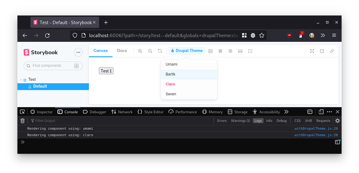
Drupal Storybook Addon
A library for best-practice Drupal integration addons in Storybook:
- Easy-to-use Drupal integration
- Simple drop-down menu
- URL-linkable state for sharing
Follow the instructions in the documentation for the Drupal module CL Server.
Start Storybook
Start the development server Storybook server:
yarn storybookTips for writing YML stories
- Anotated example with the different options for writing stories: https://gitlab.com/-/snippets/2556203
- Closed issue with some nifty tips: https://github.com/Lullabot/storybook-drupal-addon/issues/34
Storybook addon authors
As an addon author, you can use this library by adding it as a dependency and adding the following to your src/manager.ts and src/preview.ts files:
src/manager.ts
export * from '@lullabot/storybook-drupal-addon/manager';src/preview.ts
import type { Renderer, ProjectAnnotations } from '@storybook/types';
import drupalPreview from '@lullabot/storybook-drupal-addon/preview';
import { withYourDrupalDecorator } from './withYourDecorator';

// @ts-ignore
const drupalDecorators = drupalPreview?.decorators || [];

const preview: ProjectAnnotations<Renderer> = {
    ...drupalPreview,
    decorators: [...drupalDecorators, withYourI18nDecorator],
}

export default preview;
The currently selected drupal theme is available in the drupalTheme global, so you can access it in a decorator using the following snippet:
import { MyProvider } from 'your-drupal-library';
import { useGlobals } from '@storybook/manager-api';

const myDecorator = (story, context) => {
  const [{drupalTheme}] = useGlobals();

  return <MyProvider drupalTheme={drupalTheme}>;
}
