react-blacklight-facet
React components for displaying facet data from a Blacklight-api response.
The JSON response for a Blacklight catalog search will return something similar to:
{
  "facets": [
    {
      "name": "subject",
      "items": [
        {
          "value": "Cool cats",
          "hits": 290,
          "label": "Cool cats"
        },
        {
          "value": "Delightful dogs",
          "hits": 175,
          "label": "Delightful dogs"
        },
        {
          "value": "Fantastic ferrets",
          "hits": 76,
          "label": "Fantastic ferrets"
        }
      ],
      "label": "Subject",
    }
  ]
}
usage
npm install --save @lafayette-college-libraries/react-blacklight-facet
Included in the package is a FacetBase component which is used as an
interface for constructing the FacetList and FacetRangeLimitDate
components. This base component can also be extended to create custom
facet components.
FacetBase
propTypes
The items, label, and name props all come from the Blacklight
JSON catalog response:
{
  items: PropTypes.arrayOf(PropTypes.shape({
    hits: PropTypes.number,
    label: PropTypes.string,
    value: PropTypes.any,
  })).isRequired,

  label: PropTypes.string,
  name: PropTypes.string.isRequired,

  // onRemoveSelectedItem and onSelectItem are event
  // handlers that receive the signature:
  //
  //   function (facetInfo, itemInfo)
  //
  // where each is an object.
  // `facetInfo` is the Blacklight response, minus the
  //    `items` array.
  // `itemInfo` is the item in the `items` array

  onRemoveSelectedItem: PropTypes.func.isRequired,
  onSelectItem: PropTypes.func.isRequired,

  // whether to initially open the facet (see `extending` for
  // info about managing this in custom components).
  // default is false
  open: PropTypes.bool,

  // an array of selected facet items.
  // default is []
  selectedItems: PropTypes.arrayOf(itemPropType),
}
extending the class
When extending the FacetBase class, all that is required is a
renderBody method, which is called when the Facet is toggled open.
import { FacetBase } from '@lafayette-college-libraries/react-blacklight-facet'

export default class CoolFacet extends FacetBase {
  renderBody () {
    return this.props.items.map((item, index) => (
      <div
        className="CoolFacet-item"
        onClick={this.props.onSelectItem}
      >
        {item.label}
      </div>
    ))
  }
}
Note: if you're planning on using the props.open to allow some
facets to be open on initial render, you'll have to either add this
property to the state, or extend it like so:
class CoolFacet extends FacetBase {
  constructor (props) {
    super(props)

    this.state = {
      ...this.state,

      /* or */

      open: props.open,
    }
  }
}
FacetList
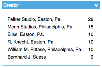
Renders facet items in an unordered list. The intention was to keep the design
close to what is featured on the Blacklight demo site but
with some stylistic / ux differences. By default the initial list is limited
to five items, controlled with the limit prop. The remaining items are stored
in a modal which is triggered by clicking a 'View More' button. This can be
disabled by setting the limit to null, which will display all of the facet items.
propTypes
{
  ...FacetBase.propTypes,

  limit: PropTypes.number,
}
FacetRangeLimitDate
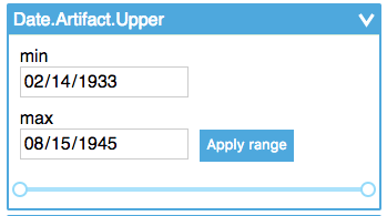
Calculates the range of dates in facet.items and renders a slider
along with a min/max input pair. The interval on the slider is determined
with the interval prop, which defaults to 'day'. The 'Apply Range' button
calls the onSelectItem handler, but the itemInfo argument is a little different
to align with how Blacklight handles ranges with the
blacklight_range_limit gem:
{
  value: {
    begin, // min value
    end, // max value
  },
  label, // stringified version of value: `${value.begin} - ${value.end}`
  name, // name of the facet
  type: 'range', // used to help distinguish from a regular facet
}
See src/FacetRangeLimitDate/create-range-facet.js for the implementation.
propTypes
{
  ...FacetBase.propTypes,

  interval: PropTypes.oneOf(['day', 'month', 'year']),
}
styling
This package also includes an SCSS stylesheet that can
be included in your project's. To do so, make sure that
node_modules is included in your Sass include-path and add
@import "@lafayette-college-libraries/react-blacklight-facet/lib/main.scss";to your Sass file. This includes some basic styling for all three components
and also includes the styling for the rc-slider component used
within. To require styling only for individual components, you can
use the following:
@import "@lafayette-college-libraries/react-blacklight-facet/lib/BaseFacet/style";
@import "@lafayette-college-libraries/react-blacklight-facet/lib/FacetList/style";
@import "@lafayette-college-libraries/react-blacklight-facet/lib/RangeSliderDate/rc-slider";
@import "@lafayette-college-libraries/react-blacklight-facet/lib/RangeSliderDate/style";
(apologies for breaking your characters-per-line limit!)
There are also a gazillion different Sass variables used within the main stylesheet that can be overridden to customize your implementation. And if that wasn't enough, each piece has a className that can be targeted.

