@jalik/react-datetime-picker
Introduction
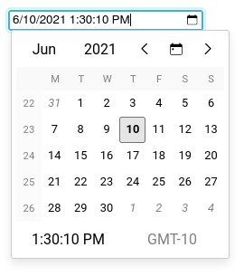
This lib allows you to add datetime inputs in your React applications with the following advantages.
- Available in CJS and ESM
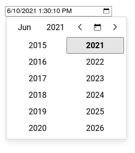
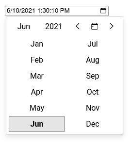
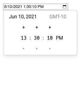
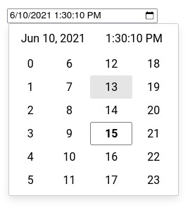
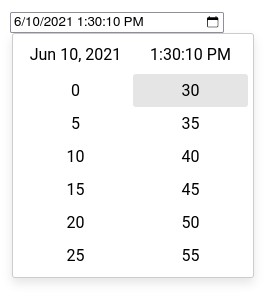
- Multiple selection views (year, month, day, time, hour, minute, second)
- Support for min and max datetime
- Support for custom day renderer
- Customizable datetime format
- Customizable view (locale, week numbers, timezone...)
- Works like a normal input (onChange/value)
- Based on Intl API to support any language (English, French, Chinese...)
- Based on luxon for date and time manipulation
NOTICE : The code has been tested with controlled components only.
Quickstart
The code below shows how to add a datetime input field with a default value and handling its changes.
import { DateTimeInput } from '@jalik/react-datetime-picker';
import React, {
  useCallback,
  useState
} from 'react';

// Don't forget to load default styles.
import '@jalik/react-datetime-picker/src/styles.css';

function App() {
  const [date, setDate] = useState(new Date().toISOString());

  const handleChange = useCallback((event) => {
    setDate(event.target.value);
  }, [])

  return (
    <div>
      <DateTimeInput
        format="D tt"
        locale="fr"
        name="date"
        onChange={handleChange}
        showCalendarIcon
        showCalendarOnFocus
        showTimeZone
        showWeekNumbers
        value={date}
      />
    </div>
  )
}
Props
calendarIcon: string
Allow to change the calendar icon in the input field.
disabled: bool
Set to true to avoid changes of the input value.
format: string
Allow to set a custom format for parsing/formatting the date in the input field.
Formatting is based on
Luxon (https://moment.github.io/luxon/docs/manual/formatting.html#table-of-tokens).
The default value is D tt (localized date and time).
locale: string
Set the locale to use when displaying dates, month... (based on the Intl API).
The default value is navigator.language.
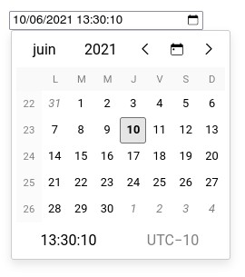
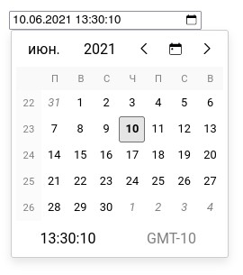
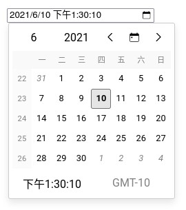
Example of different locales (fr-FR, ru, zh):
max: string
Pass an ISO date string that is the maximal valid datetime.
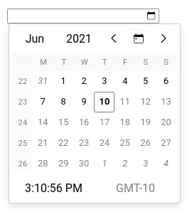
Example with 2021-06-10T23:59:59.000-10:00:
min: string
Pass an ISO date string that is the minimal valid datetime.
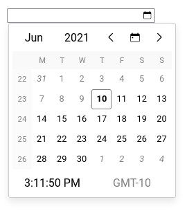
Example with 2021-06-10T00:00:00.000-10:00:
renderDay: function
Pass a function or functional component to customize days rendering.
showCalendarIcon: bool
Set to true to display the calendar icon in the input field.
showCalendarOnFocus: bool
Set to true to open the calendar when the input receives the focus (by click or keyboard).
showTimeZone: bool
Set to true to display the current timezone in the calendar.
showWeekNumbers: bool
Set to true to display week numbers in the calendar.
value: string
Used to pass the date in the format defined with format.
Customization
renderDay: function
The example below shows how to disable selection of week-end days.
import {
  CalendarDay,
  DateTimeInput
} from '@jalik/react-datetime-picker';
import React, {
  useCallback,
  useState
} from 'react';

// Don't forget to load default styles.
import '@jalik/react-datetime-picker/src/styles.css';

// Custom component that renders week-end days in red.
function CustomDayCell(props) {
  const { dateTime, currentMonth, selectedDateTime } = props;
  const isWeekEnd = dateTime.weekday > 5;
  const style = isWeekEnd ? { color: 'red' } : {};
  // We use the default component for rendering day, so we have less code to write.
  // But we could use another component with a complete different logic.
  return <CalendarDay {...props} style={style} />;
}

function App() {
  const [date, setDate] = useState(new Date().toISOString());

  const handleChange = useCallback((event) => {
    setDate(event.target.value);
  }, [])

  return (
    <div>
      <DateTimeInput
        name="date"
        onChange={handleChange}
        renderDay={CustomDayCell}
        value={date}
      />
    </div>
  )
}
Changelog
History of releases is in the changelog.
License
The code is released under the MIT License.


