ifs-design-tokens
Design Tokens are a way of storing design decisions. To ensure consistency. The entities are in the shape of key-value pairs. Each entity representing a design element - a color, a spacing, a font, or even a font-size.
Example - Token representing a color
Video explanation of design tokens
Deployments
To preview the design tokens live - check out the demo application deployments.
| Name | URL | Secondary URL |
|---|---|---|
| Latest | https://uxtokendemolatest.z16.web.core.windows.net/ | - |
| Beta | https://uxtokendemobeta.z16.web.core.windows.net/ | - |
Web
Both static and run time resources are provided.
| Type | File type |
|---|---|
| Static | SCSS* |
| Run time | Typescript (JSON) |
*Note: initially only SCSS format is provided (not css or less).
How to use
The designated default theme has to be imported as SCSS. The default theme refers to CSS variables that are updated in run time with the help of the IFS Token Manager.
Within your application, the DOM root element will make css variables available.
Theme and Color
Two core themes are made available - light and dark. A theme is commonly limited to color choices, but may also include tokens for any other style property. The goal is that each theme should supply high contrast between elements, based on great accessibility.
SCSS
By importing the SCSS, token variables will automatically be made available within :root. In this example, we import the light theme. It will then be considered as the default theme.
@import '@ifsworld/ifs-design-tokens/design-tokens/light/tokens';If it turns out that you also need to interact with the tokens in scss compilation, include them as scss variables.
@import '@ifsworld/ifs-design-tokens/design-tokens/light/variables';Using a theme token
// Direct usage for modern browsers
background-color: var(--fnd-css-variable);
Token supported browsers
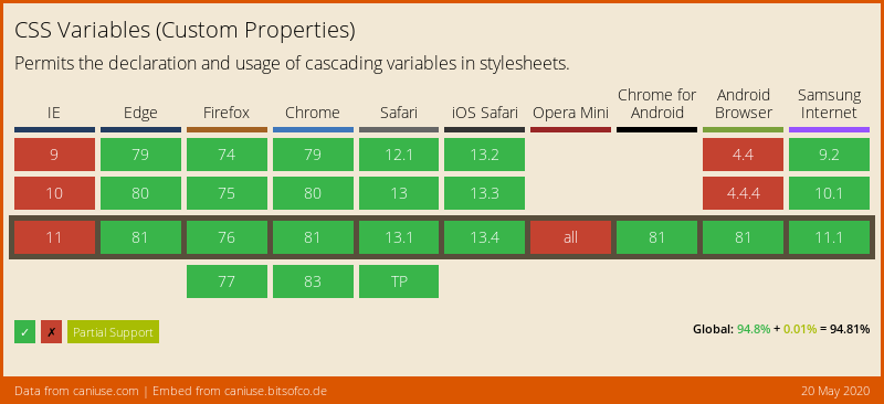
To support older browsers that do not support CSS variables, the fallback value parameter is required. For these scenarios, parse out values from the provided stylesheet, or use your own fallback values.
Typically, a SCSS map structure would be provided, with the design tokens, to cover such a scenario. We have however deemed that this will not be necessary, as all modern browser versions doesn't need any fallback value, as they fully support CSS variables.
Typescript
import { IFSThemeTokenManager } from '@ifsworld/ifs-design-tokens';JavaScript
const themeTokenManager = require('@ifsworld/ifs-design-tokens');White-label
Whitelabelling, the art of enabling users to change certain design elements, is managed by overriding CSS variable values. In the future, such values will be carefully chosen by designers, to blend in well with the rest of the user interface. Color values for example may be representative of a certain company or user.
Token Types
There are currently two types of tokens; strings and numbers. To avoid issues, do not assume that all tokens are of type string!
Extend package on the outside
In special cases, when the package is missing support for a specific color, the following workaround may be appliccable.
Each theme has a unique GUID. These universal ids may be used to detect which theme is active. Then based on the id, a certain hex color can be applied.
| Theme id (may change) | GUID |
|---|---|
| Light (default) | 29dc6511-dfc8-4fab-8528-70a55d9263ef |
| Dark | 363e77ec-6dbb-4694-b7e0-92e04666f317 |
Note: this should only be used as a last resort! First and foremost, use existing variables. Secondly, contact IFS UX department for feature requests.
Breaking changes
v4.x.x
- Granite Design System tokens has their category section represented in singular instead of plural (colors => color).
- Tokens for UI component library added.
v3.x.x
- Typescript Intellisense (built-in type support).
- Design tokens for lobby and conditional formatting introduced.
v2.x.x
- Prefix 'granite' introduced. Earlier denoted with 'fnd'. - Introduction of first design system tokens.
v1.x.x - Beta release
- Design tokens, with legacy support for Aurena.
v0.x.x
- Alpha release.
Contribute
Visit project's Development Guidelines for instructions. See GIT repository.


