
@hallysonh/ngx-popover
Based on ngx-popover.
Simple popover control for your angular7 applications using bootstrap4. Does not depend of jquery. If you don't want to use it without bootstrap - simply create proper css classes. Please star a project if you liked it, or create an issue if you have problems with it.
Demo
Access a demo here or download this project and execute: yarn && yarn start or npm install && npm run start to self server it.
Installation
-
Install npm module:
npm install @hallysonh/ngx-popover --save -
Import the module in your app module
import { NgxPopoverModule } from '@hallysonh/ngx-popover';

@NgModule({
  imports: [BrowserModule, NgxPopoverModule],
  declarations: [AppComponent],
  bootstrap: [AppComponent],
})
export class AppModule {}
Usage
After import NgxPopoverModule in your app, start using the component:
<div popover="content to be shown in the popover"
     popoverTitle="Popover header"
     popoverPlacement="top"
     [popoverOnHover]="false"
     [popoverCloseOnClickOutside]="true"
     [popoverCloseOnMouseOutside]="false"
     [popoverDisabled]="false"
     [popoverAnimation]="true"
     [popoverDismissTimeout]="1000">
    element on which this popover is applied.
</div>
Example of usage with dynamic html content:
<ng-template #myPopoverContent>
  <b>Very </b><span style="color: #C21F39">Dynamic </span><span style="color: #00b3ee">Reusable </span>
  <b><i><span style="color: #ffc520">Popover With </span></i></b><small>Html support </small>.
</ng-template>

<button [popover]="myPopoverContent"
  popoverTitle="Popover title"
  popoverPlacement="left"
  [popoverAnimation]="true"
  [popoverCloseOnClickOutside]="true">
  element on which this popover is applied.
</button>
Popover Directive Properties
-
popover="string"The message or template to be shown in the popover. -
popoverTitle="string"Popover title text. -
popoverPlacement="top|bottom|left|right|auto|auto top|auto bottom|auto left|auto right"Indicates where the popover should be placed. When using "auto" modifier, will show in opposite direction if not enough room. Default is "bottom". -
[popoverDisabled]="true|false"Indicates if popover should be disabled. If popover is disabled then it will not be shown. Default is false -
[popoverAnimation]="true|false"Indicates if all popover should be shown with animation or not. Default is true. -
[popoverOnHover]="true|false"If set to true then popover will open on mouse over instead of mouse click. Default is false. -
[popoverCloseOnMouseOutside]="true|false"Indicates if popover should be closed when user mouse outside of it. Default is false. -
[popoverCloseOnClickOutside]="true|false"Indicates if popover should be closed when user click outside of it. Default is false. -
[popoverDismissTimeout]="number"Used to automatically dismiss popover after given amount of time. Default is 0, means disabled.
Sample
import { NgModule, Component } from '@angular/core';
import { BrowserModule } from '@angular/platform-browser';
import { NgxPopoverModule } from '@hallysonh/ngx-popover';
@Component({
selector: 'app',
template: `
<div class="container">
<!-- regular popover -->
<p>
Message <span popover="Hello fact!" popoverTitle="Fact #1"><b>click this fact</b></span>
</p>
<!-- popover with dynamic html content -->
<br /><br />
<div>
<ng-template #myPopoverContent let-popover="popover">
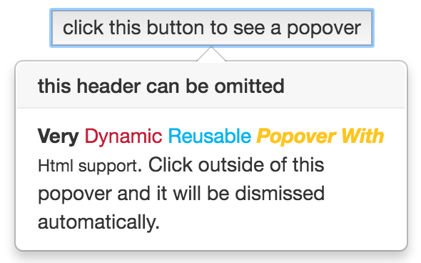
<b>Very </b><span style="color: #C21F39">Dynamic </span><span style="color: #00b3ee">Reusable </span>
<b><i><span style="color: #ffc520">Popover With </span></i></b><small>Html support </small>.
Click outside of this popover and it will be dismissed automatically.
<button (click)="popover.hide()">click here to close it</button>.
</ng-template>
<button [popover]="myPopoverContent" popoverTitle="this header can be omitted" popoverPlacement="right" [popoverCloseOnClickOutside]="true">click
this button to see a popover</button>
</div>
<!-- popover show on hover -->
<br />
<div>
<button popover="Hello popover" [popoverOnHover]="true">hover this button to see a popover</button>
</div>
</div>
`,
})
export class App {}
@NgModule({
imports: [BrowserModule, NgxPopoverModule],
declarations: [AppComponent],
bootstrap: [AppComponent],
})
export class AppModule {}Take a look on samples app in ./app for more examples of usages.