React Crossword
This is a React crossword component extracted from the Guardian Frontend application.
Features
- Displaying a grid and clues
- Displaying separators in the gird for hyphenated and multiple-word answers
- Displaying attempted clues as greyed out
- Responsive to different screen sizes
- Clicking on clue highlights row or column
- Grouping clues together for clues that span multiple columns or rows
- Tabbing highlights the previous or next clue
- Deep-linking to individual clues with URL fragments
- Arrow keys can be used to navigate between cells
- Saving progress to local storage
- Smart clearing that only clears cells not part of other completed answers
- Checking and revealing answers (if provided)
- Anagram helper
API
Props
| name | information |
|---|---|
data |
Required. This contains crossword clues, answers and other information needed to draw the grid. See Crossword Data below for more. |
loadGrid |
Optional function to override storage mechanism. Called when the component is initialized with the ID of the crossword. Should return an array-based representation of the crossword grid. See The Grid below for more. |
saveGrid |
Optional function to override storage mechanism. Called after the grid has changed with the ID of the crossword and array-based representation of the grid. See The Grid below for more. |
onMove |
Optional function. Called after a grid cell has changed with an object representing the move. The object contains the properties x, y, value and previousValue. |
Functions
There are publicly accessible functions in the Crossword component that help manage the state of the crossword. They can be accessed from a React Ref. In particular, two are useful if loading grid data from other sources:
setCellValue
setCellValue(x, y, value, triggerOnMoveCallback = true)Call to fill in an individual cell. This will trigger the onMove callback unless the triggerOnMoveCallback parameter is set to false.
updateGrid
updateGrid(gridState)This can be used to update the state of the whole grid. The onMove callback will not be called. See The Grid below for more.
Crossword Data
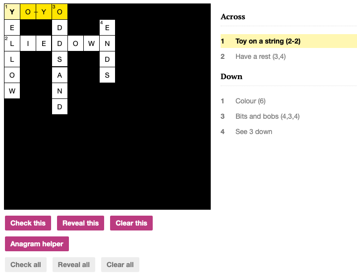
Here's an example set of data to create the crossword pictured above and in the included example:
{
  id: 'simple/1',
  number: 1,
  name: 'Simple Crossword 1',
  date: 1542326400000,
  entries: [
    {
      id: '1-across',
      number: 1,
      humanNumber: '1',
      clue: 'Toy on a string (2-2)',
      direction: 'across',
      length: 4,
      group: ['1-across'],
      position: { x: 0, y: 0 },
      separatorLocations: {
        '-': [2],
      },
      solution: 'YOYO',
    },
    {
      id: '2-across',
      number: 2,
      humanNumber: '2',
      clue: 'Have a rest (3,4)',
      direction: 'across',
      length: 7,
      group: ['2-across'],
      position: { x: 0, y: 2 },
      separatorLocations: {
        ',': [3],
      },
      solution: 'LIEDOWN',
    },
    {
      id: '1-down',
      number: 1,
      humanNumber: '1',
      clue: 'Colour (6)',
      direction: 'down',
      length: 6,
      group: ['1-down'],
      position: { x: 0, y: 0 },
      separatorLocations: {},
      solution: 'YELLOW',
    },
    {
      id: '3-down',
      number: 3,
      humanNumber: '3',
      clue: 'Bits and bobs (4,3,4)',
      direction: 'down',
      length: 7,
      group: ['3-down', '4-down'],
      position: { x: 3, y: 0 },
      separatorLocations: {
        ',': [4],
      },
      solution: 'ODDSAND',
    },
    {
      id: '4-down',
      number: 4,
      humanNumber: '4',
      clue: 'See 3 down',
      direction: 'down',
      length: 4,
      group: ['3-down', '4-down'],
      position: {
        x: 6,
        y: 1,
      },
      separatorLocations: {},
      solution: 'ENDS',
    },
  ],
  solutionAvailable: true,
  dateSolutionAvailable: 1542326400000,
  dimensions: {
    cols: 13,
    rows: 13,
  },
  crosswordType: 'quick',
}
The Grid
Some functions require or return the state of the crossword grid. This is a 2-dimensional array holding the values in each cell. Incomplete cells or cells that are not part of any answer are represented as the empty string (""). Note that it follows the convention of indexing by column first (x) and then row (y) so the printed array is transposed compared to how the crossword grid appears. For example, a crossword of:
| ■ | D | ■ |
| ■ | O | ■ |
| A | G | E |
would be represented as:
[
 ["",  "",  "A"],
 ["D", "O", "G"],
 ["",  "",  "E"],
]
Architecture
This component builds an SVG crossword grid and displays clues next to it. An input element captures typing and is moved around the grid as different clues or cells are selected. There are hidden input elements before and after this to capture tab key presses and trigger navigating to the next clue.
Outline of the structure of rendered components:
<Crossword>
  <Grid> (stateless component to render SVG element)
    <Cell/>
    ...
  </Grid>

  <HiddenInput/>

  <Controls>
    <ConfirmButton/>
    ...
  </Controls>

  <AnagramHelper> (sometimes displayed)
    <ClueInput/> or <Ring/>
    <CluePreview/>
  </AnagramHelper>

  <Clues>
    <Clue/>
    ...
  </Clues>
</Crossword>
Working with this Project
yarn install to install dependencies
yarn test to run lint javascript & sass and run tests
yarn examples to build and serve an example crossword
yarn build to package for publishing
Project History
This component was originally extracted from the Guardian Frontend application that serves all the pages on guardian.com.
You can see the work to extract the component. The code was then imported to the new react-crossword project to make a break from the larger Frontend repository.
Known Issues
- Resizing window after loading breaks the position of input element and display of crossword.
- CSS is not scoped to crossword component so may interfere with other elements on the page.
- Grid sizes are based on predefined crossword types specified with the
$xword-grid-sizesvariable in_vars.scssrather than the gird sized passed in with the crossword data.
